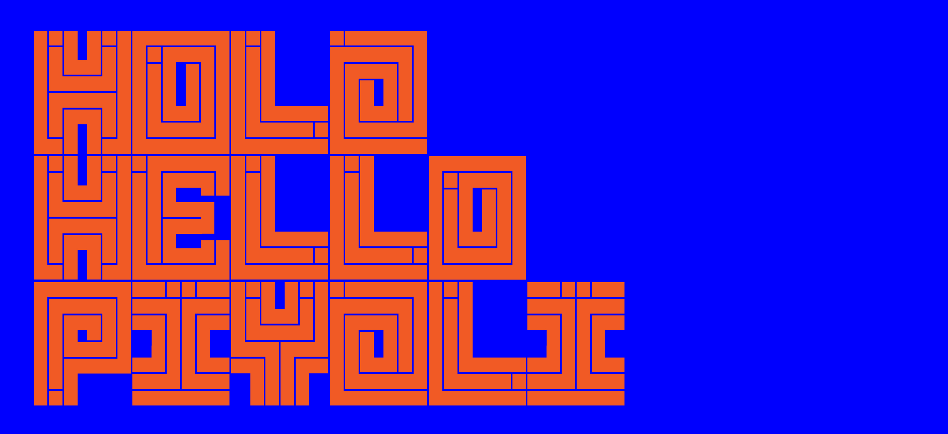
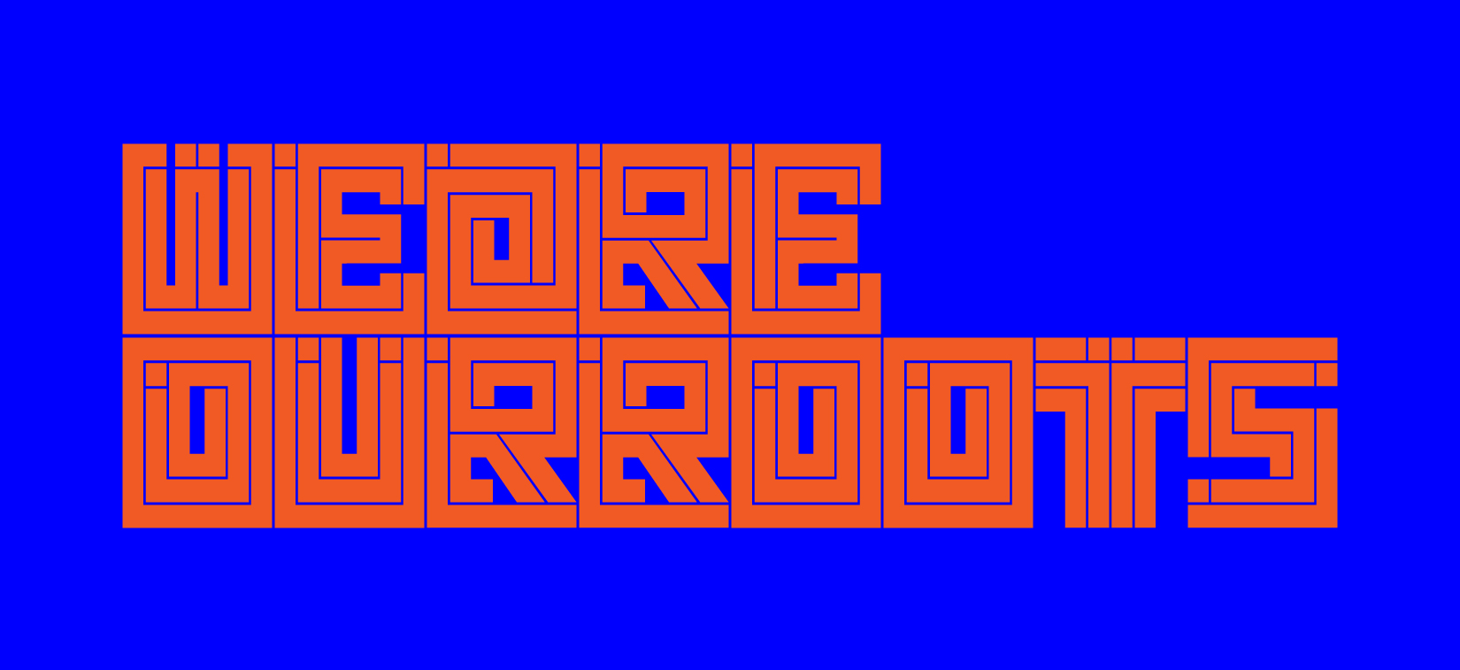
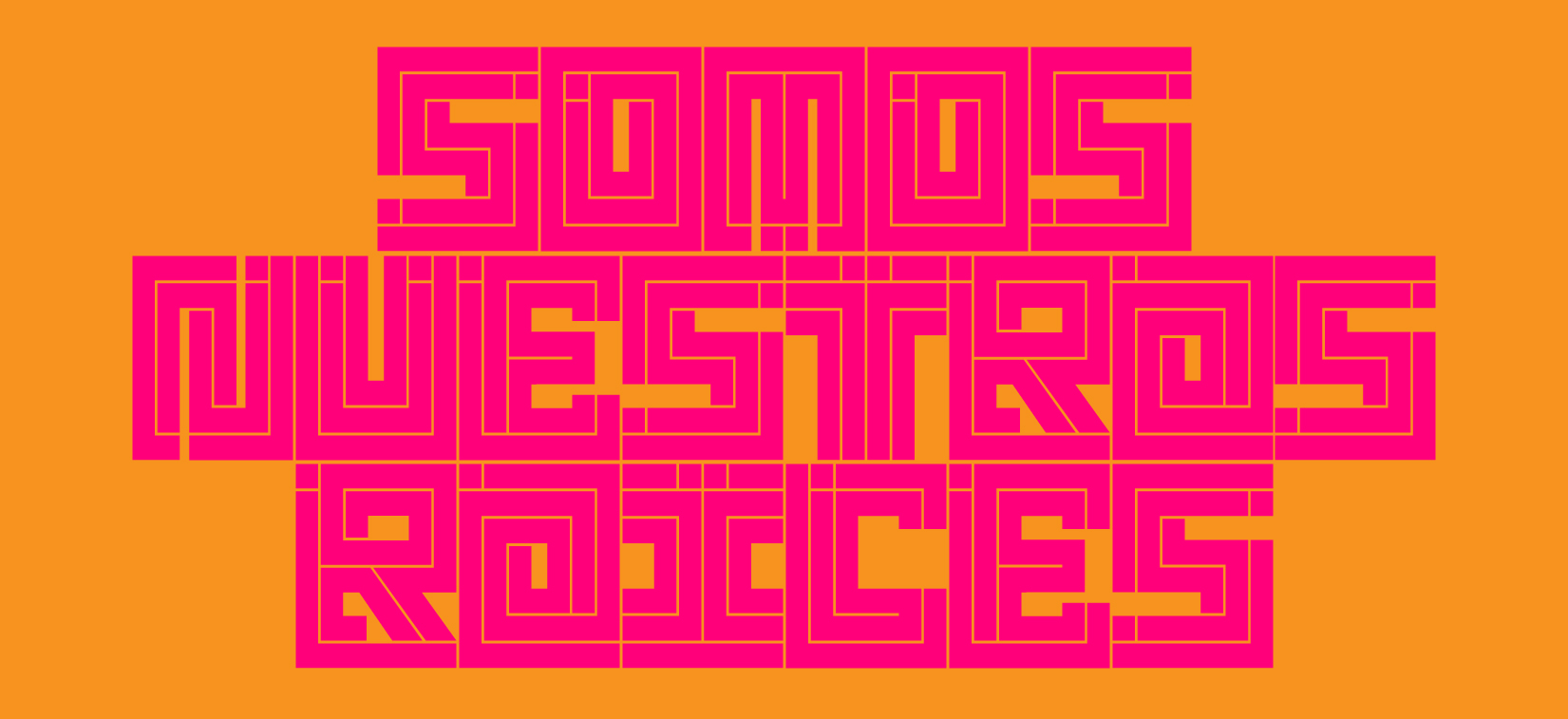
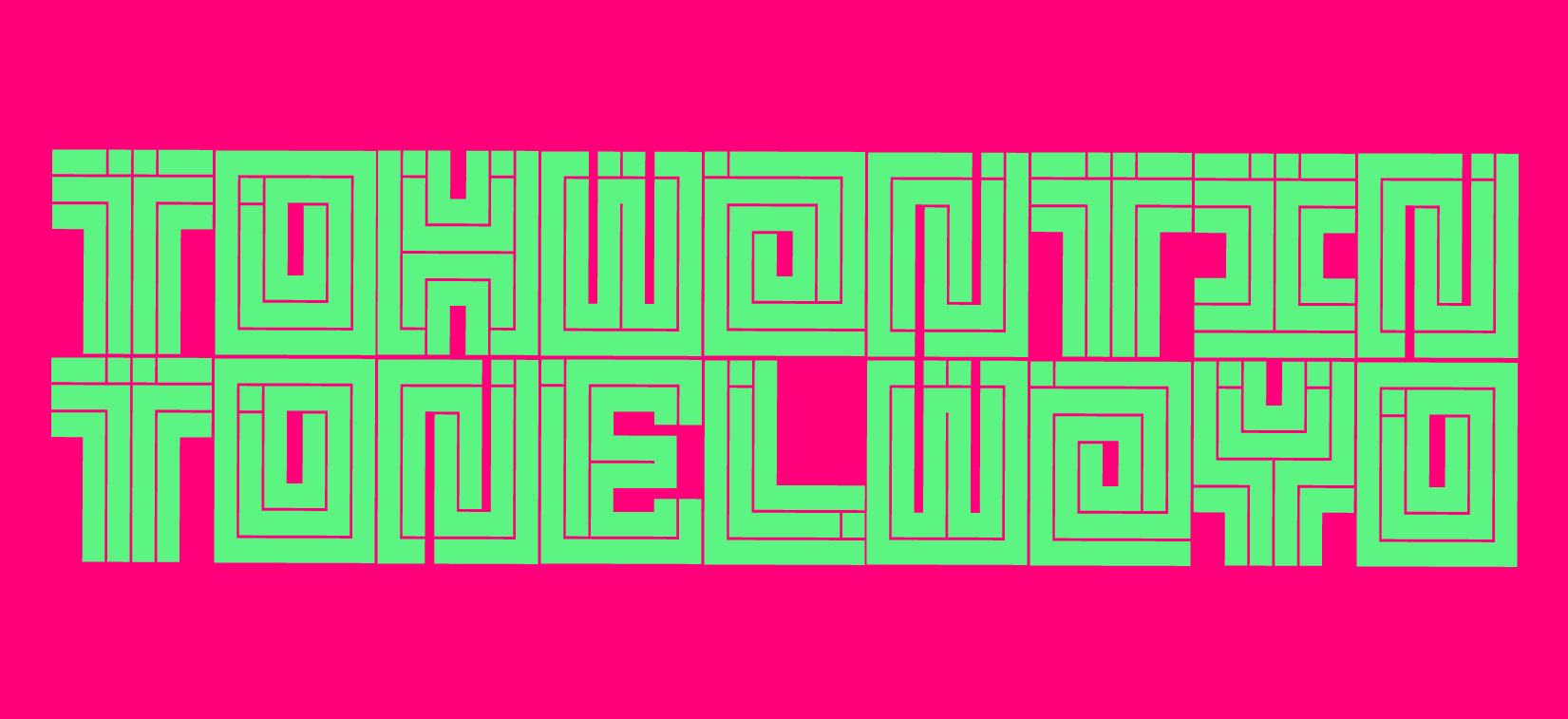
01 We Are Our Roots
Transmedia + Cultural Identity Campaign
(Print/Spatial/Motion/Social Media)
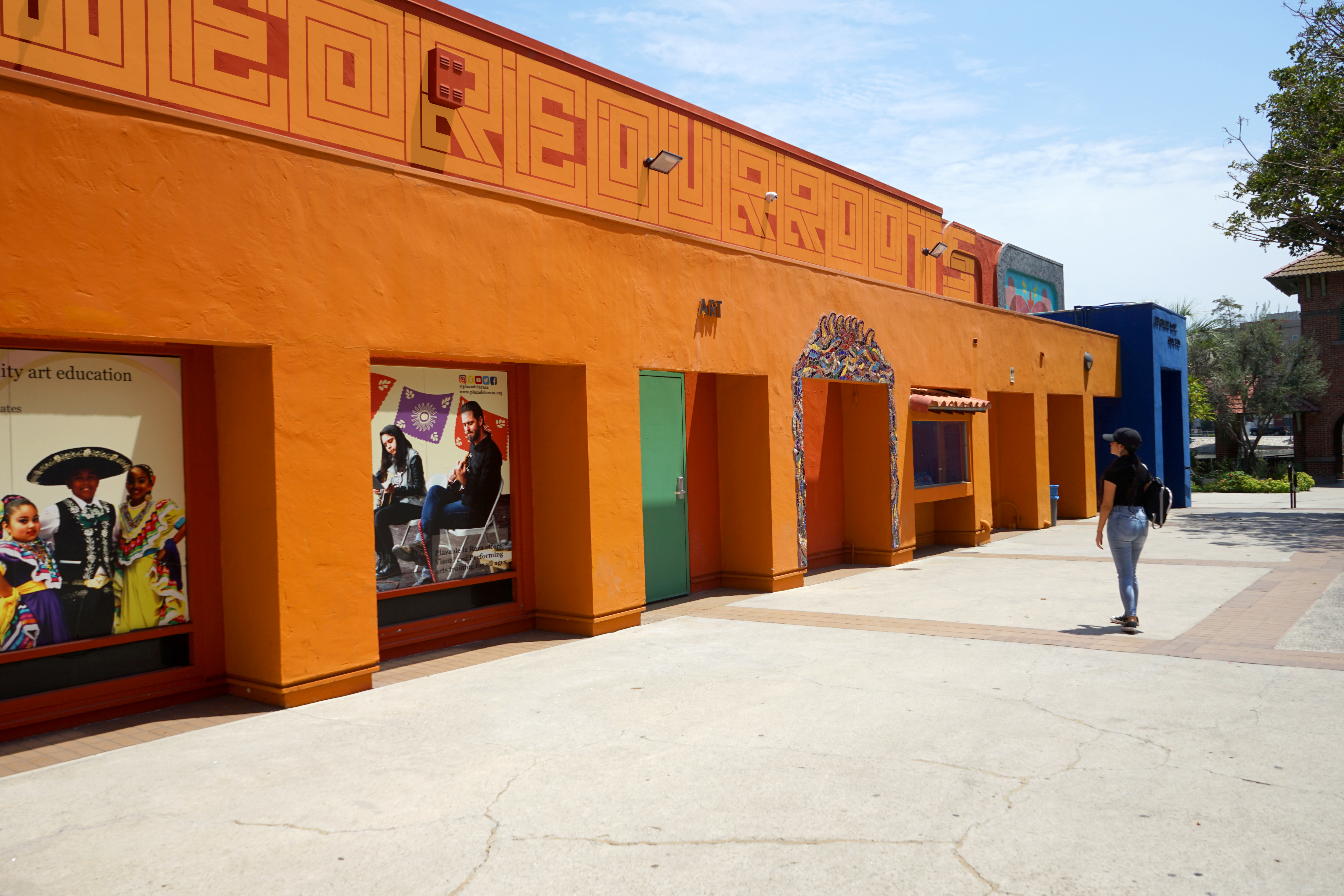
This campaign sheds light on the Nahuatl language indigenous to México through contemporary forms of communication. A launch event and community festival, We Are Our Roots Fest was created to spark intrigue among attendees and bring awareness to the community through the revitalization of Nahuatl language and arts.
Verbal and visual poetry are translated into three languages English, Spanish, and Nahuatl. This process assisted in widening the viewer demographic and helped me discover more about my own roots, challenging myself to speak and learn Nahuatl words and phrases.
(Print/Spatial/Motion/Social Media)
This campaign sheds light on the Nahuatl language indigenous to México through contemporary forms of communication. A launch event and community festival, We Are Our Roots Fest was created to spark intrigue among attendees and bring awareness to the community through the revitalization of Nahuatl language and arts.
Verbal and visual poetry are translated into three languages English, Spanish, and Nahuatl. This process assisted in widening the viewer demographic and helped me discover more about my own roots, challenging myself to speak and learn Nahuatl words and phrases.
Credits:
Motion Design: Erron Estrada + Jovan Estrada
Font Design: Erron Estrada
*Hypothetical project for educational purposes only!
My Role: Graphic Design + Identity CampaignMotion Design: Erron Estrada + Jovan Estrada
Font Design: Erron Estrada
Identity System + Variable Font
(Megalith A-Z/Numerals/Icons)
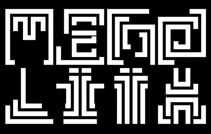
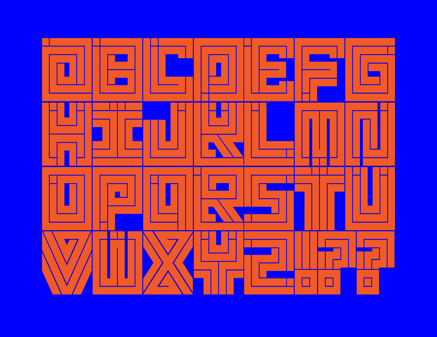
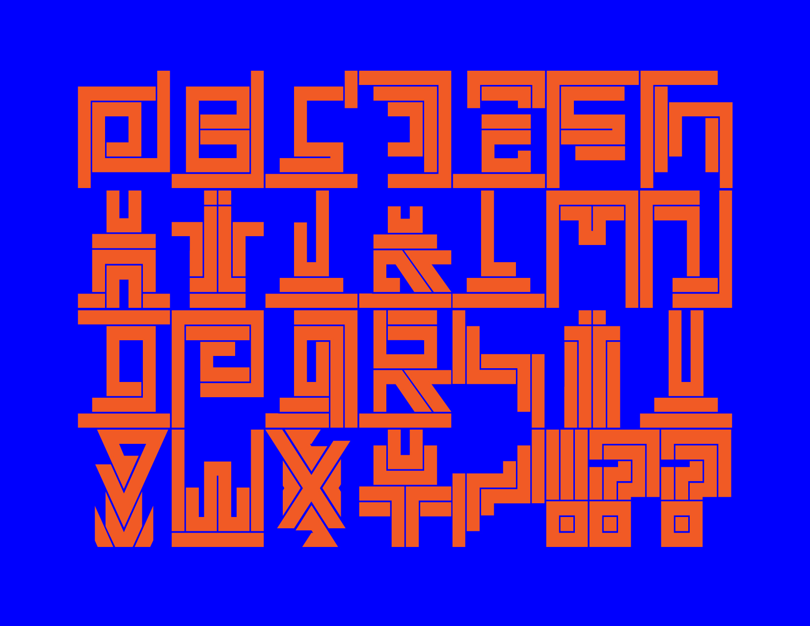
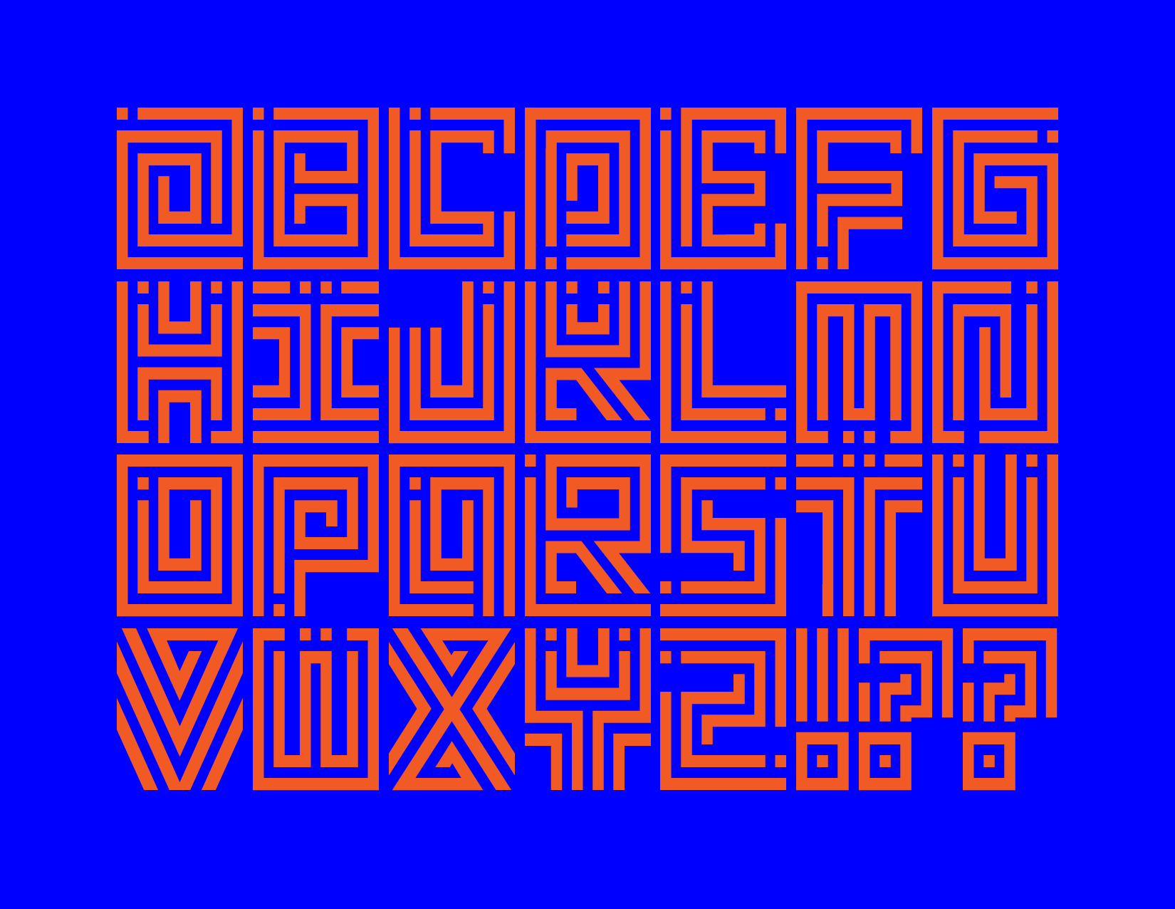
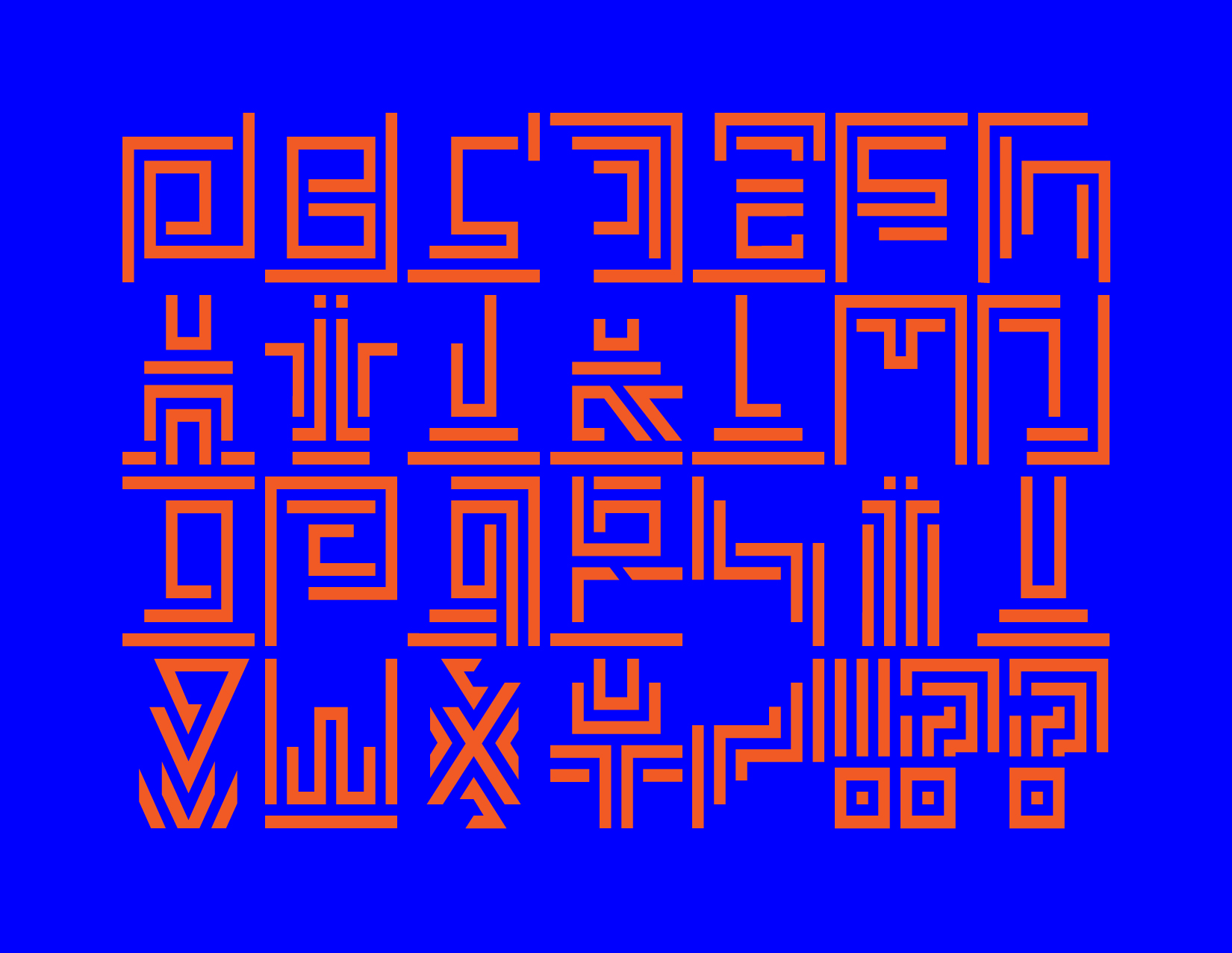
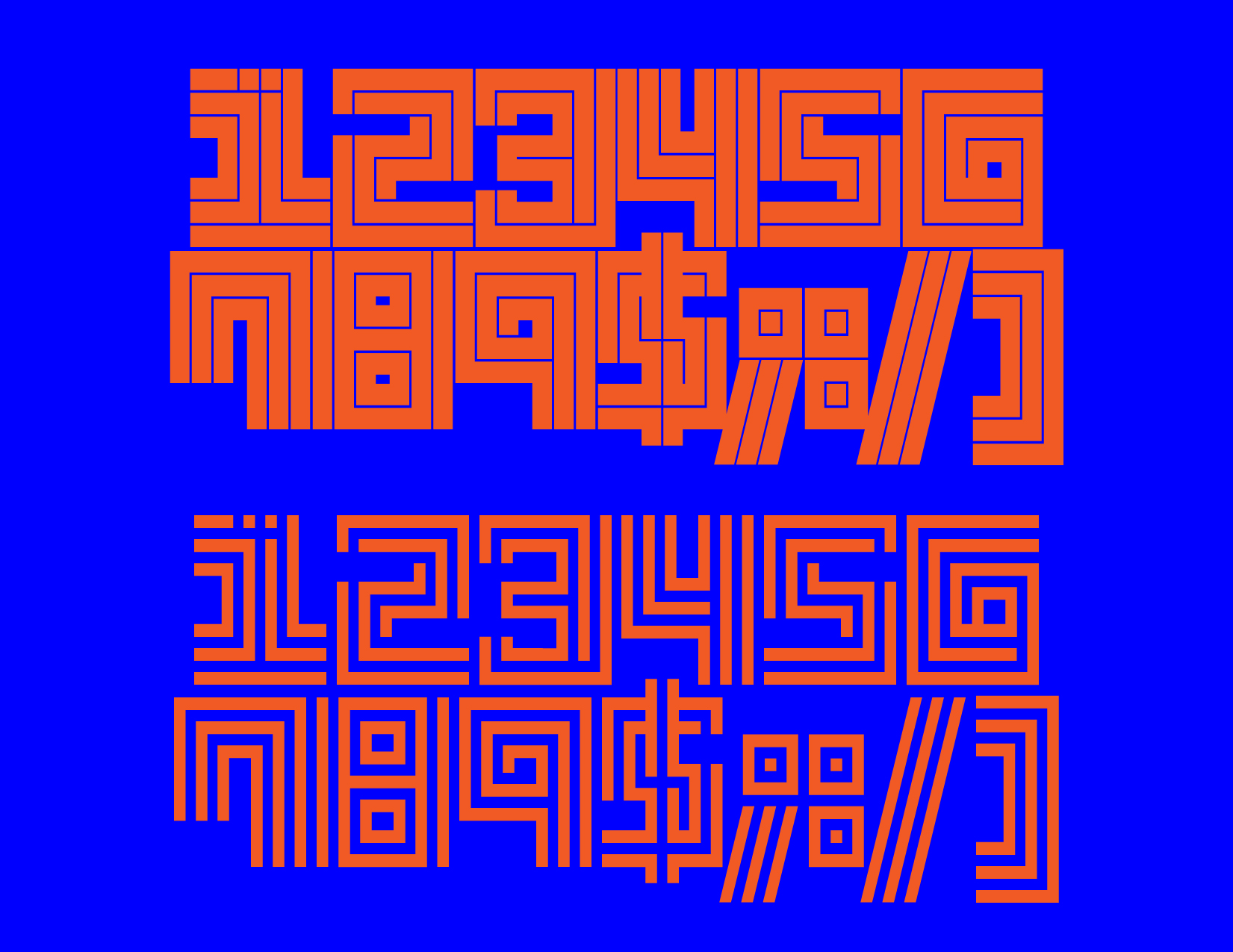
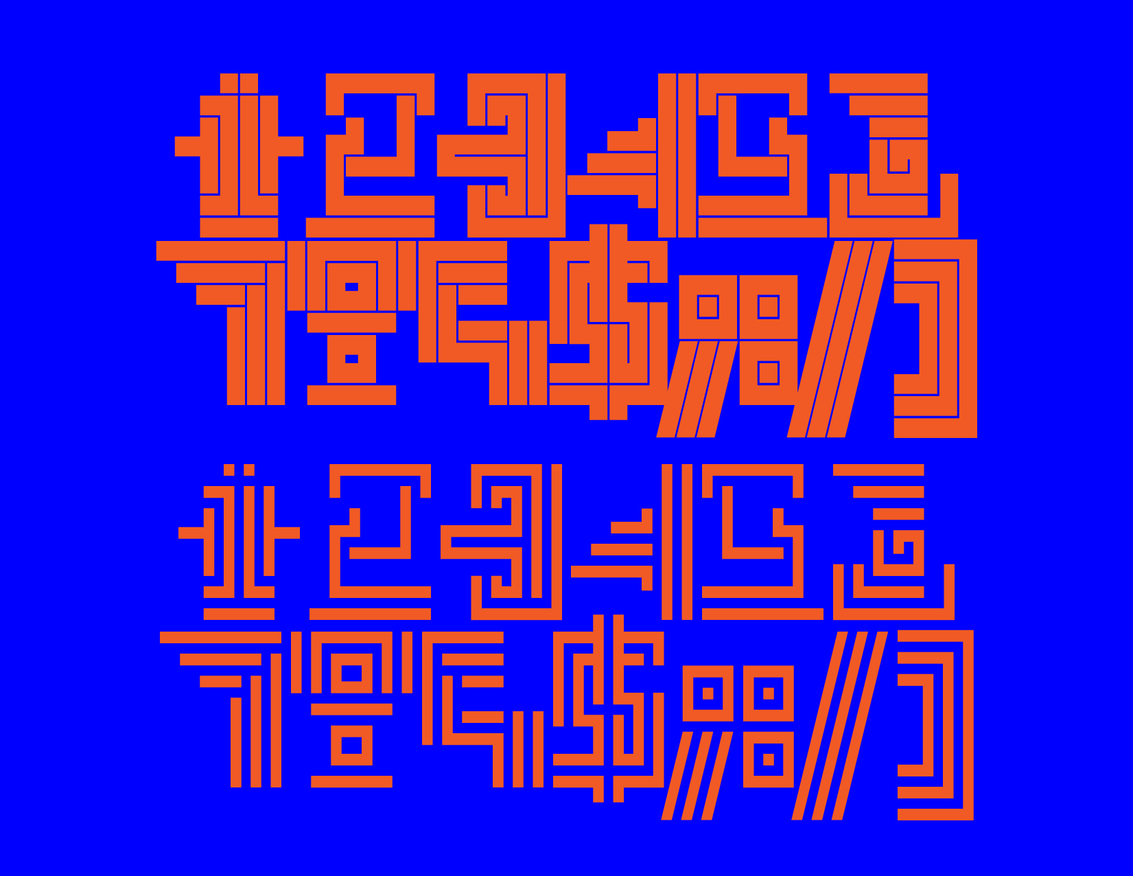
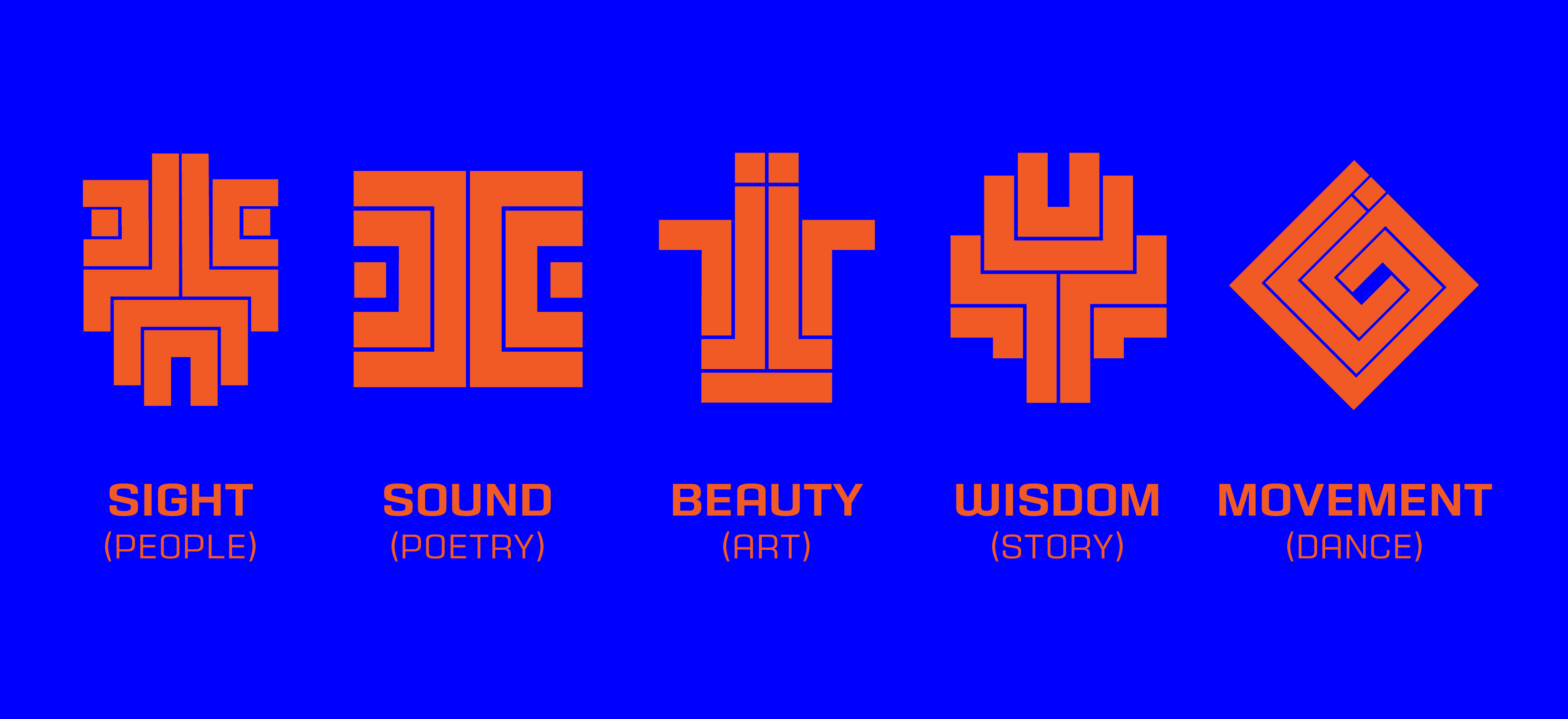
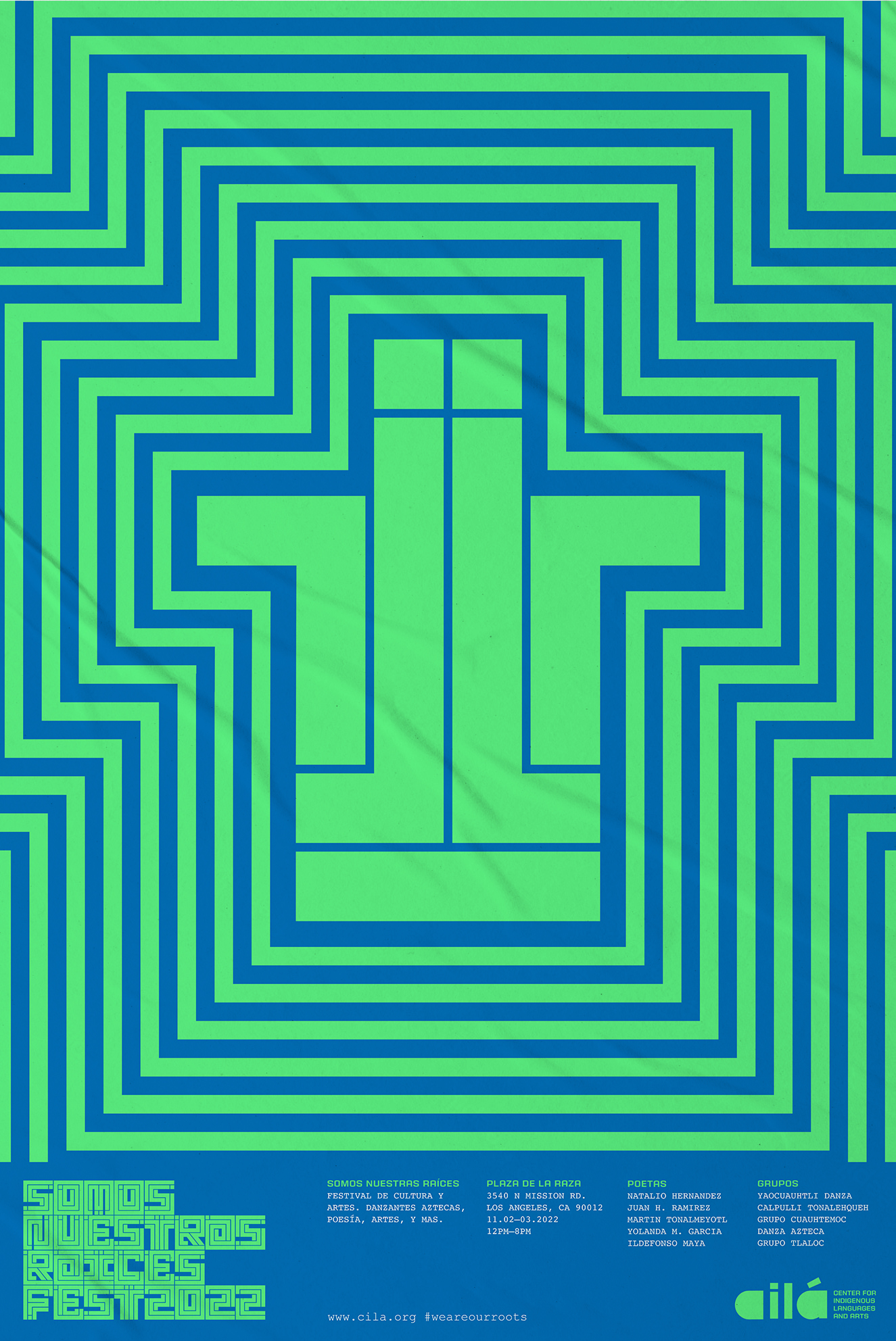
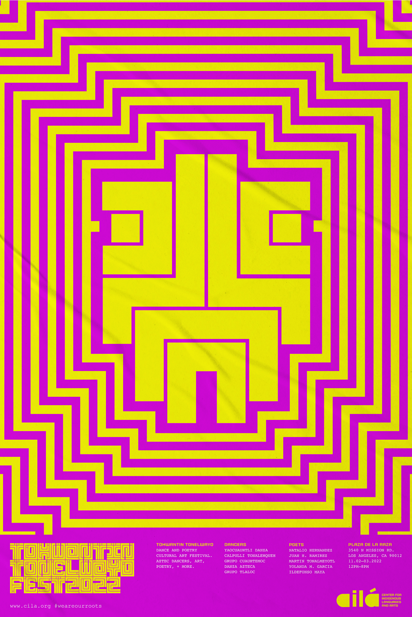
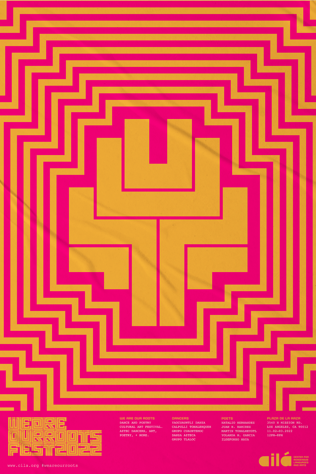
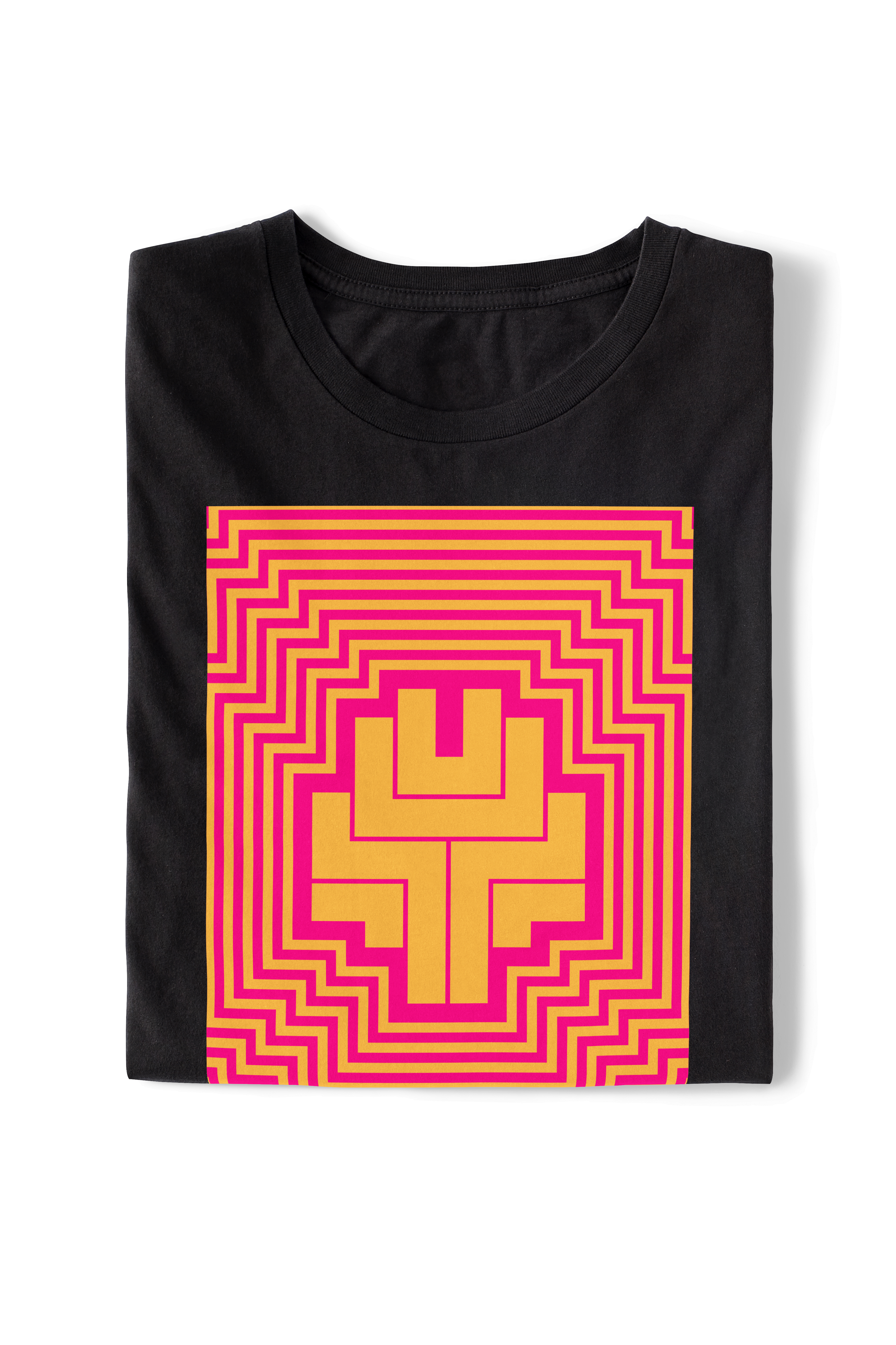
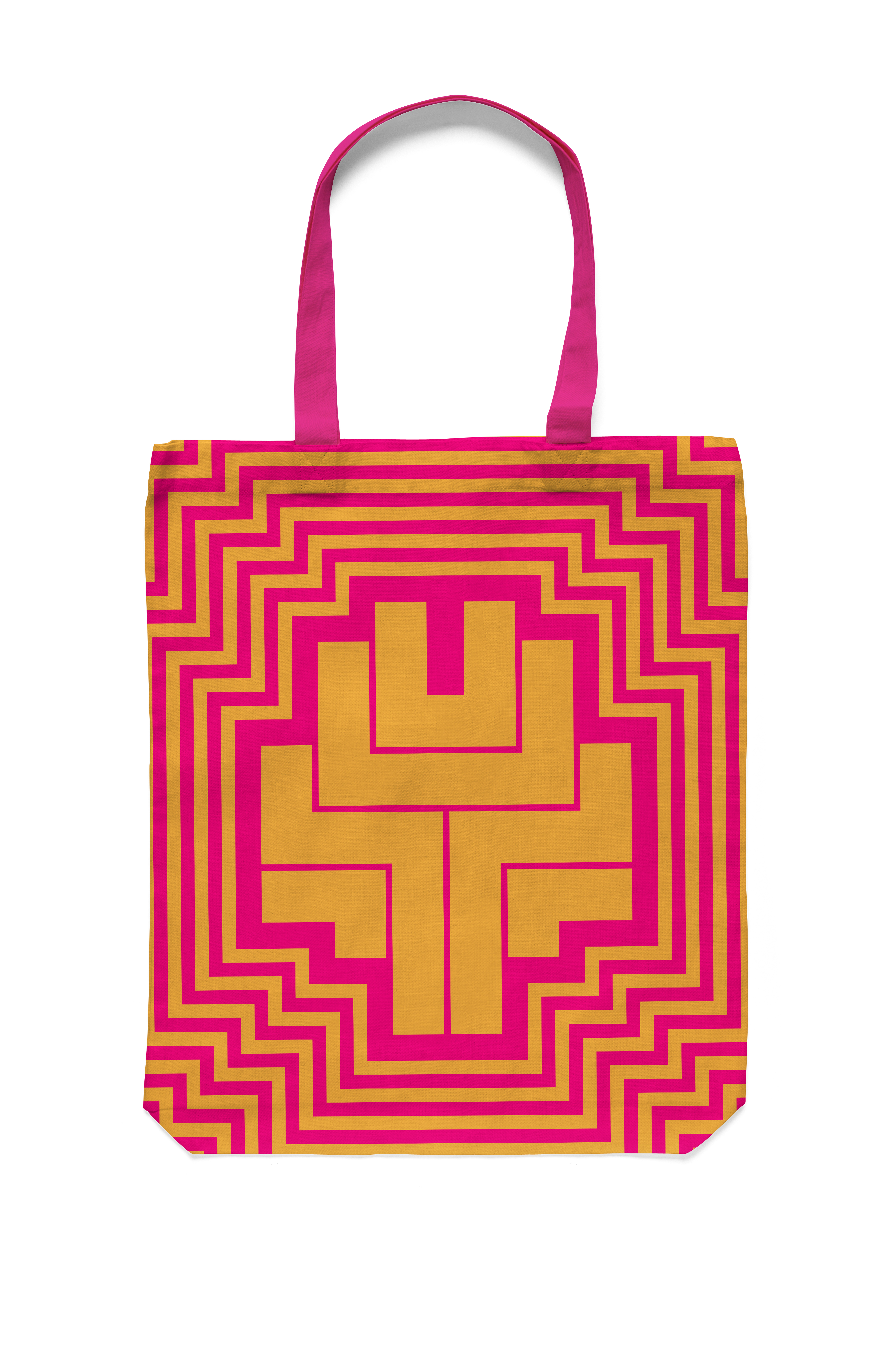
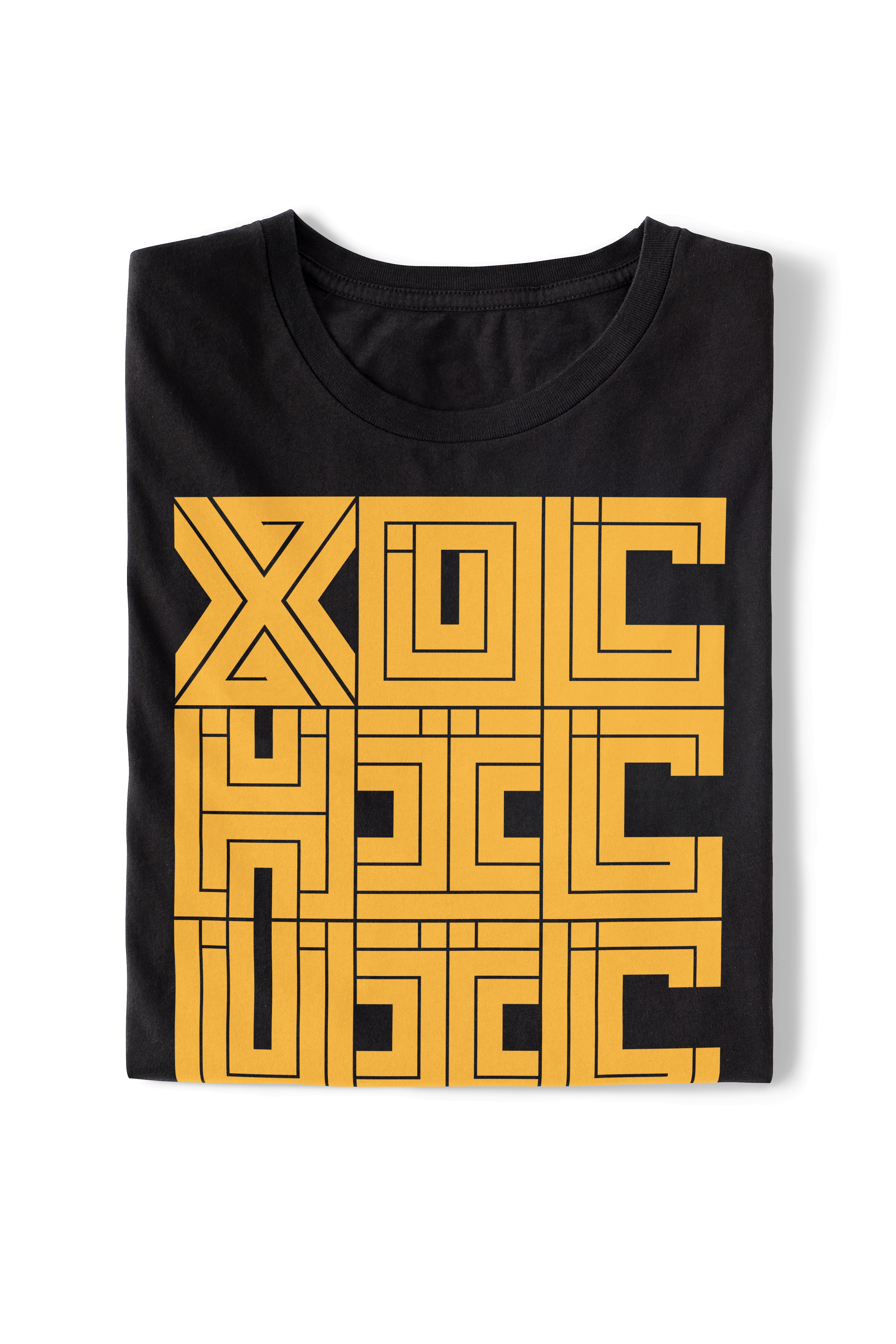
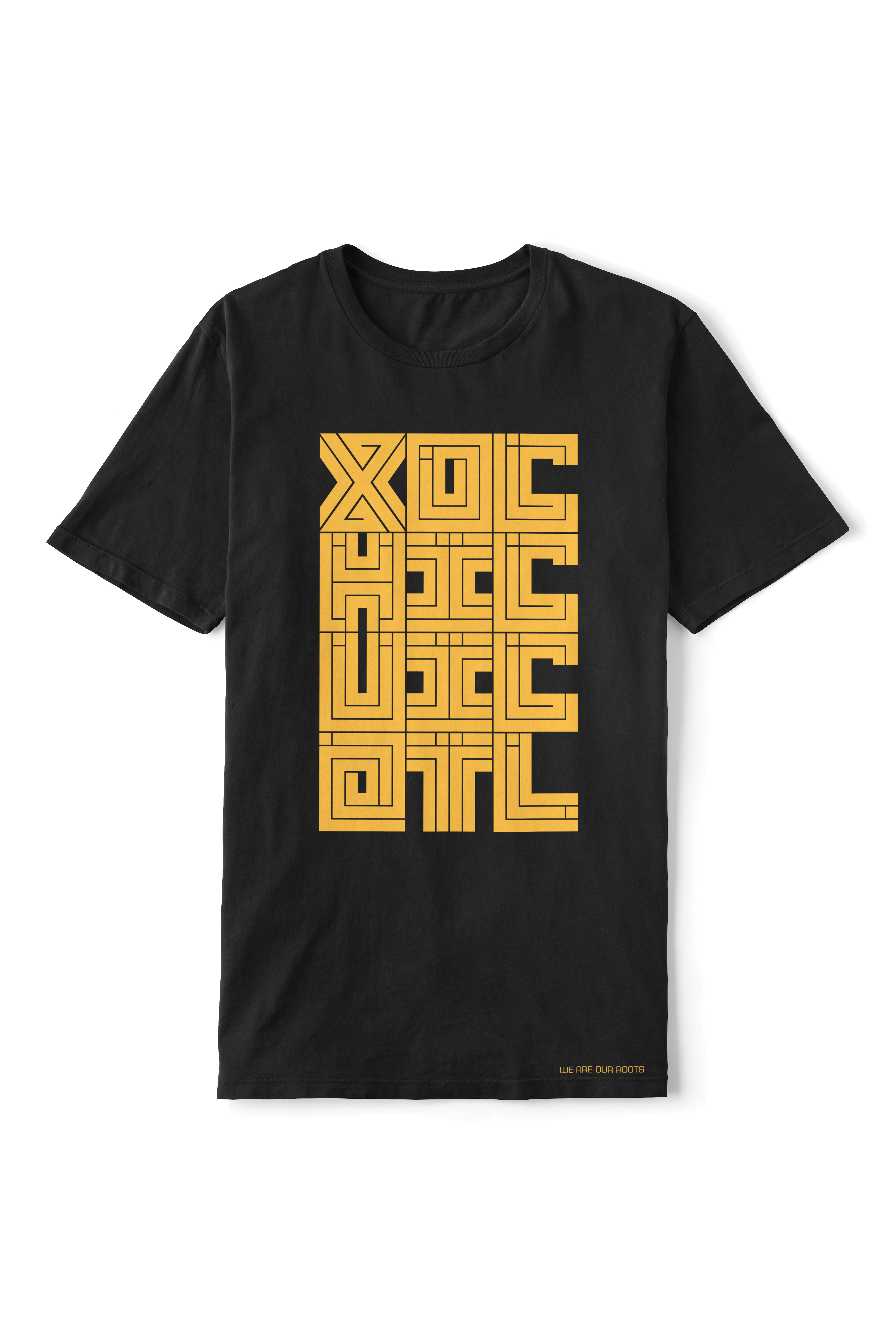
A custom designed font was developed for the visual language and identity system. I designed a variable typeface called “Megalith”, that’s able to change form, from regular to bold weight and constructed to deconstructed letterforms. This versatility defined the iconography system, and is molded from the deconstructed letterforms. Icons are used as symbolic motifs that resemble Aztec glyphs or pictographs, which represent key words and attributes.
(Megalith A-Z/Numerals/Icons)
A custom designed font was developed for the visual language and identity system. I designed a variable typeface called “Megalith”, that’s able to change form, from regular to bold weight and constructed to deconstructed letterforms. This versatility defined the iconography system, and is molded from the deconstructed letterforms. Icons are used as symbolic motifs that resemble Aztec glyphs or pictographs, which represent key words and attributes.
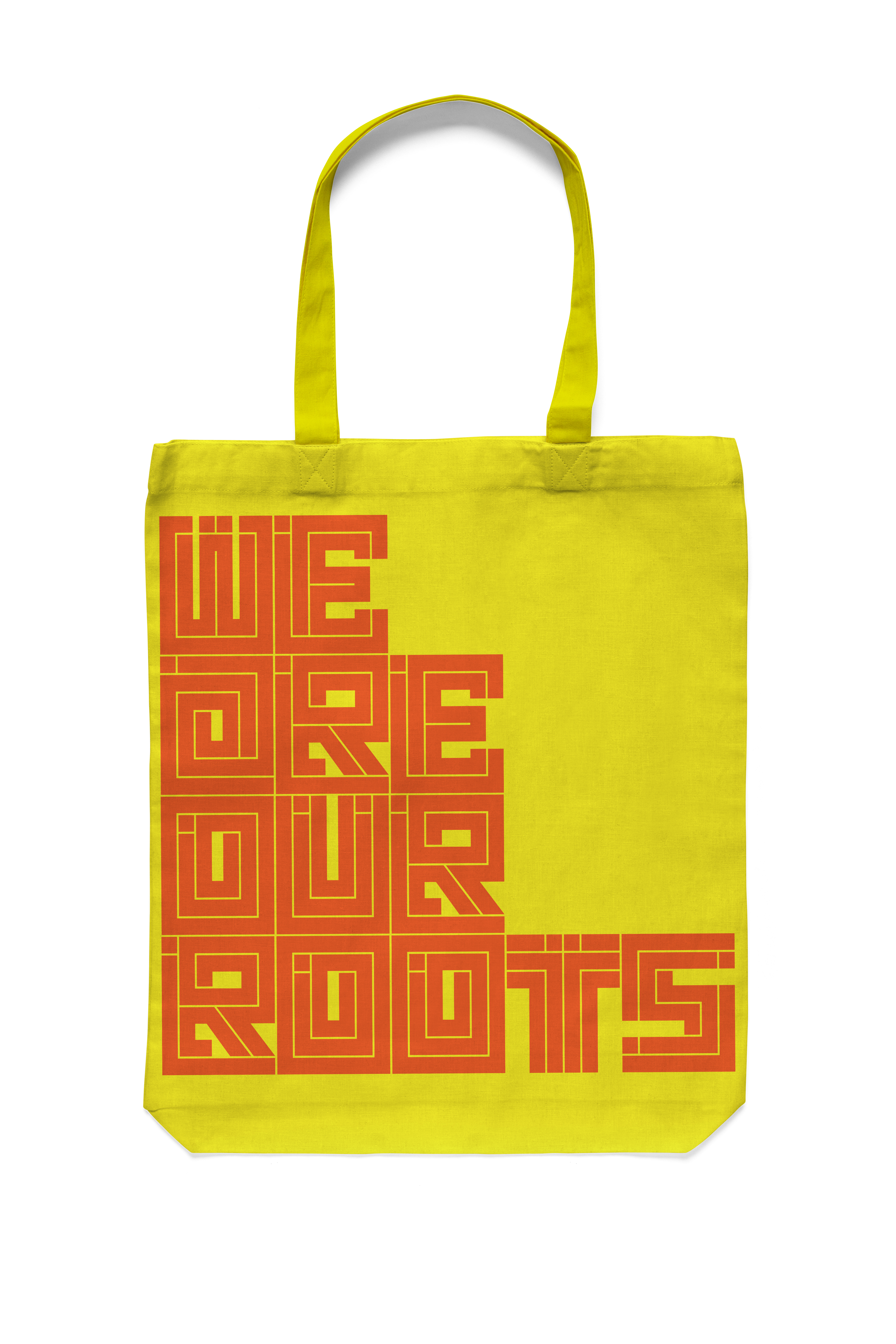
Icons + Words + Phrases
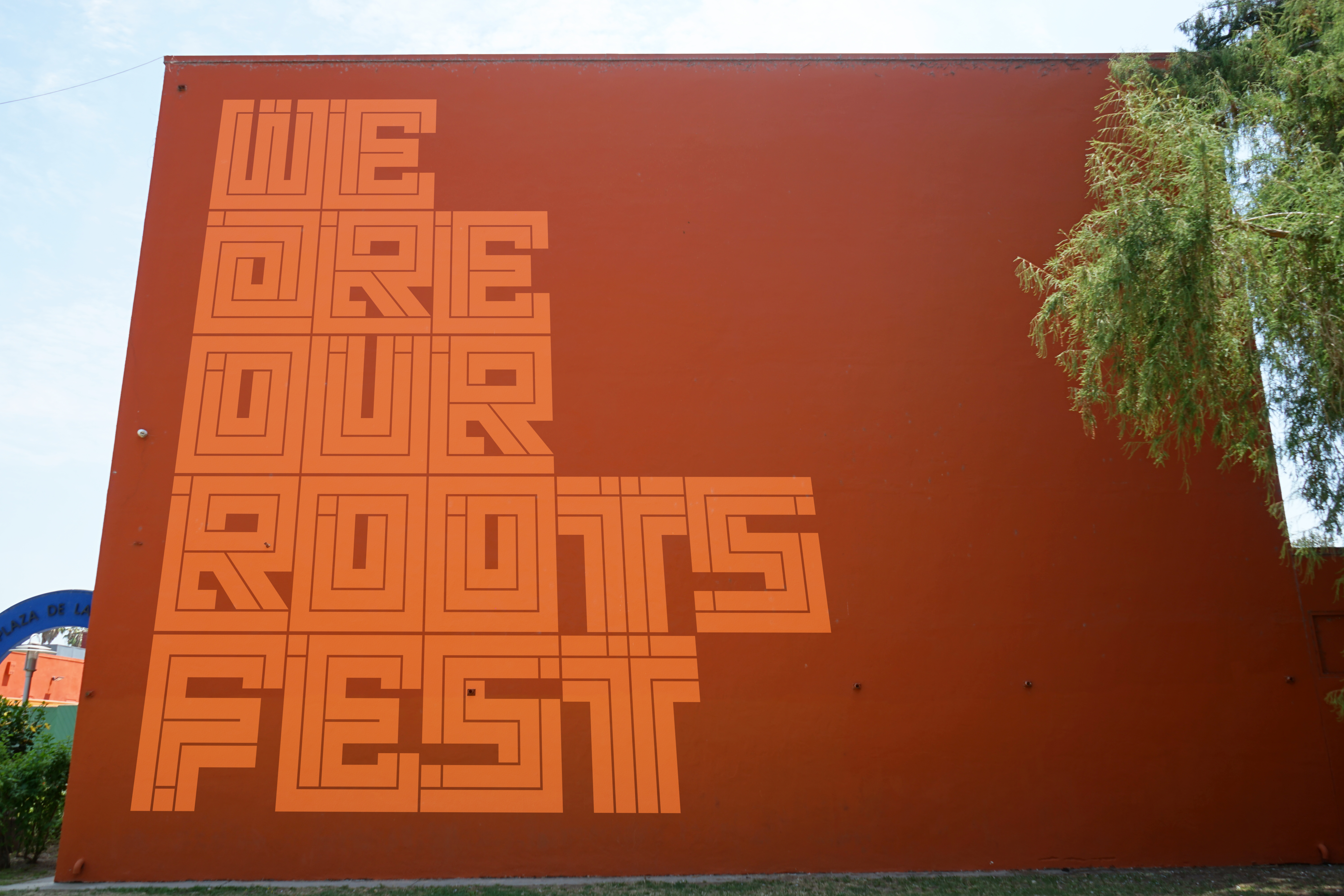
Promotional
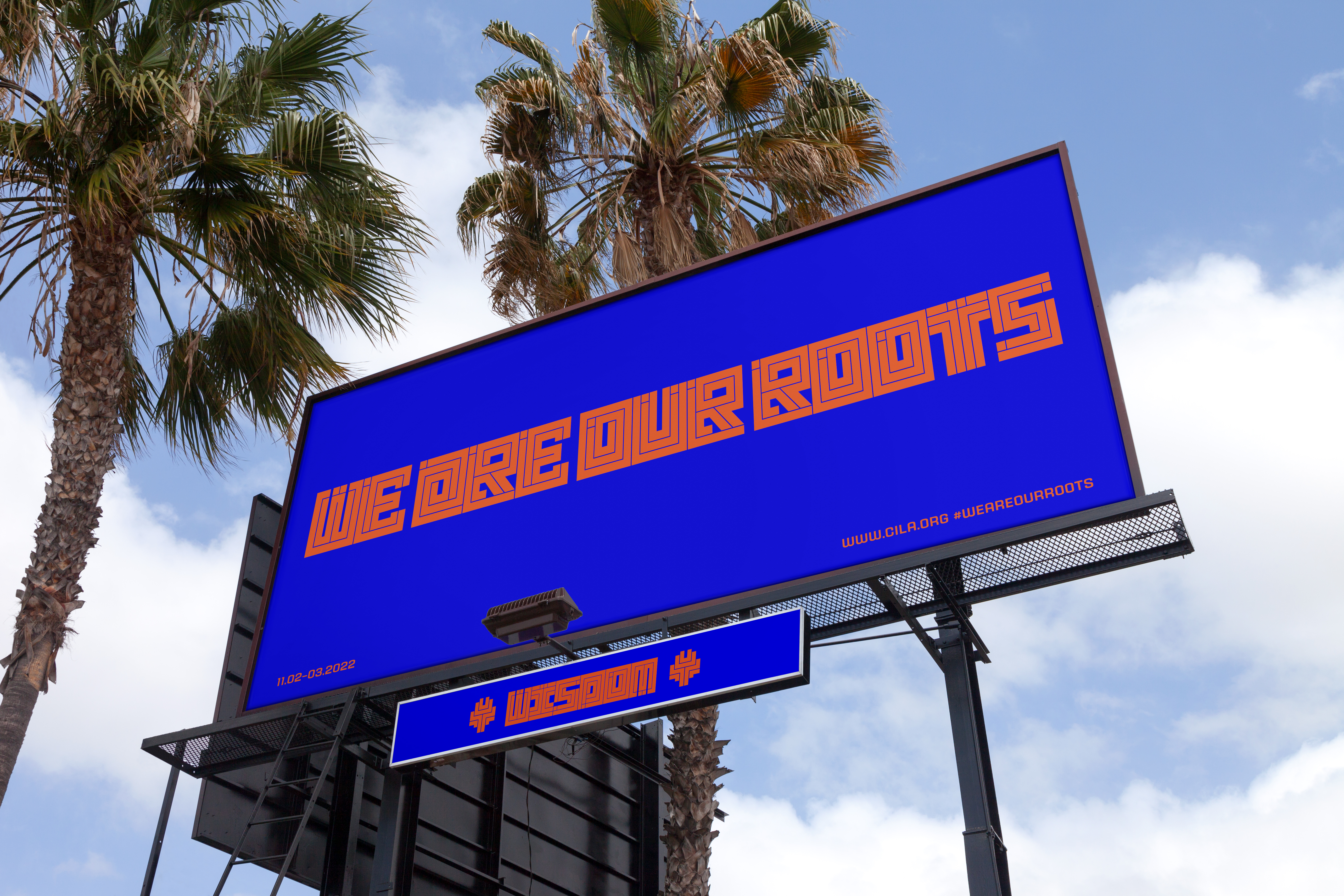
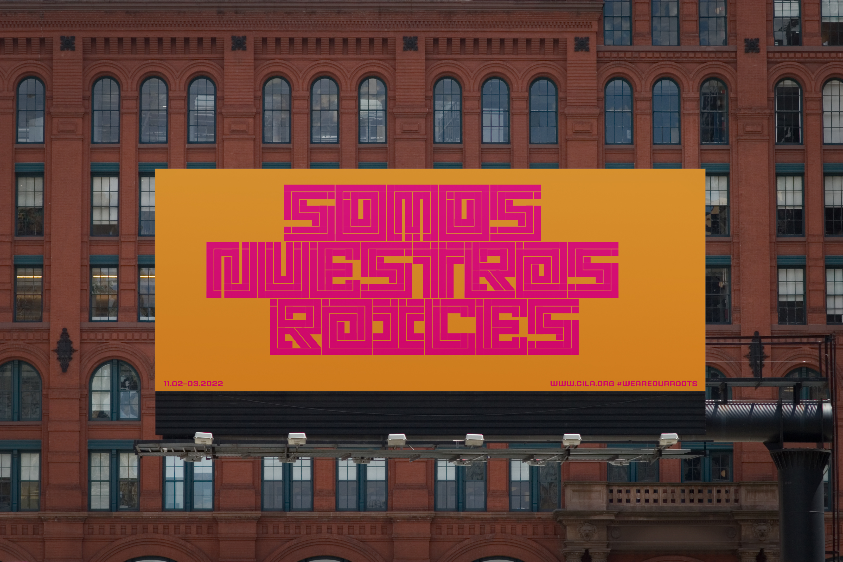
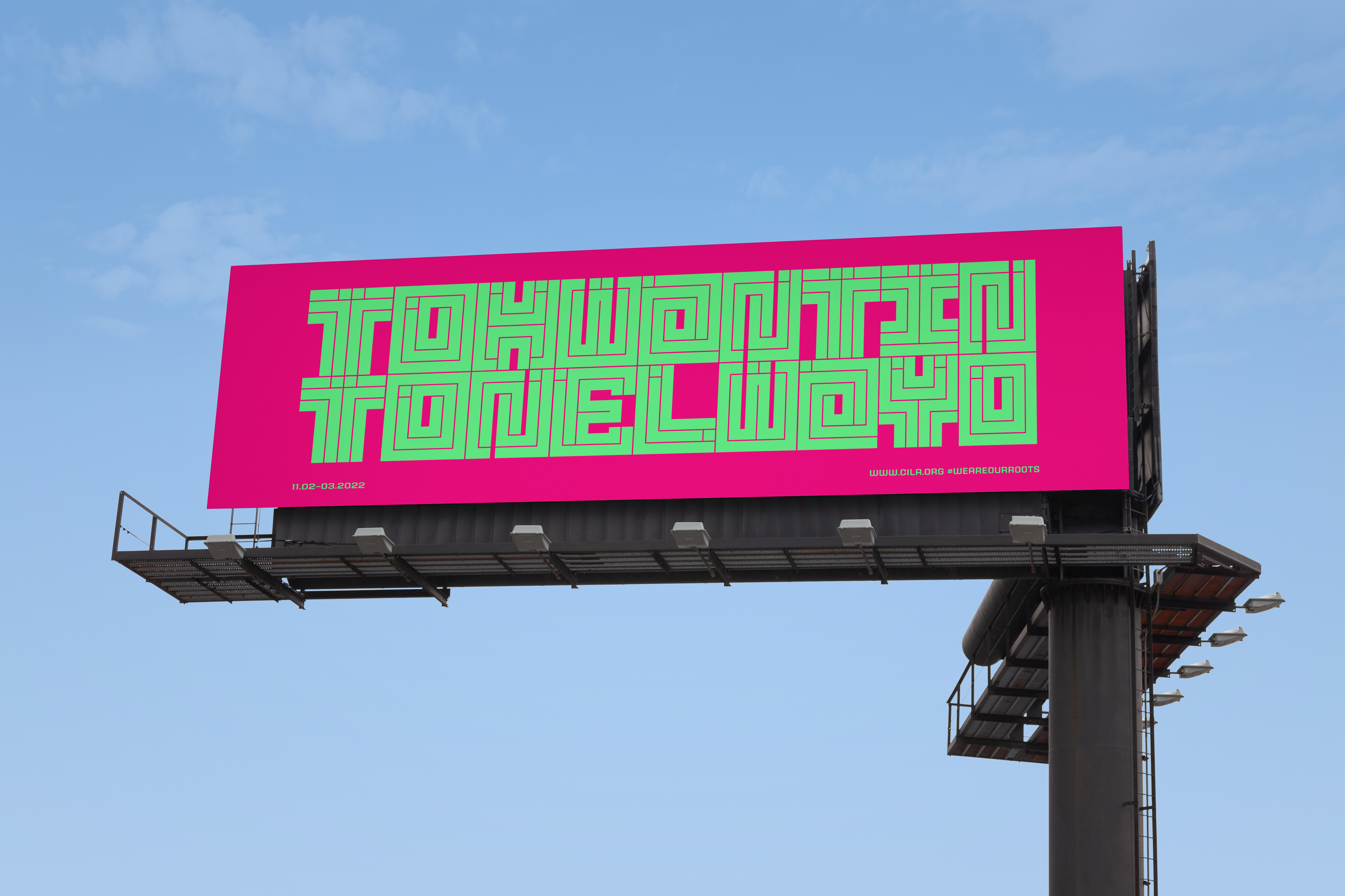
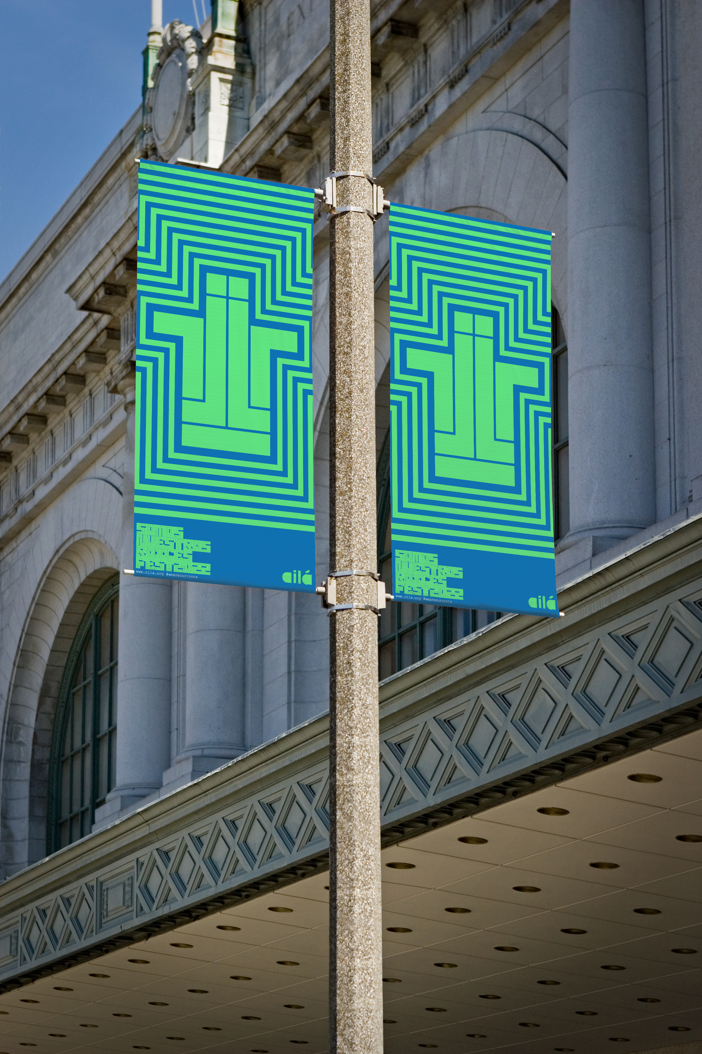
(Billboards/Poster Series/Banners)
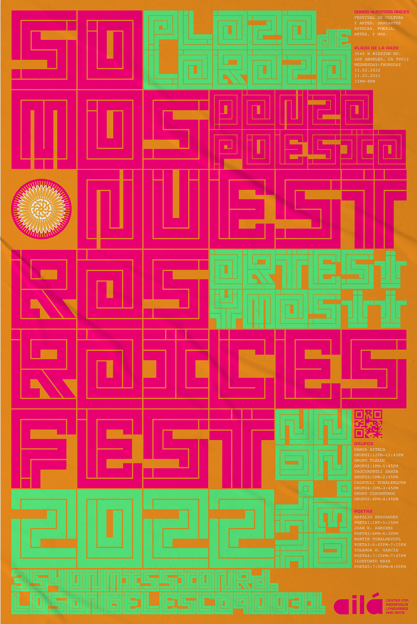
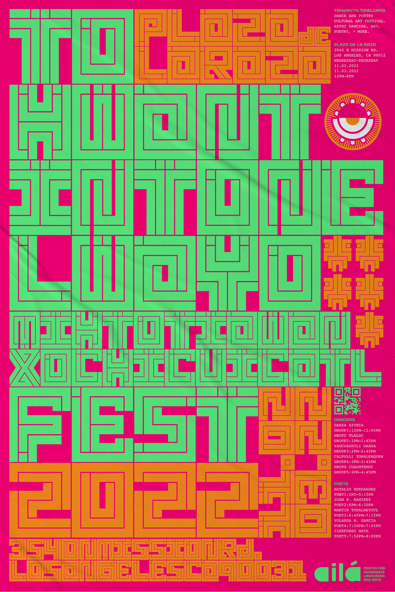
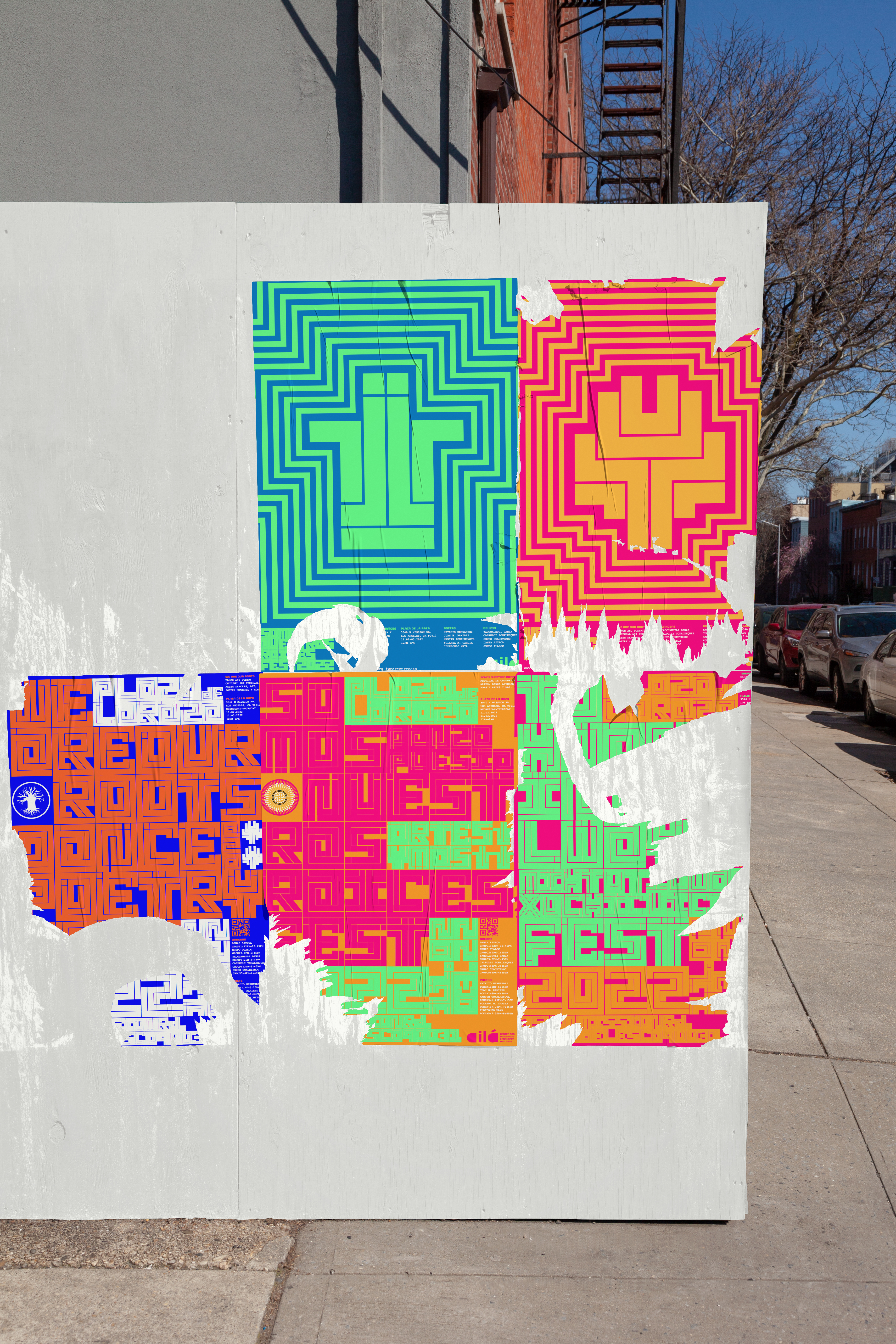
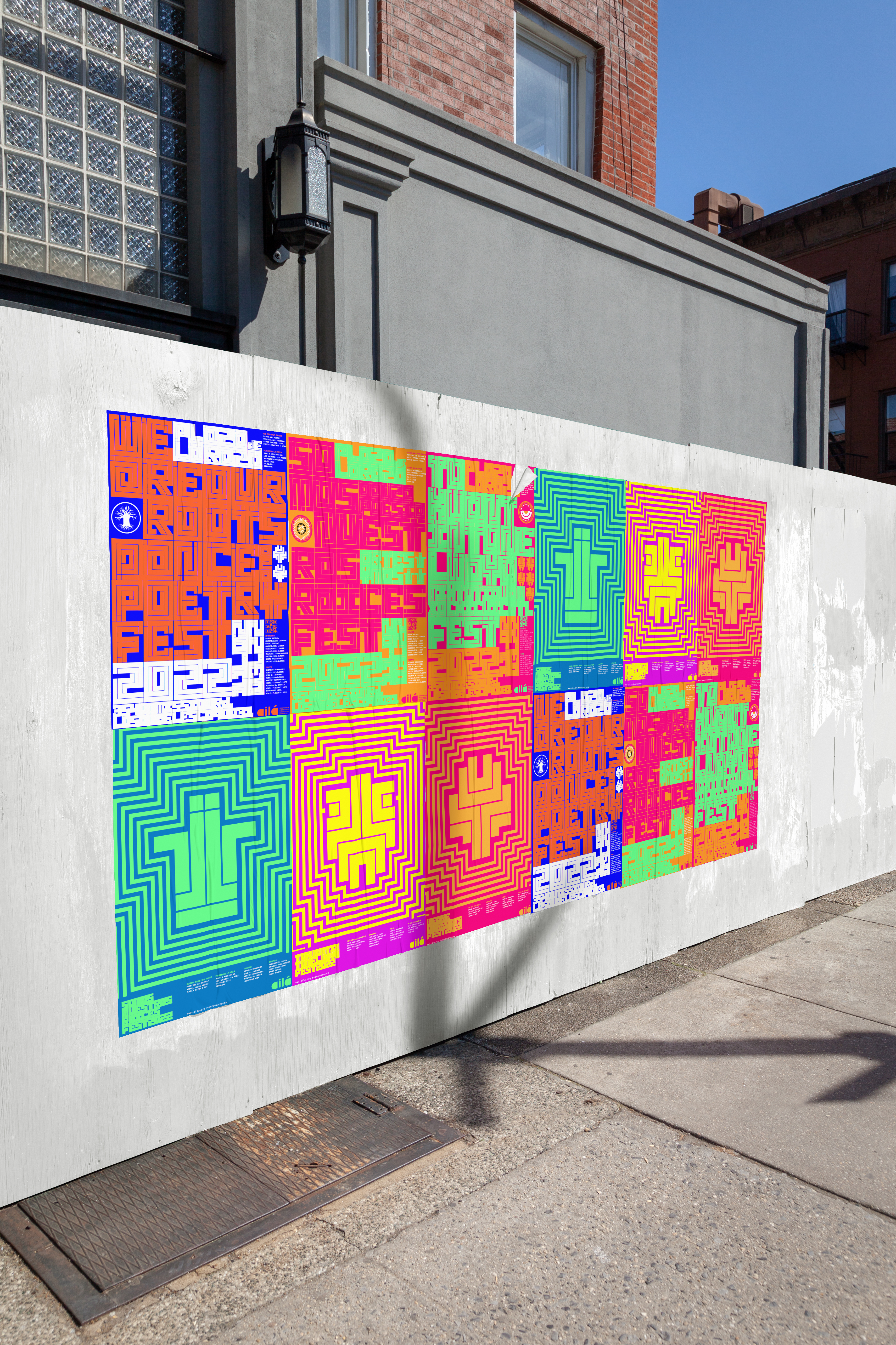
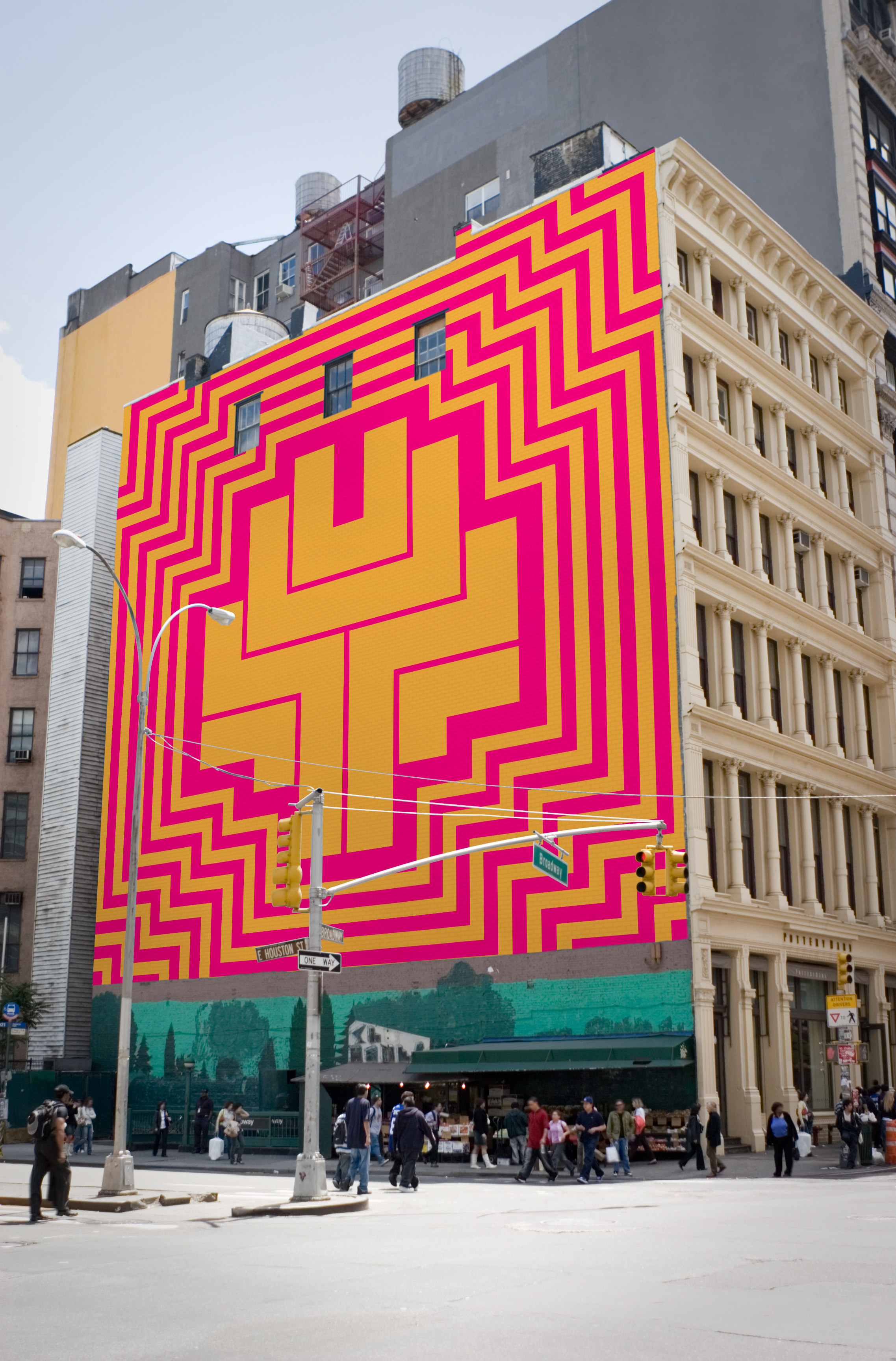
This promotional campaign utilized both language and iconography system to promote the event name, time, and space. Billboards and banners were strategically placed around heavy populated areas and in specific communities. The posters communicate revitalization, which helped to preserve Nahuatl language and culture. A guerilla style street campaign adorned multiple Los Angeles neighborhoods with brilliant color and design, informing the public.
(Billboards/Poster Series/Banners)
This promotional campaign utilized both language and iconography system to promote the event name, time, and space. Billboards and banners were strategically placed around heavy populated areas and in specific communities. The posters communicate revitalization, which helped to preserve Nahuatl language and culture. A guerilla style street campaign adorned multiple Los Angeles neighborhoods with brilliant color and design, informing the public.
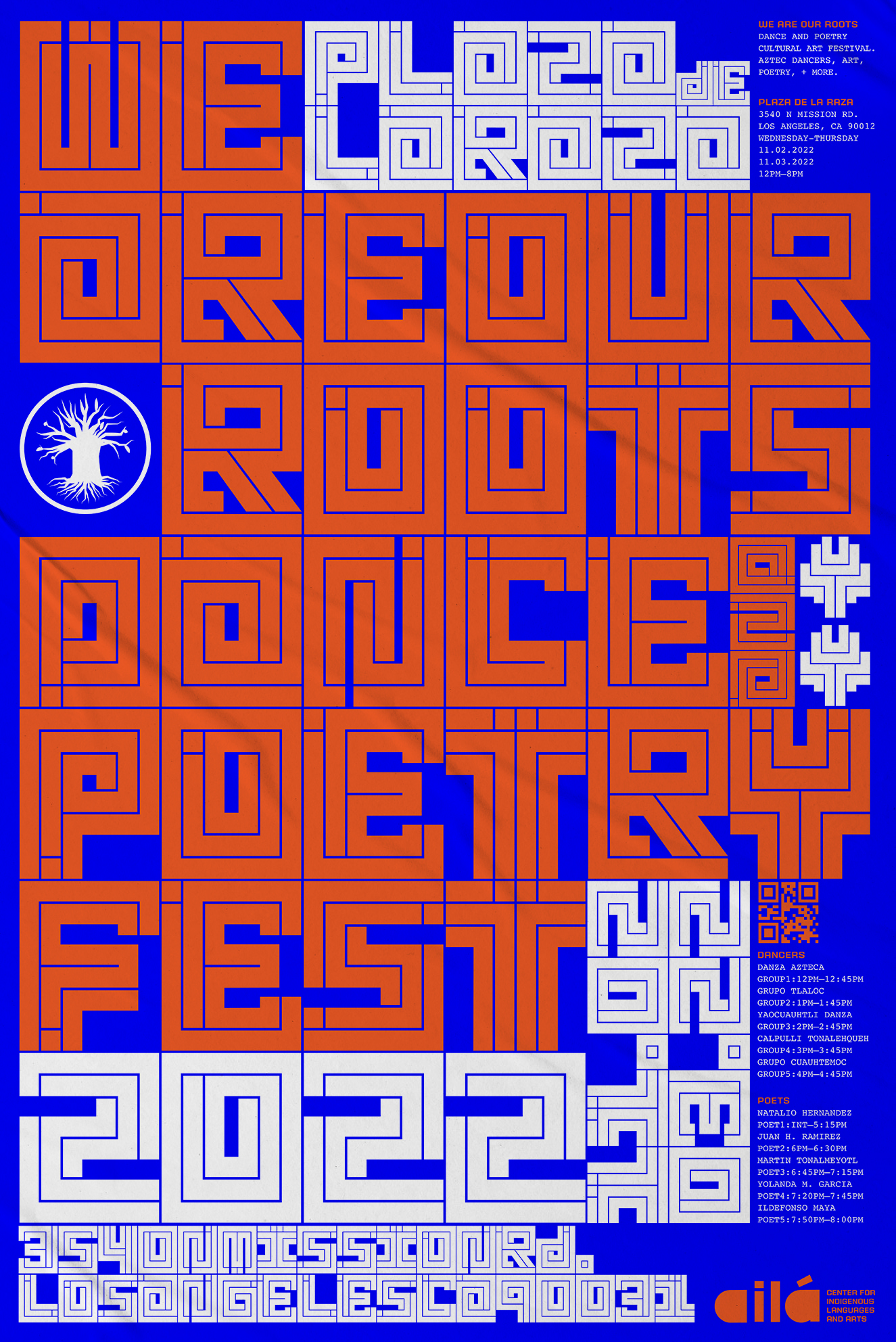
Event Posters
Bold type conveys a strong message of resilience and is unapologetic as the culture it’s made to reflect. I adapted color reflective of flowers (xochitl) that were admired for their beauty and used in the gardens, poems, and songs of the Aztec empire.
Bold type conveys a strong message of resilience and is unapologetic as the culture it’s made to reflect. I adapted color reflective of flowers (xochitl) that were admired for their beauty and used in the gardens, poems, and songs of the Aztec empire.
Guerilla Style Campaign

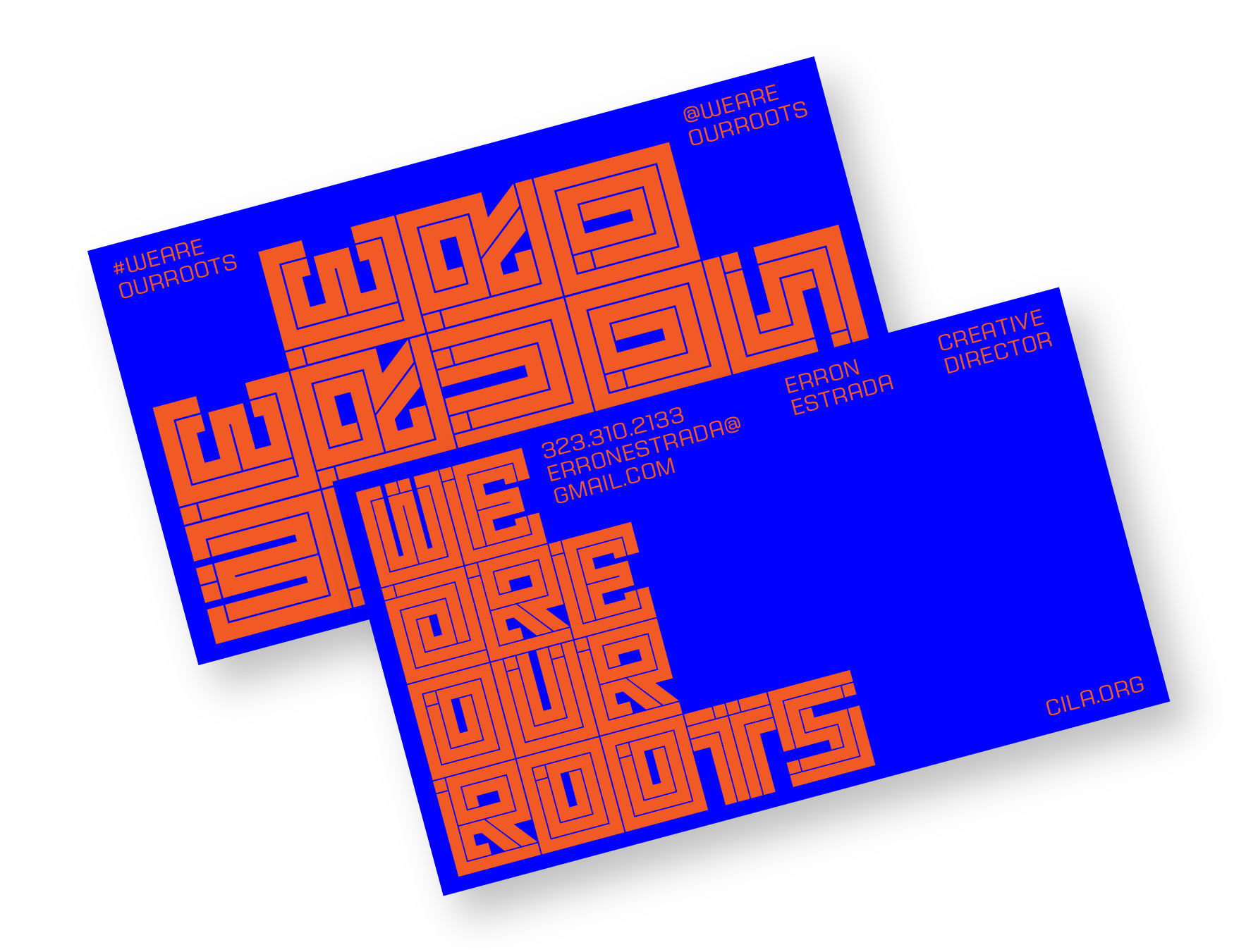
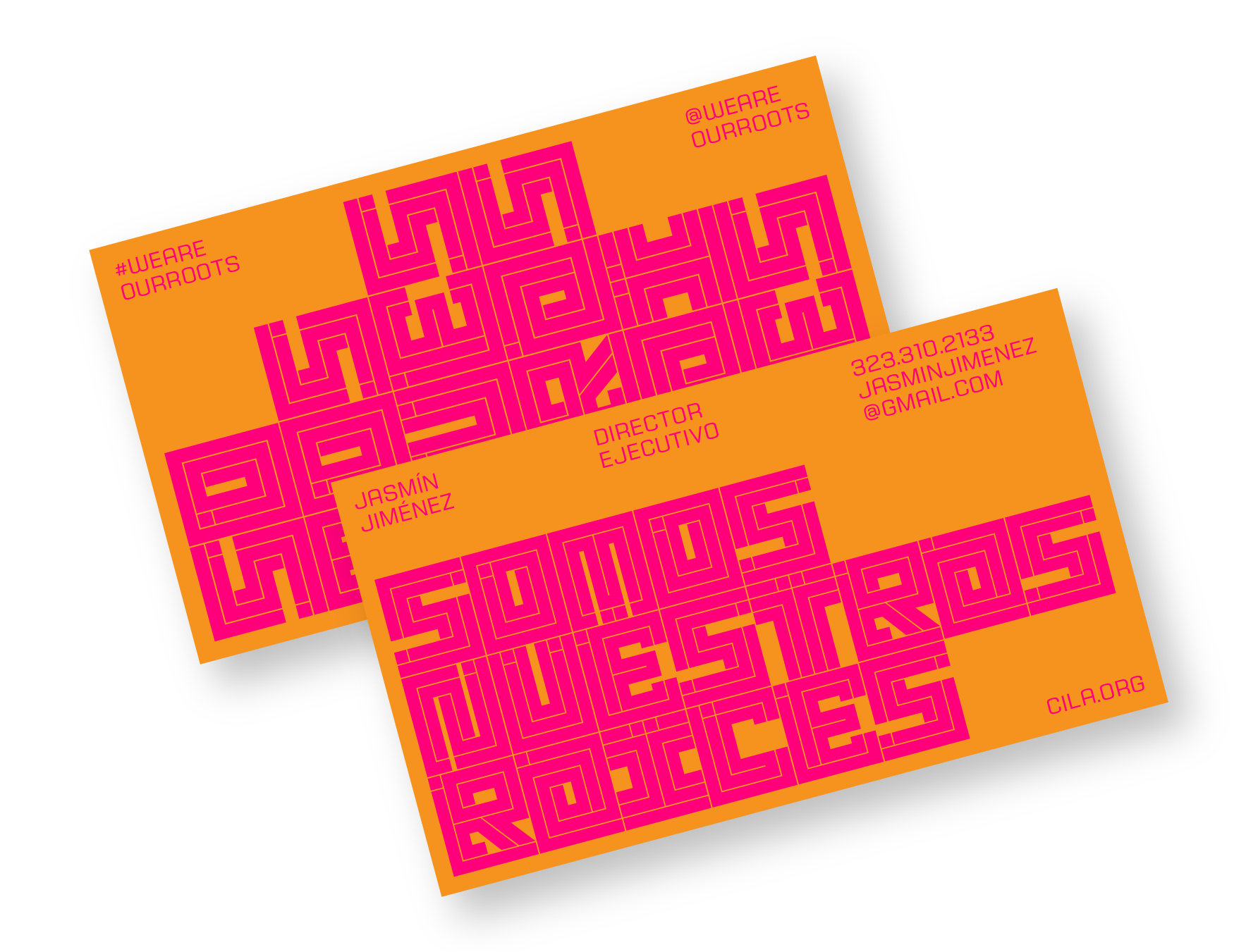
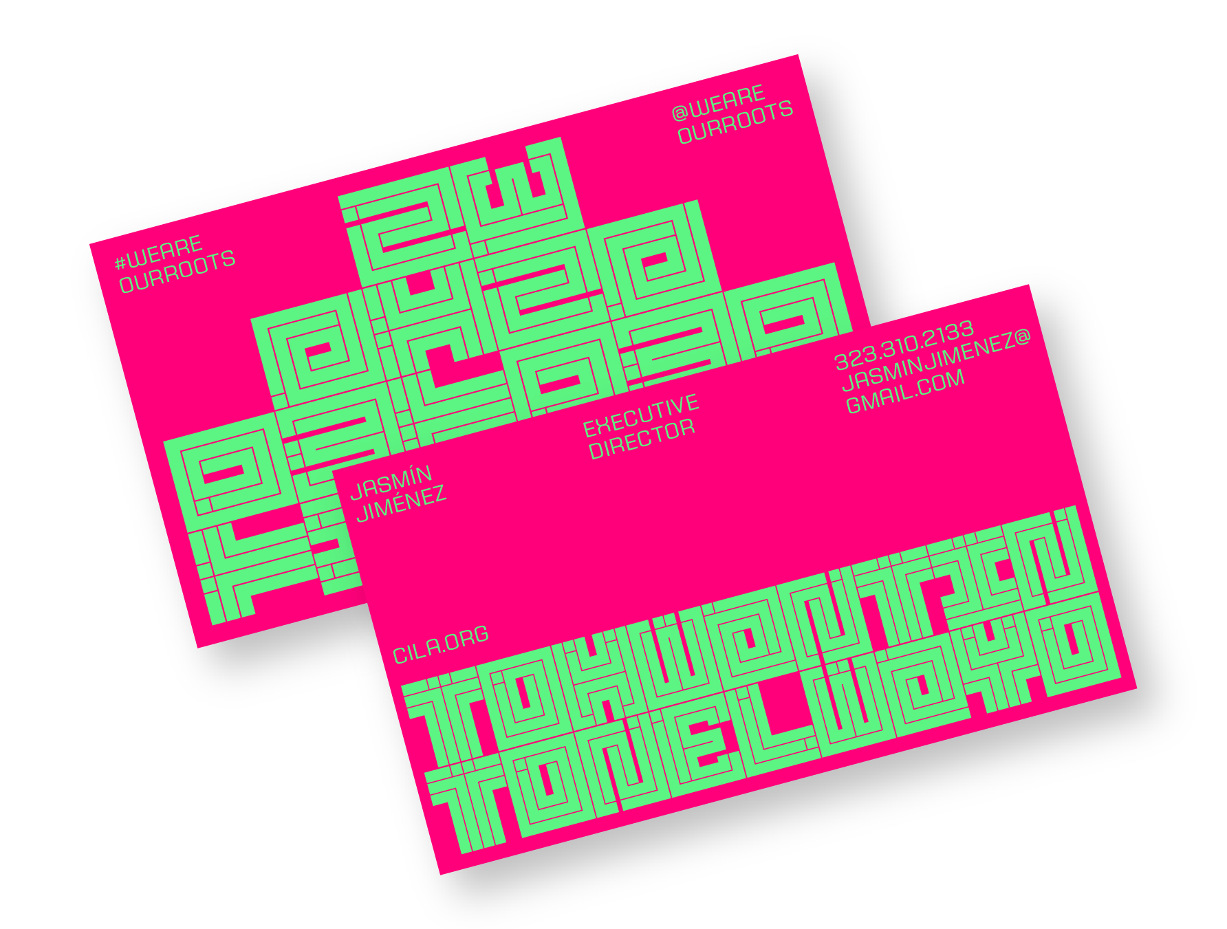
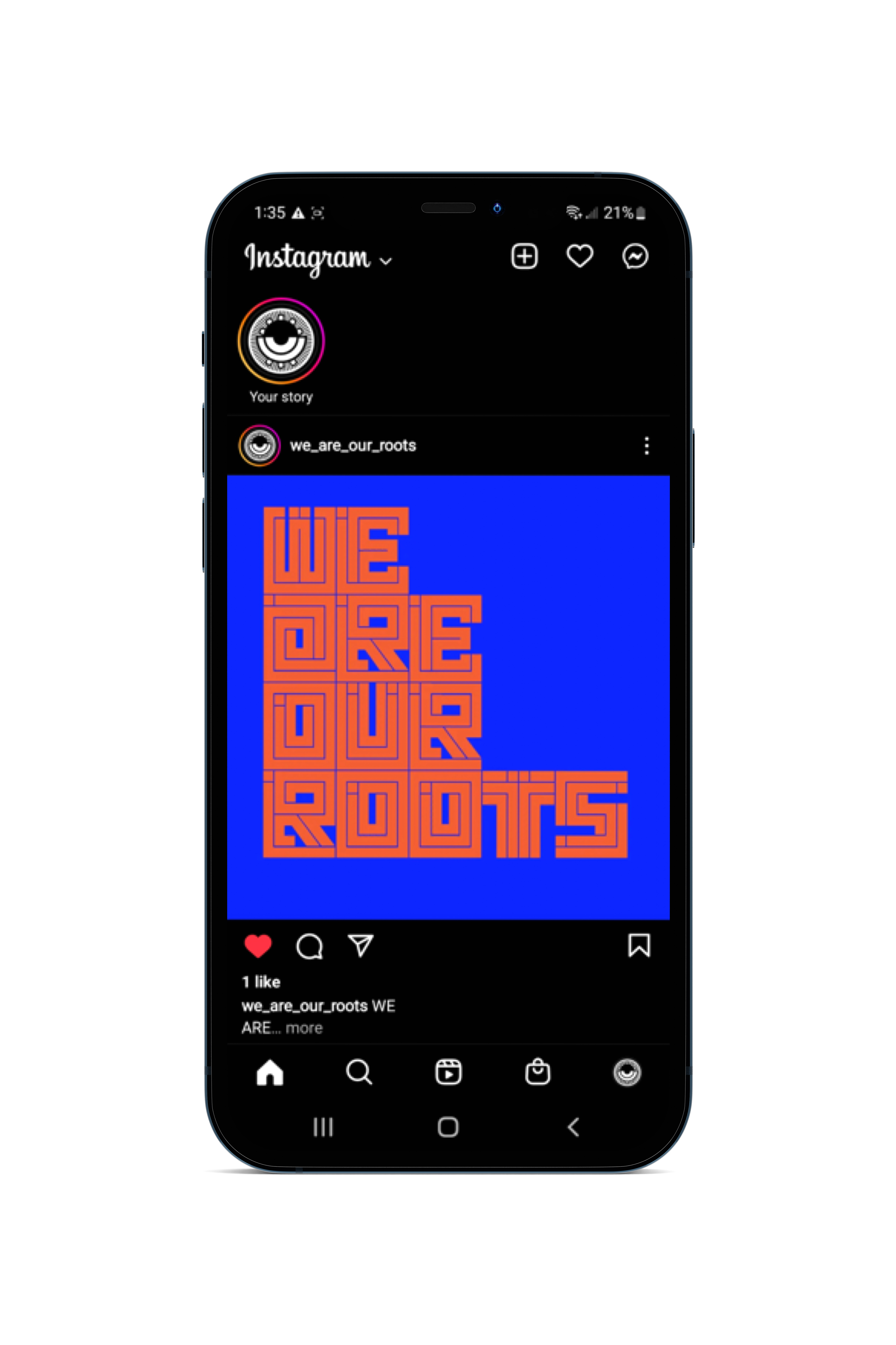
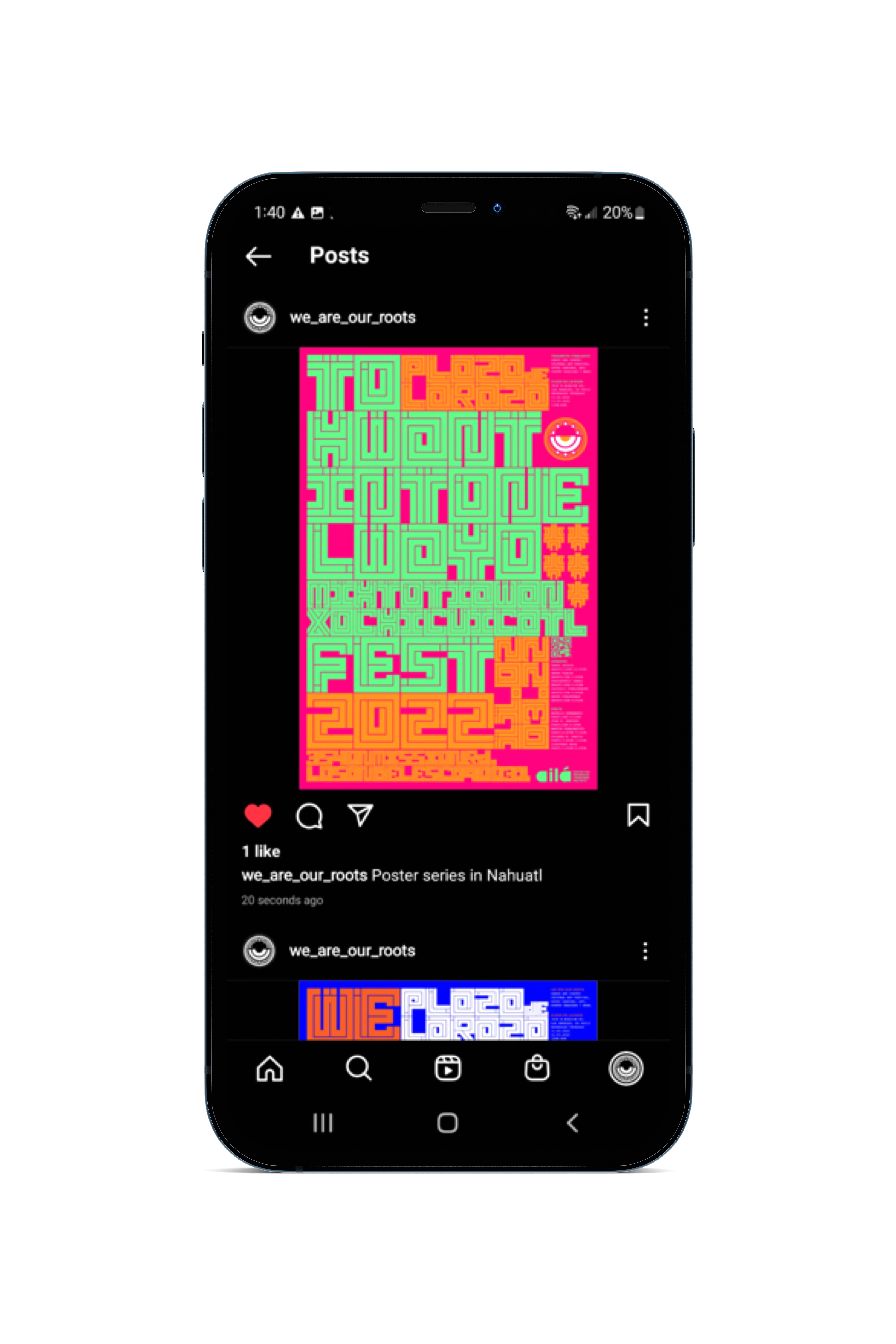
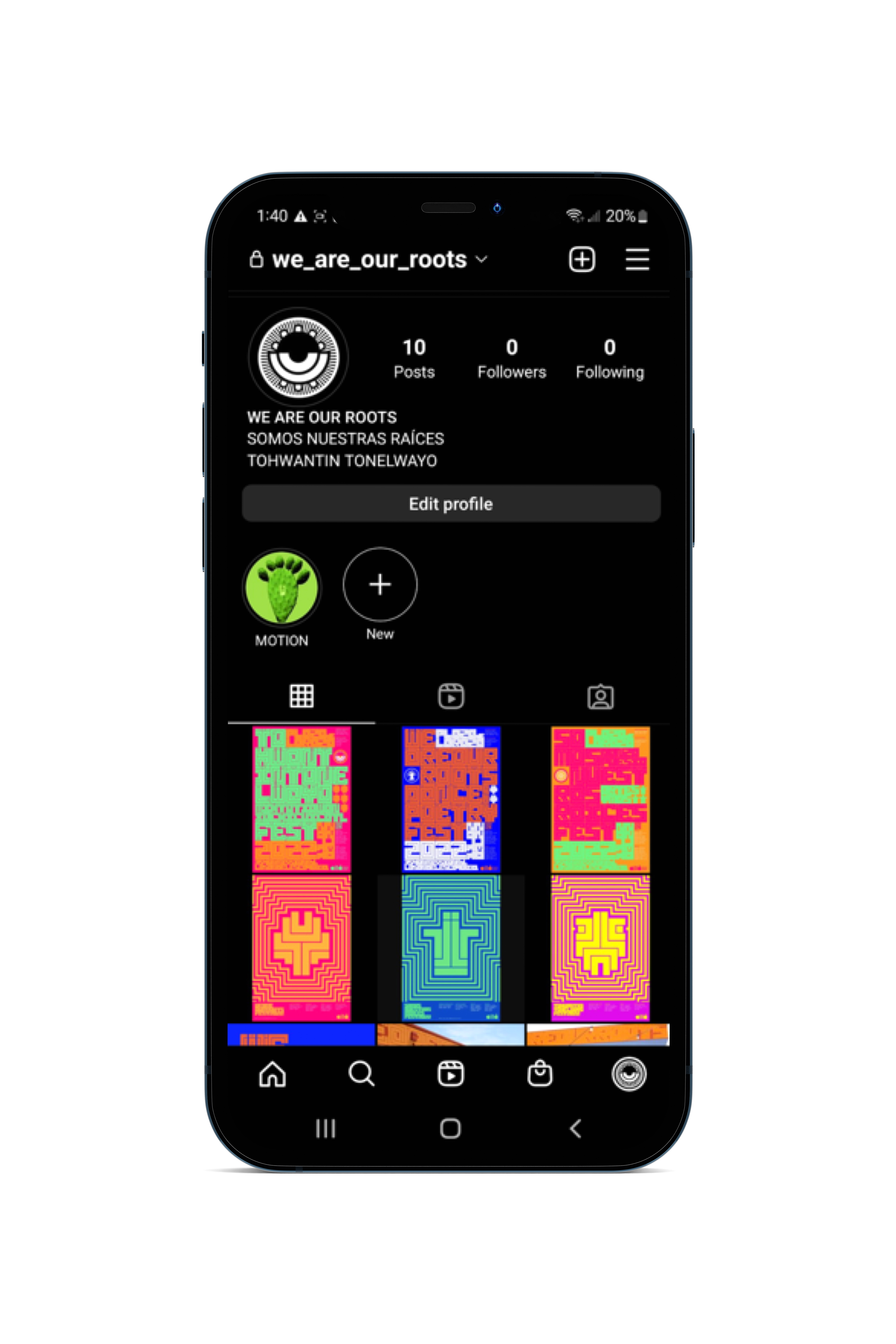
Cards + Social Media
Taking the identity from large-scale printed material to small-scale spaces was a great opportunity to showcase more messaging, while reaching a younger audience through Instagram.
Taking the identity from large-scale printed material to small-scale spaces was a great opportunity to showcase more messaging, while reaching a younger audience through Instagram.
Social Media/Instagram
Event Space
(Spatial/Immersive Installation)
Located at Plaza de la Raza in Los Angeles, We Are Our Roots Fest showcases music, Aztec dancers, and readings by indigenous poets. A fully immersive room of Nahuatl language, poetry, and symbolism invigorates the senses of sight and sound.
(Spatial/Immersive Installation)
Located at Plaza de la Raza in Los Angeles, We Are Our Roots Fest showcases music, Aztec dancers, and readings by indigenous poets. A fully immersive room of Nahuatl language, poetry, and symbolism invigorates the senses of sight and sound.
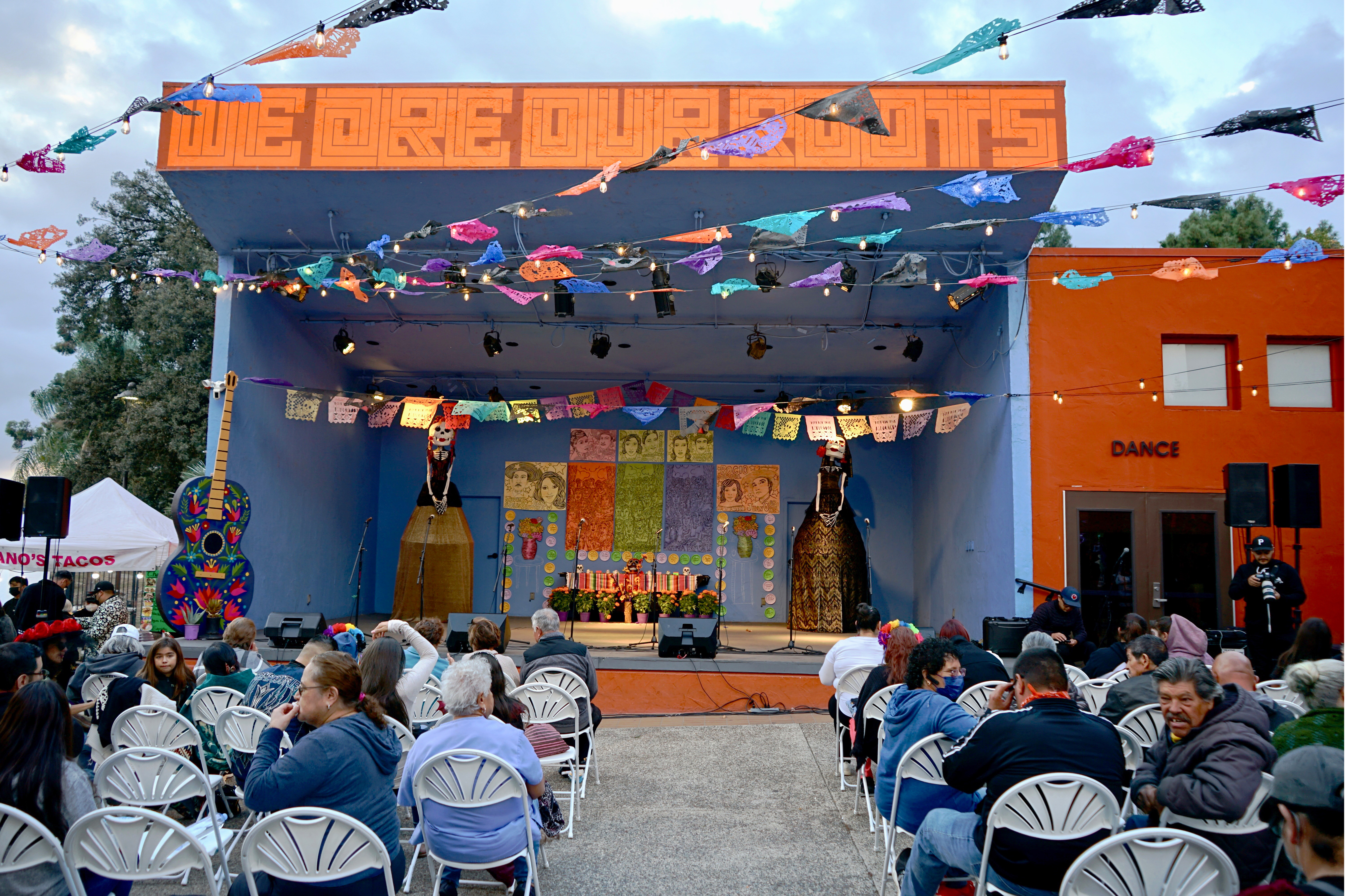
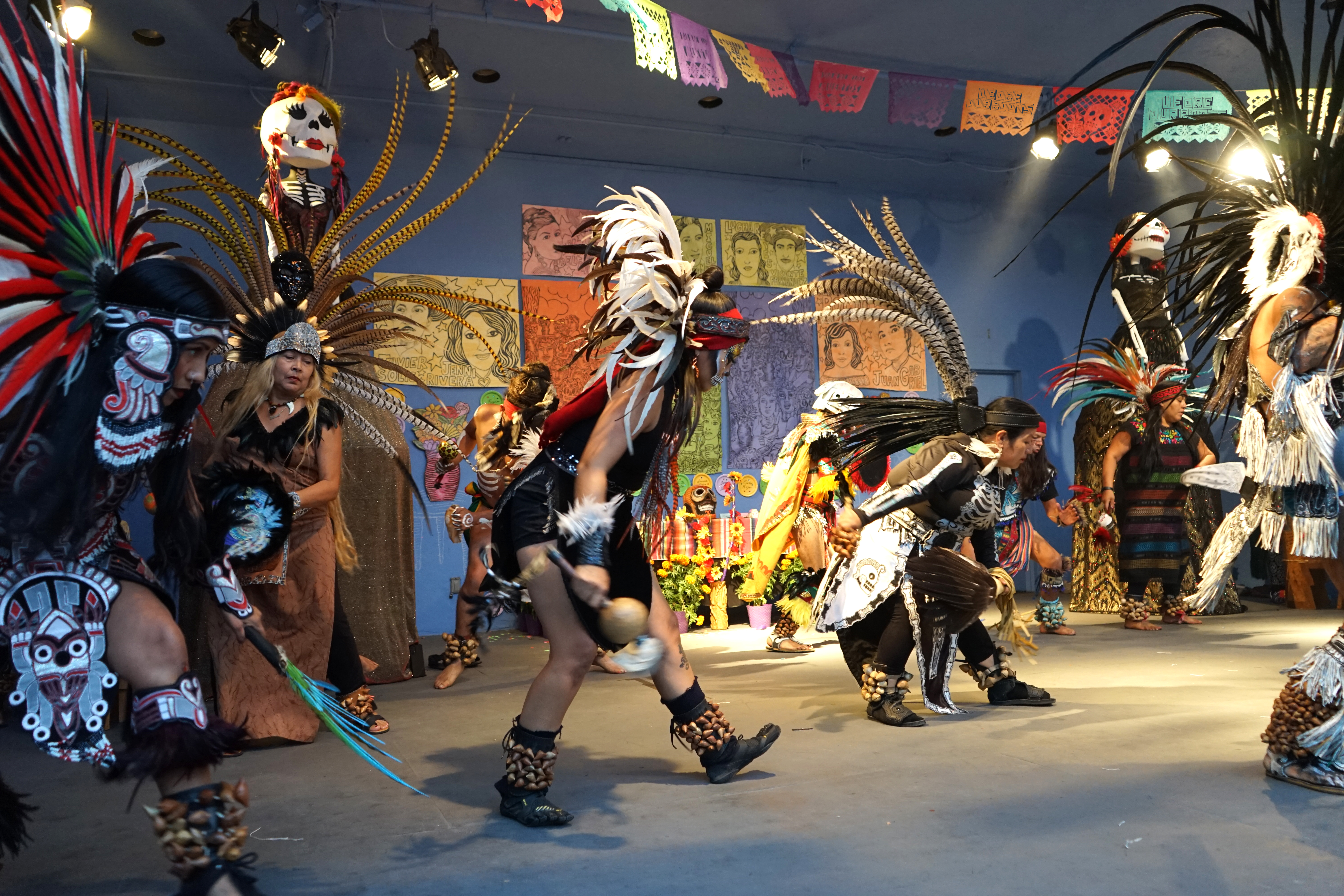
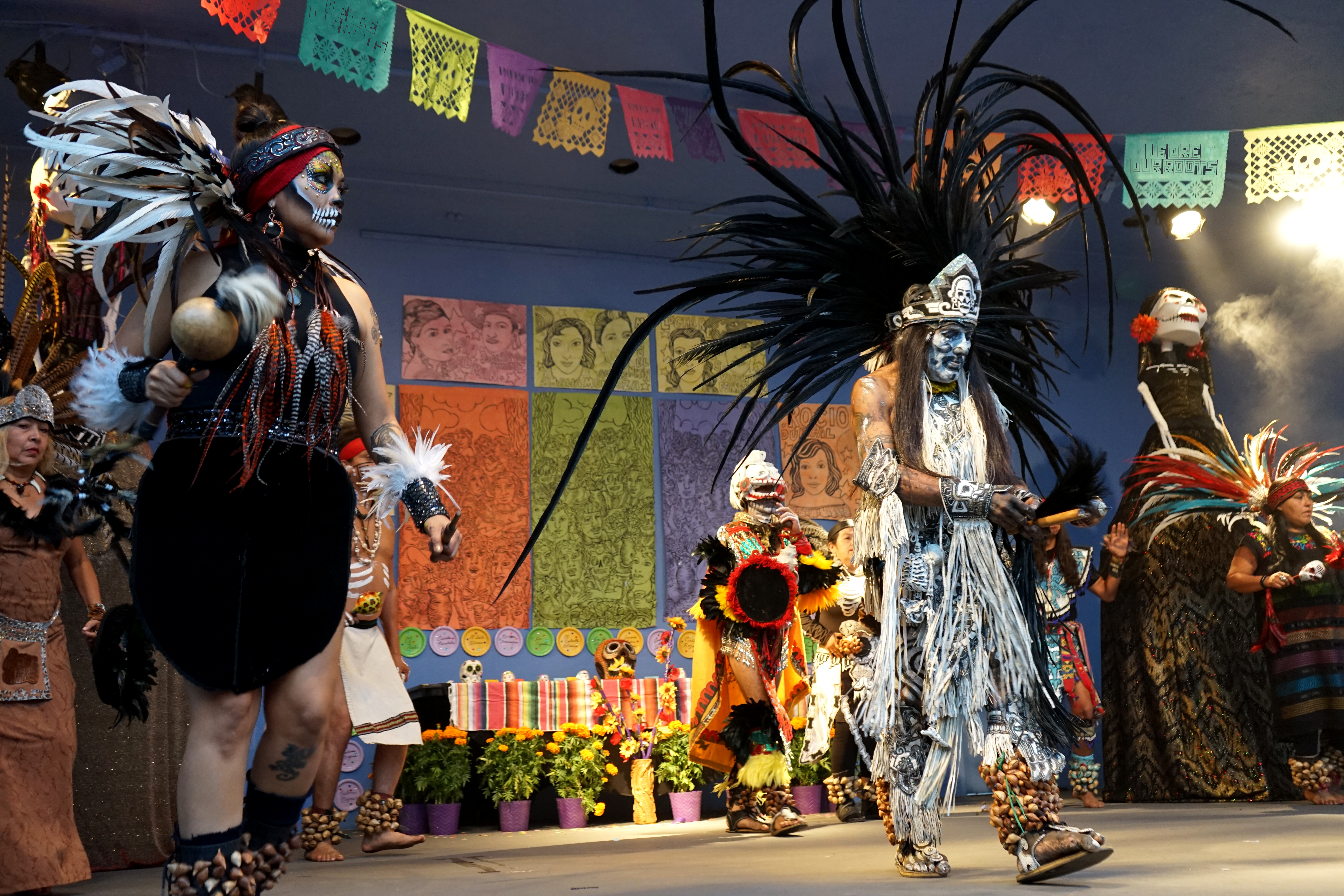
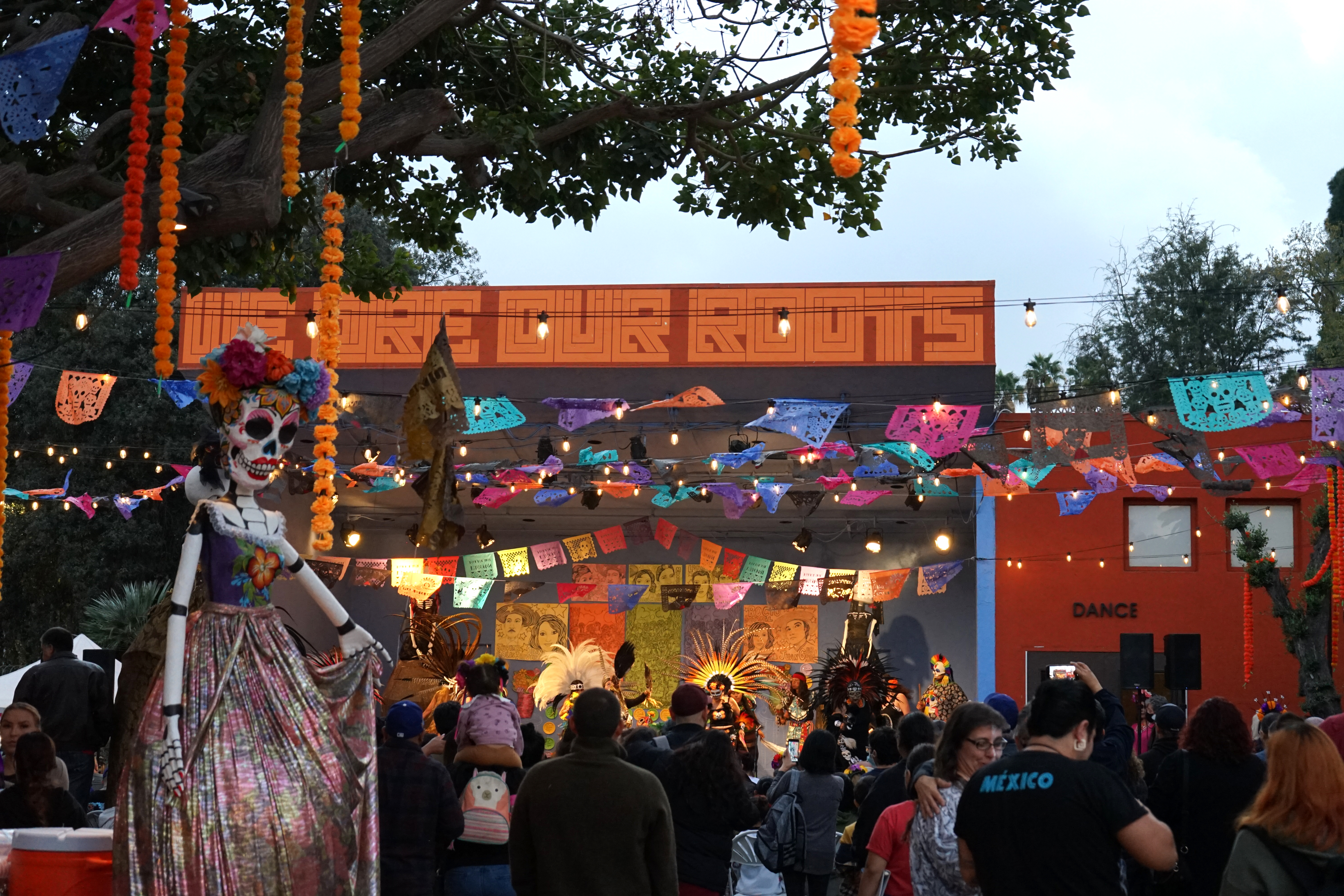
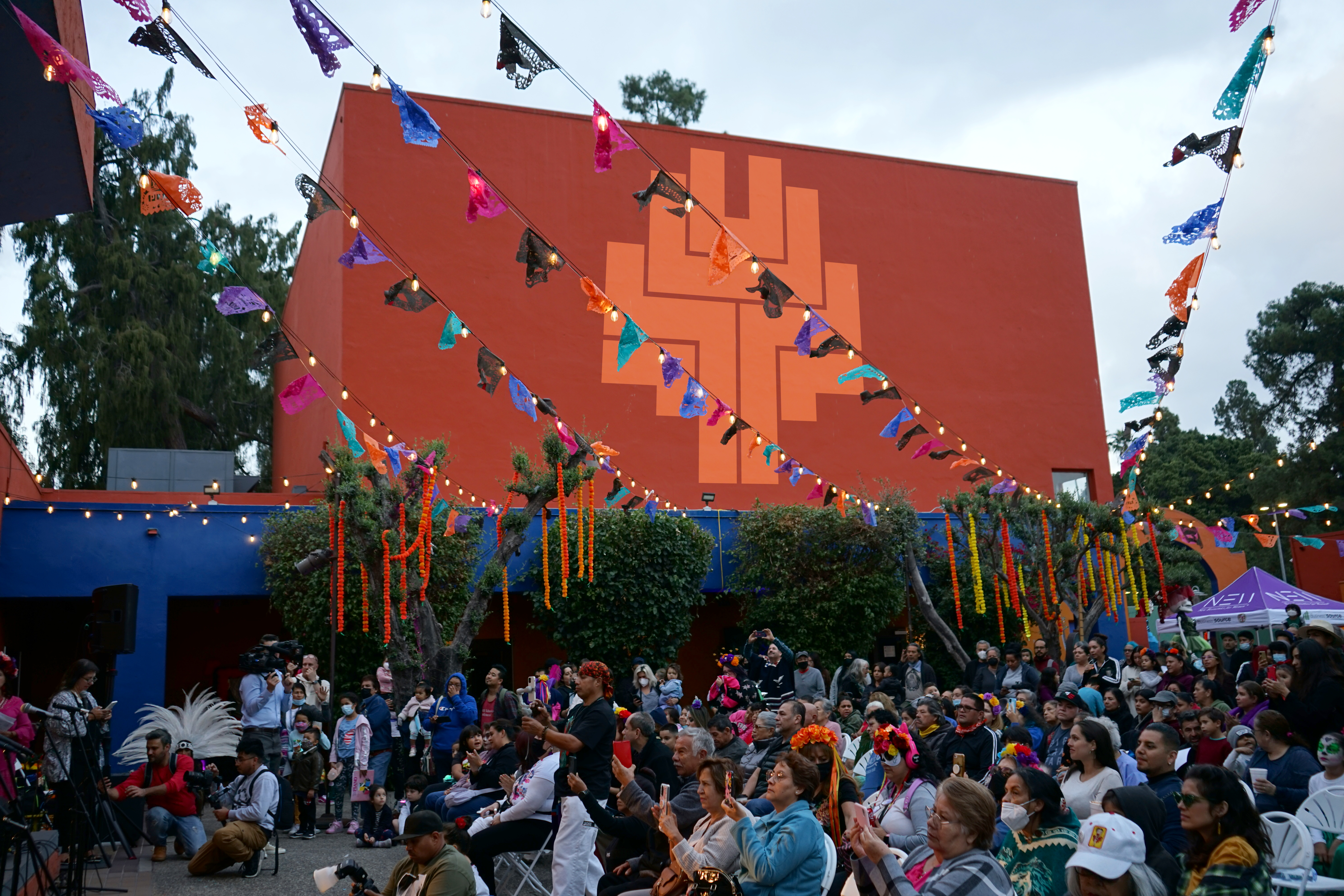
Immersive Room (Symbolism + Poetry)
Poetry by Natalio Hernández: In Tonati translated in three languages English/Nahuatl/Spanish.
Memorabilia/Swag
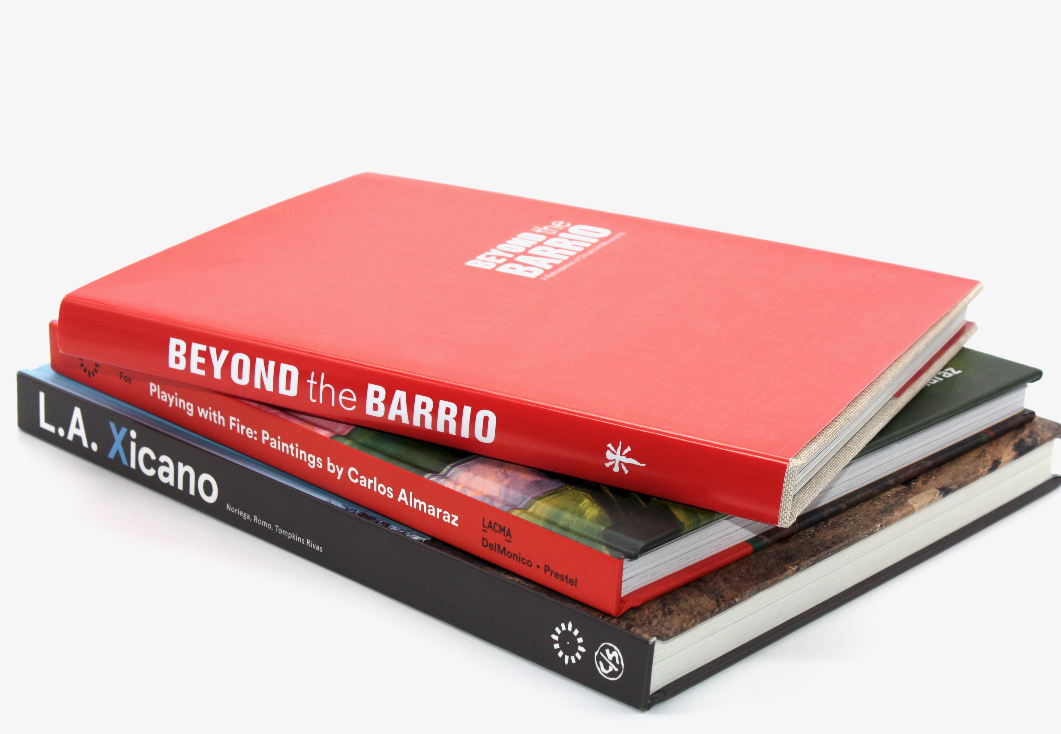
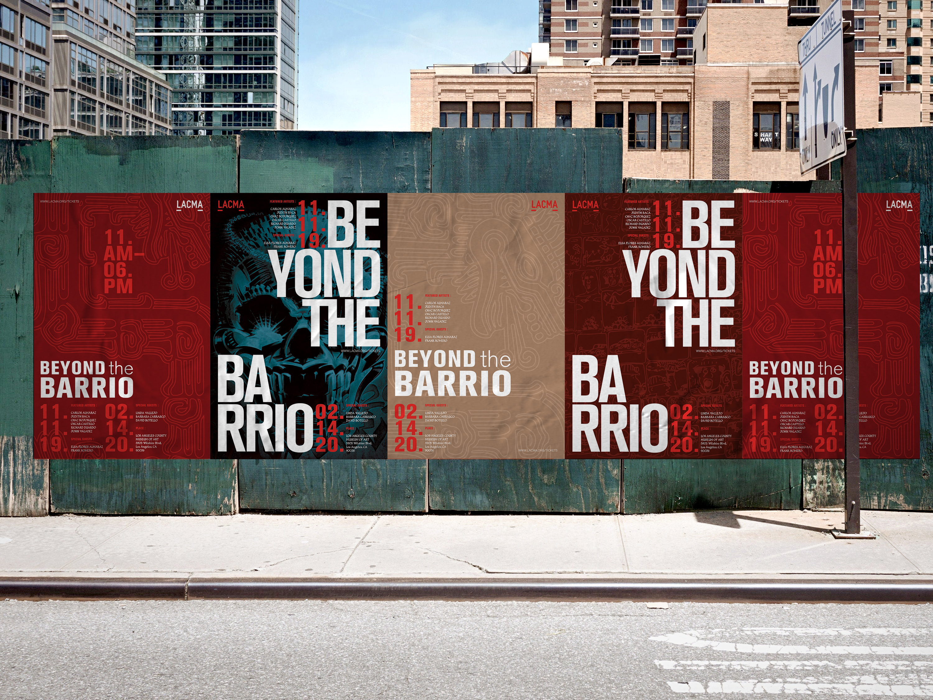
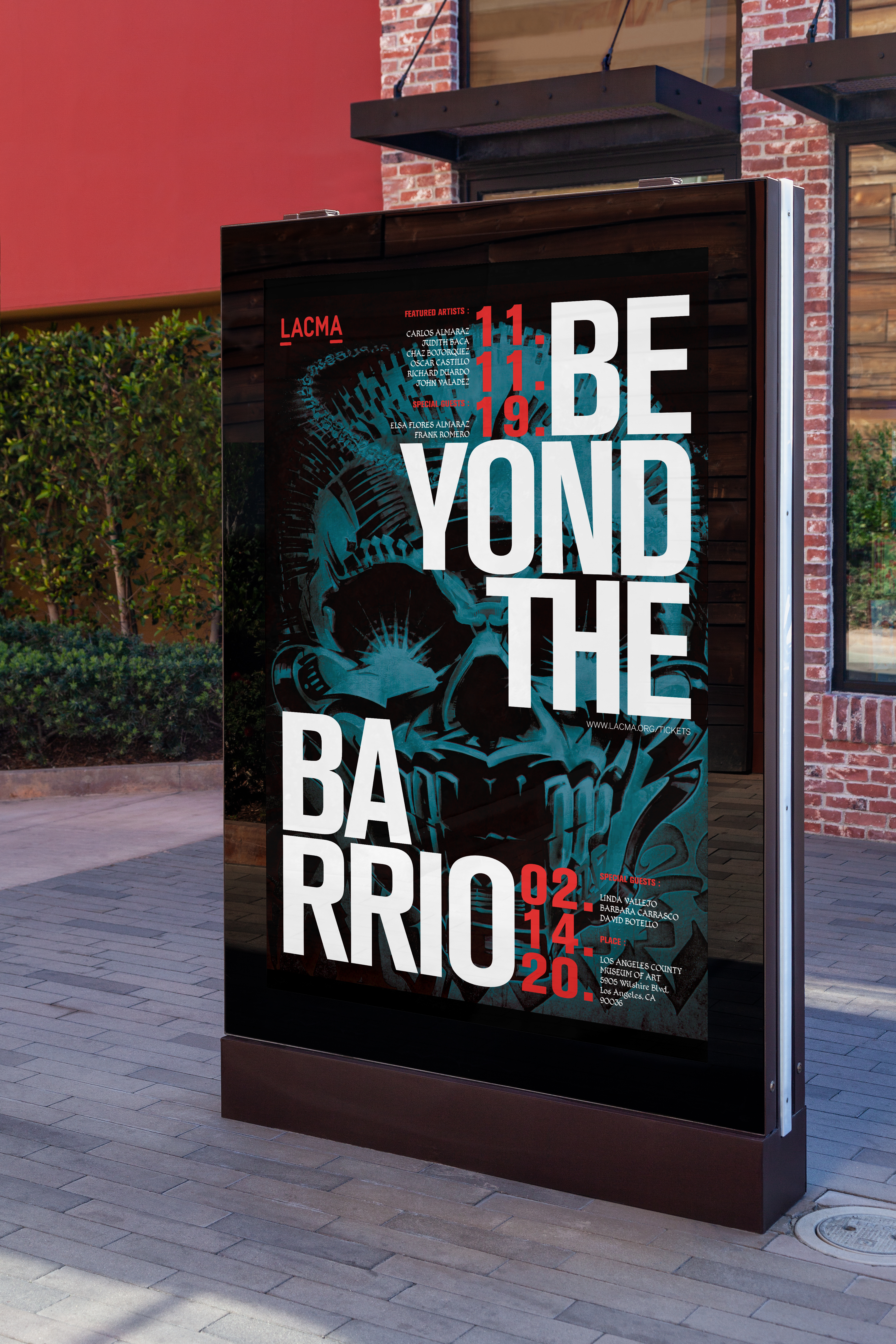
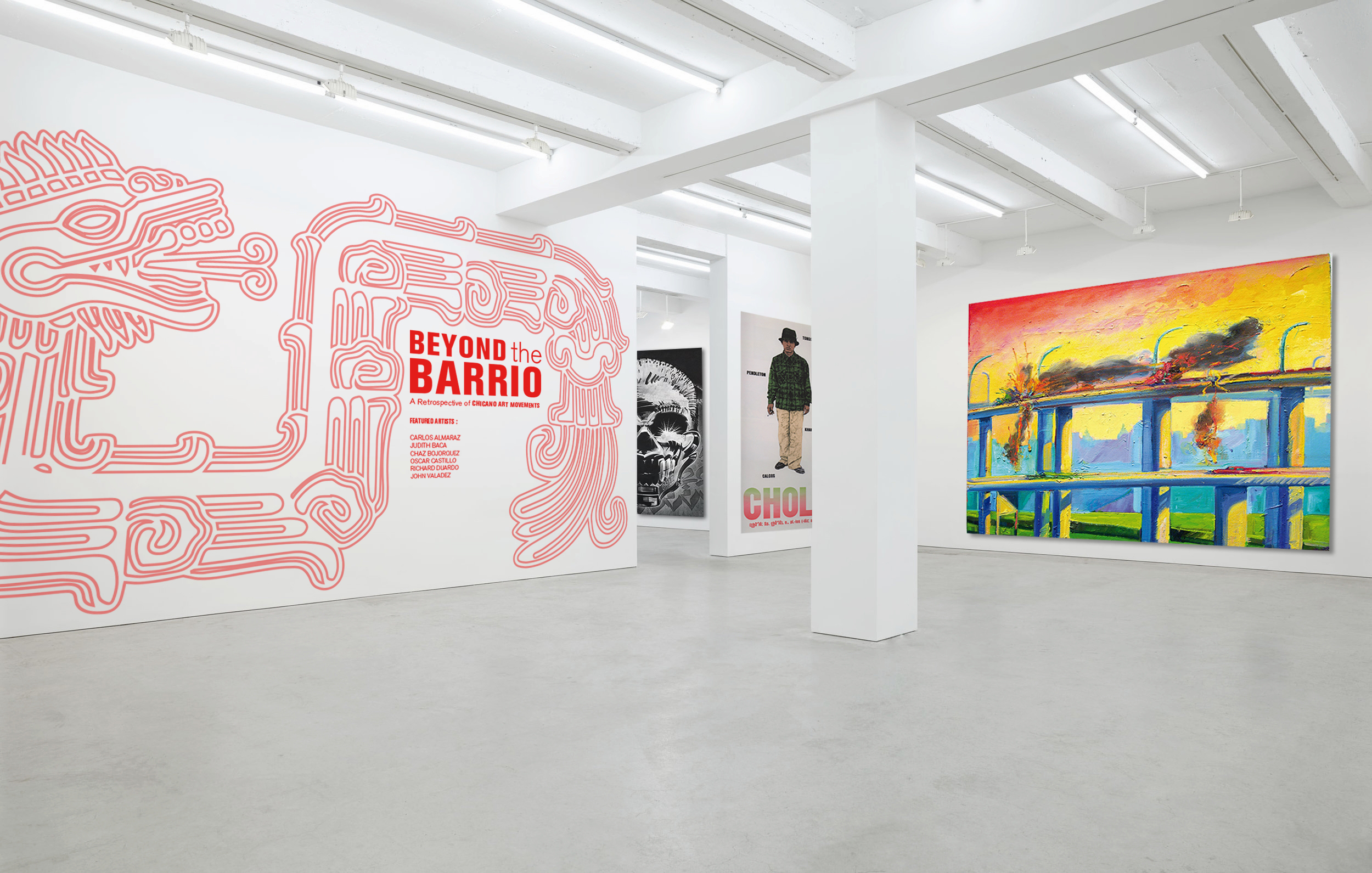
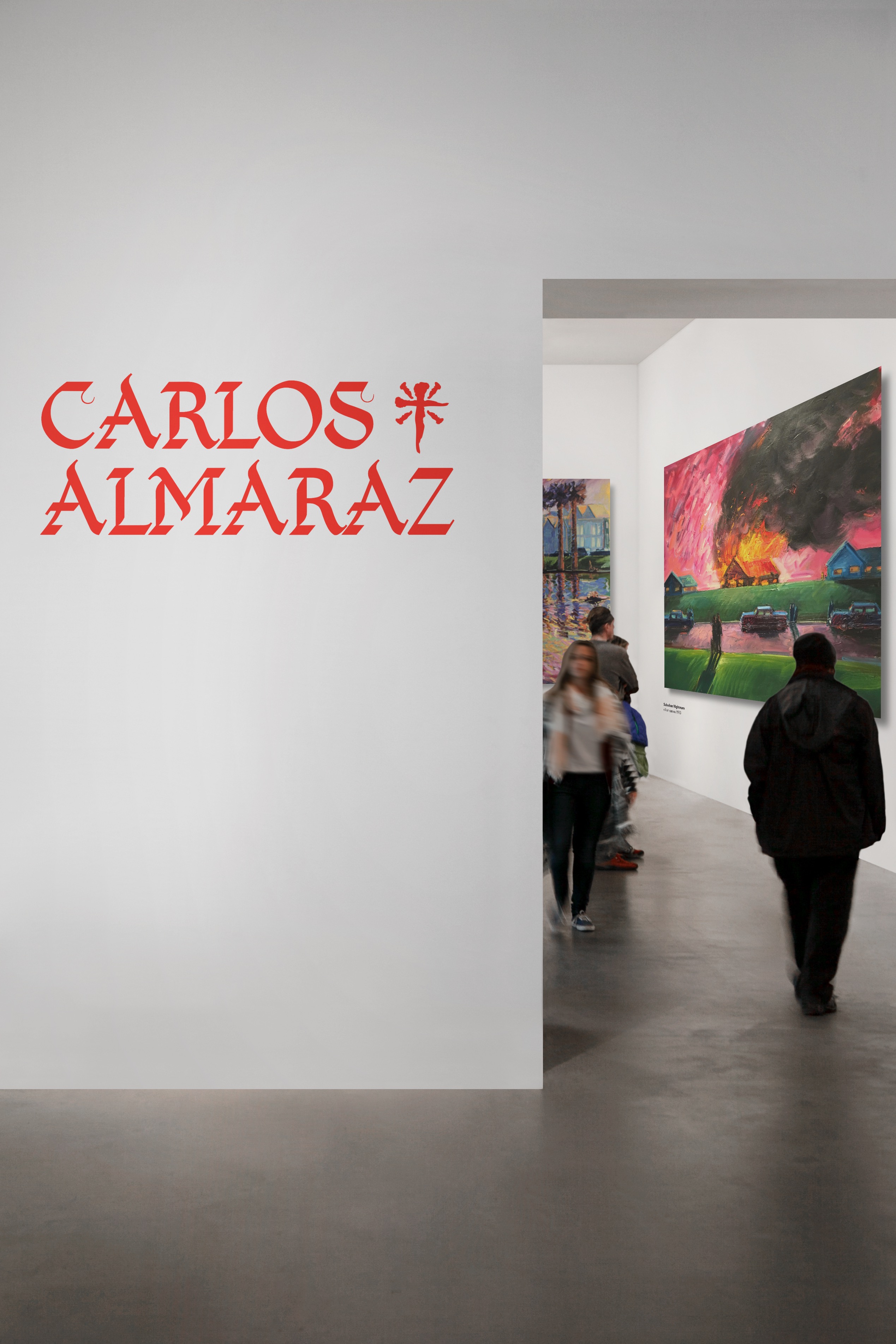
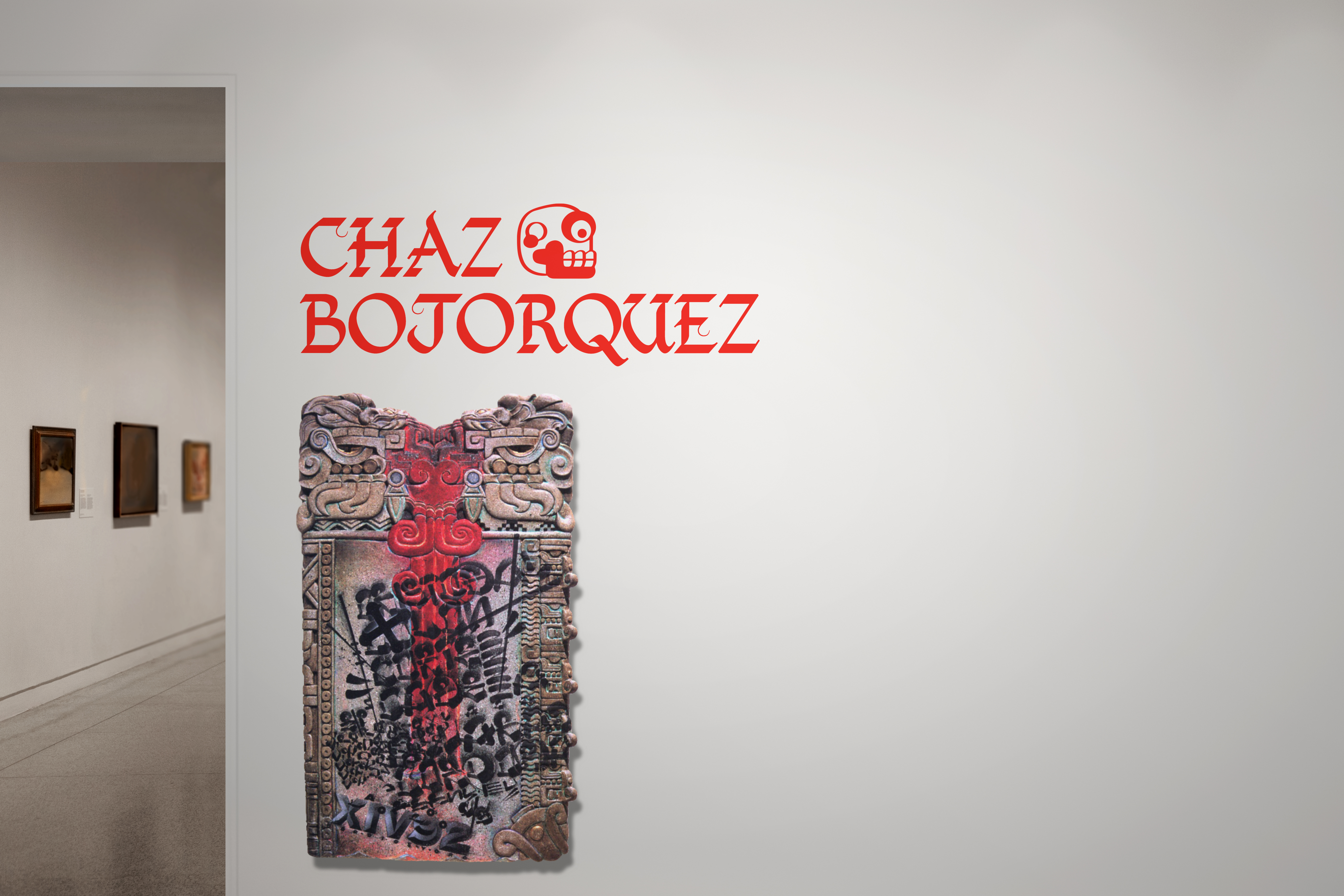
02 Beyond the Barrio
Publication + Exhibition
(Book Design/Typography/Print)
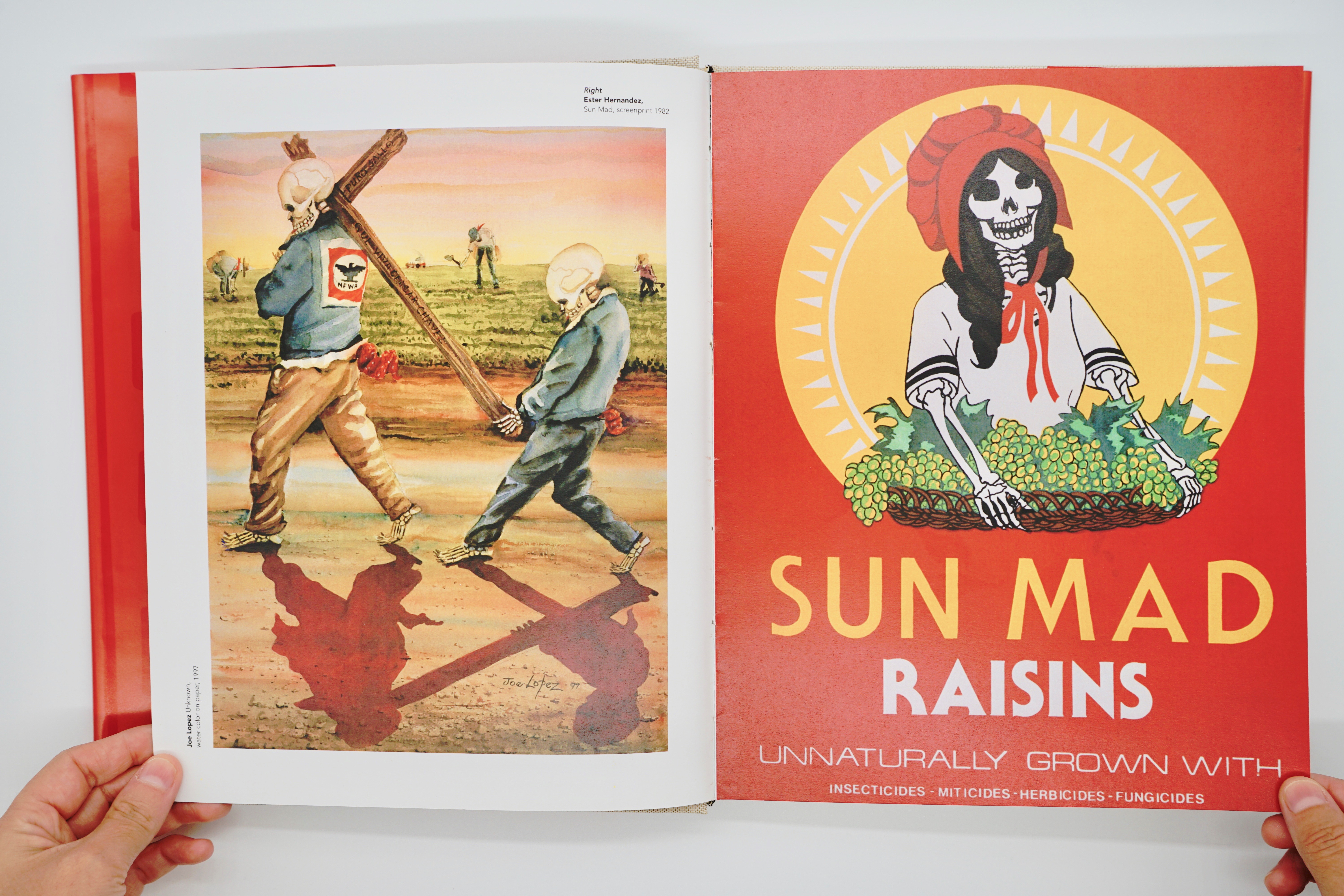
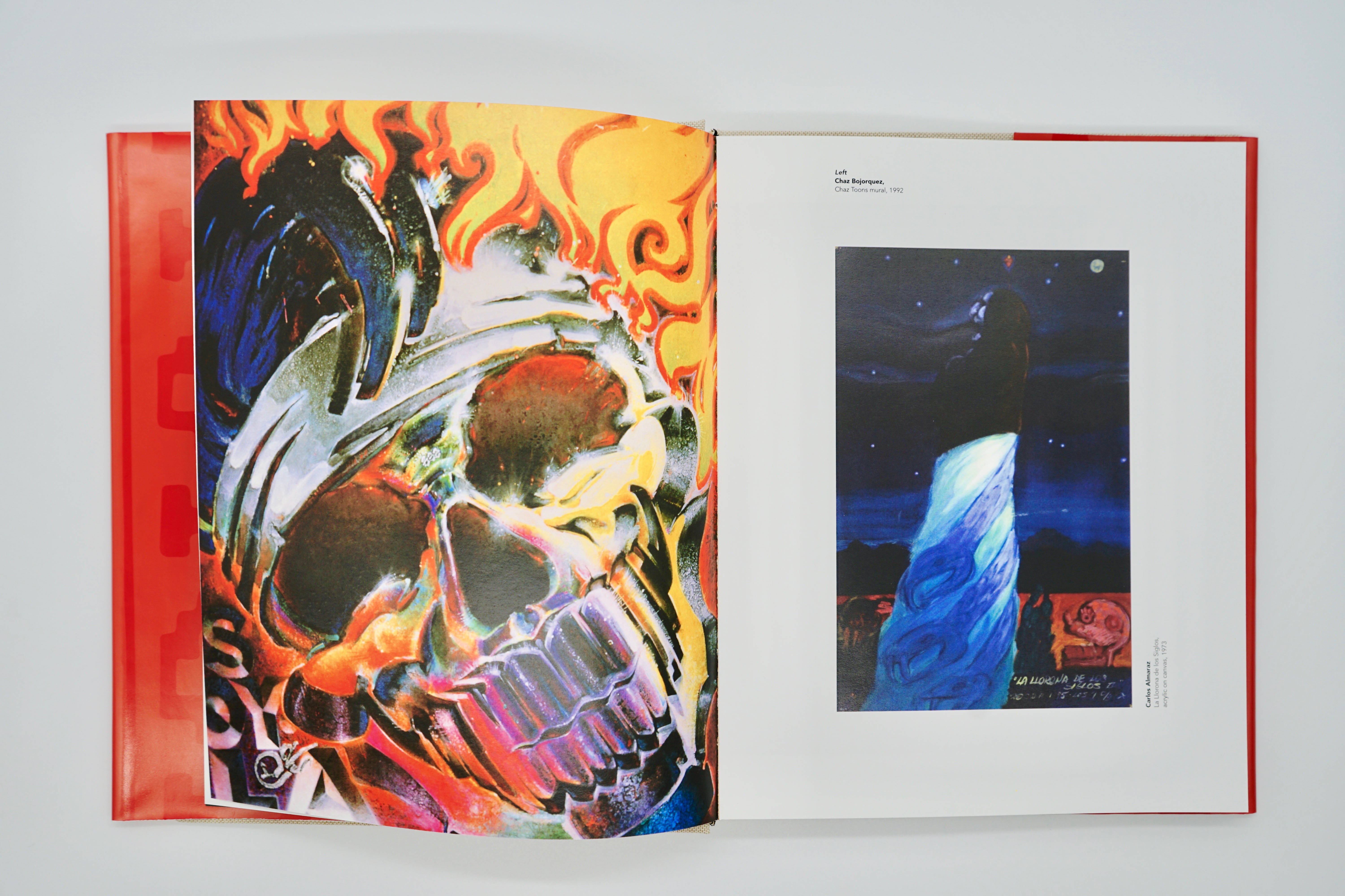
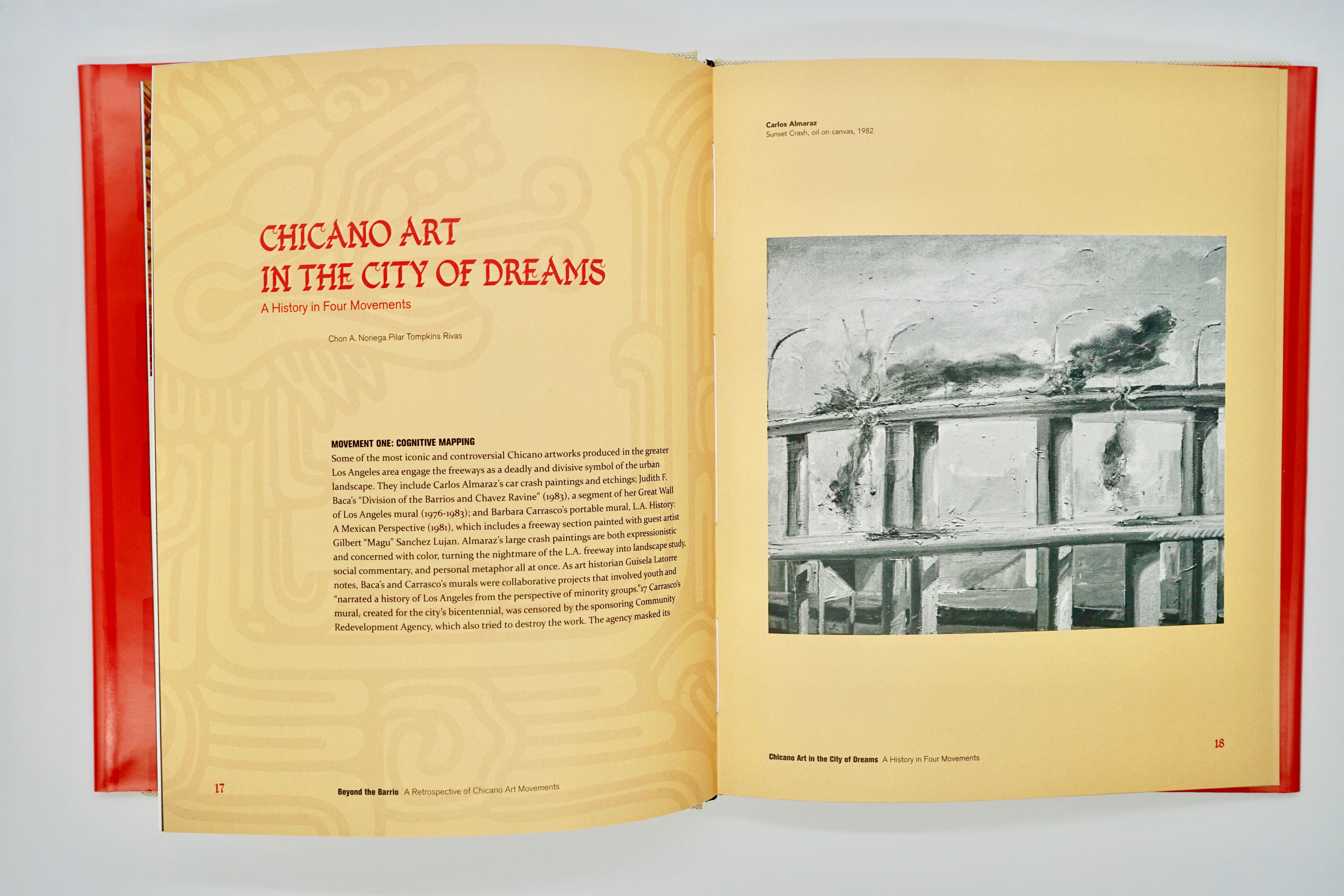
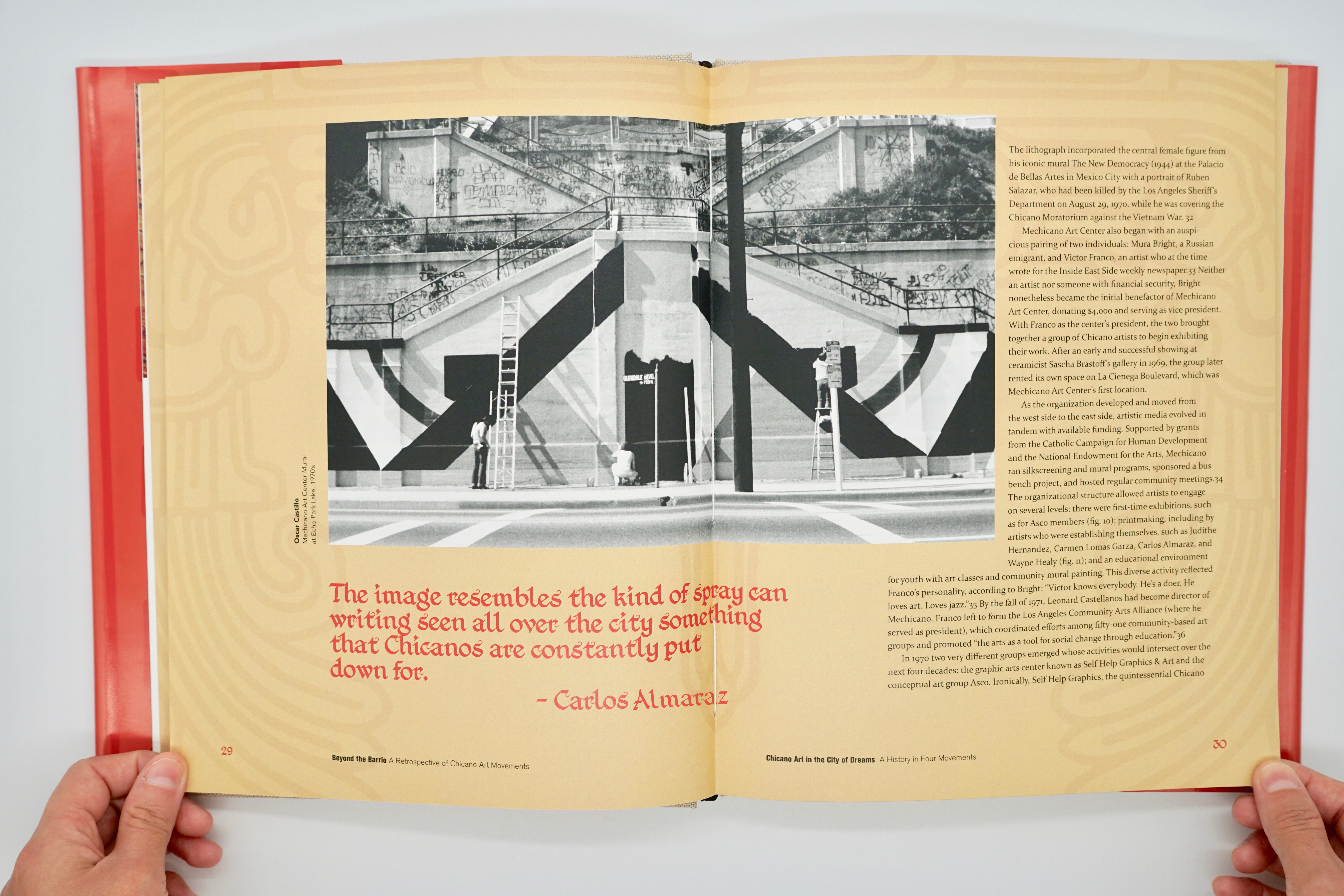
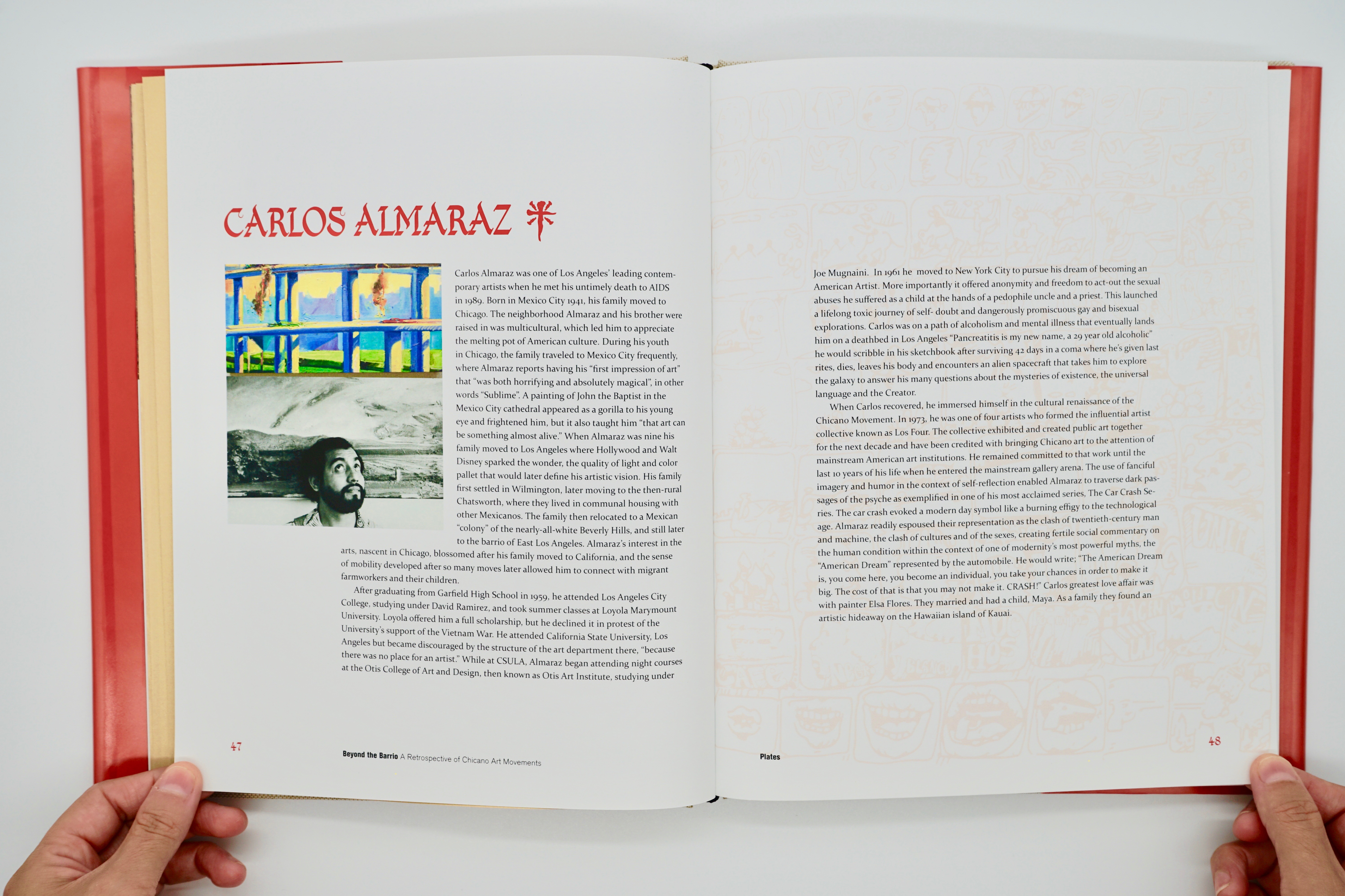
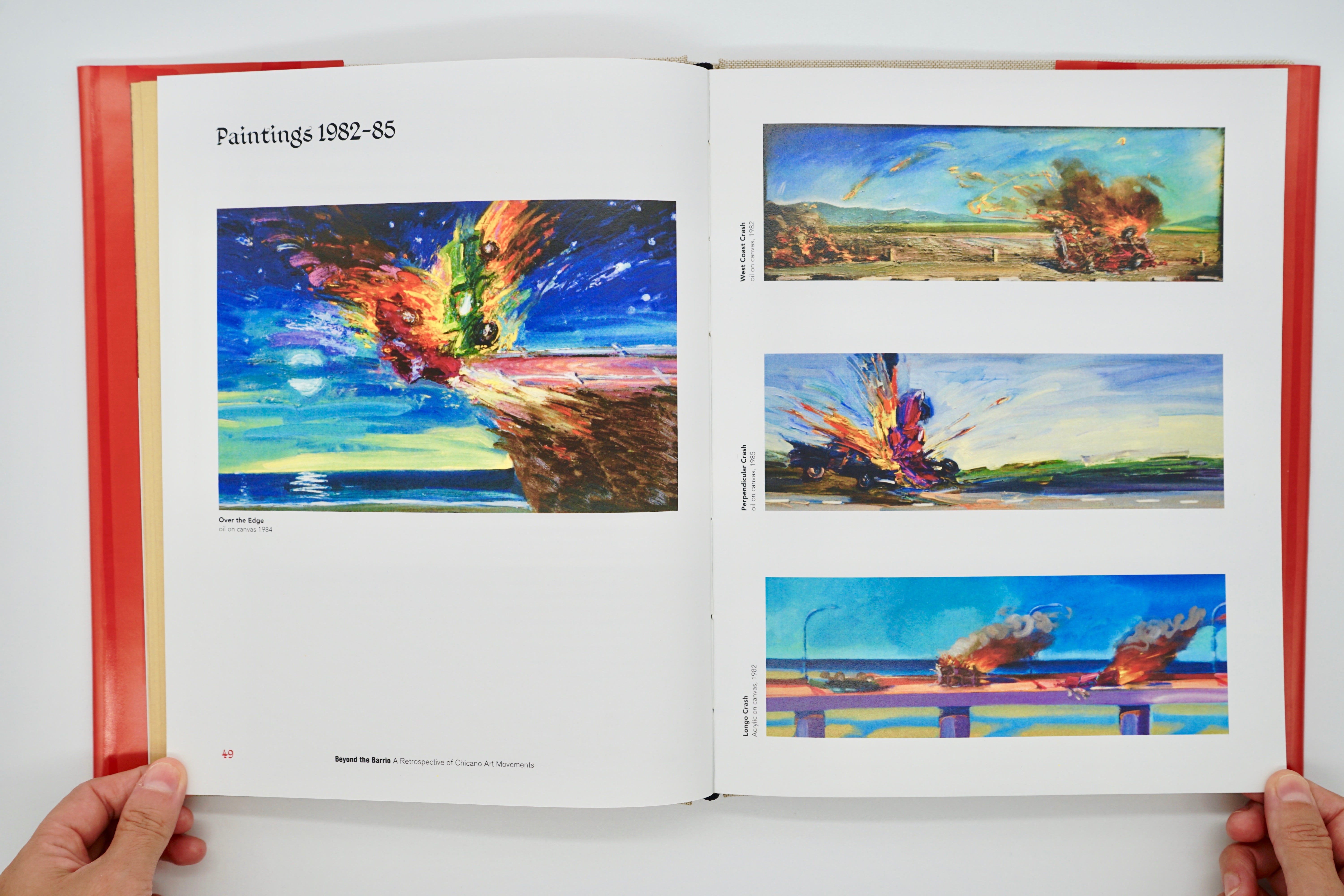
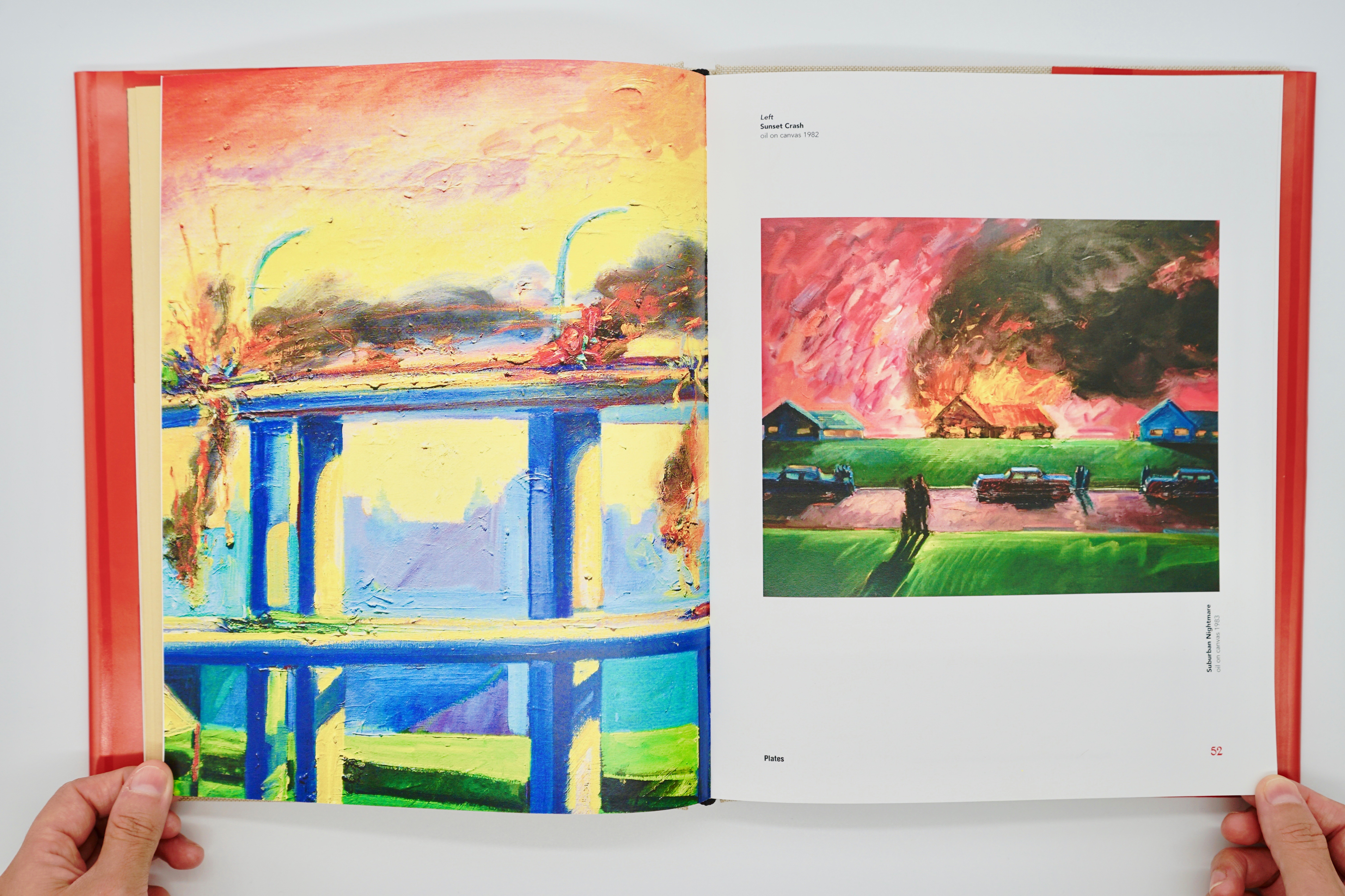
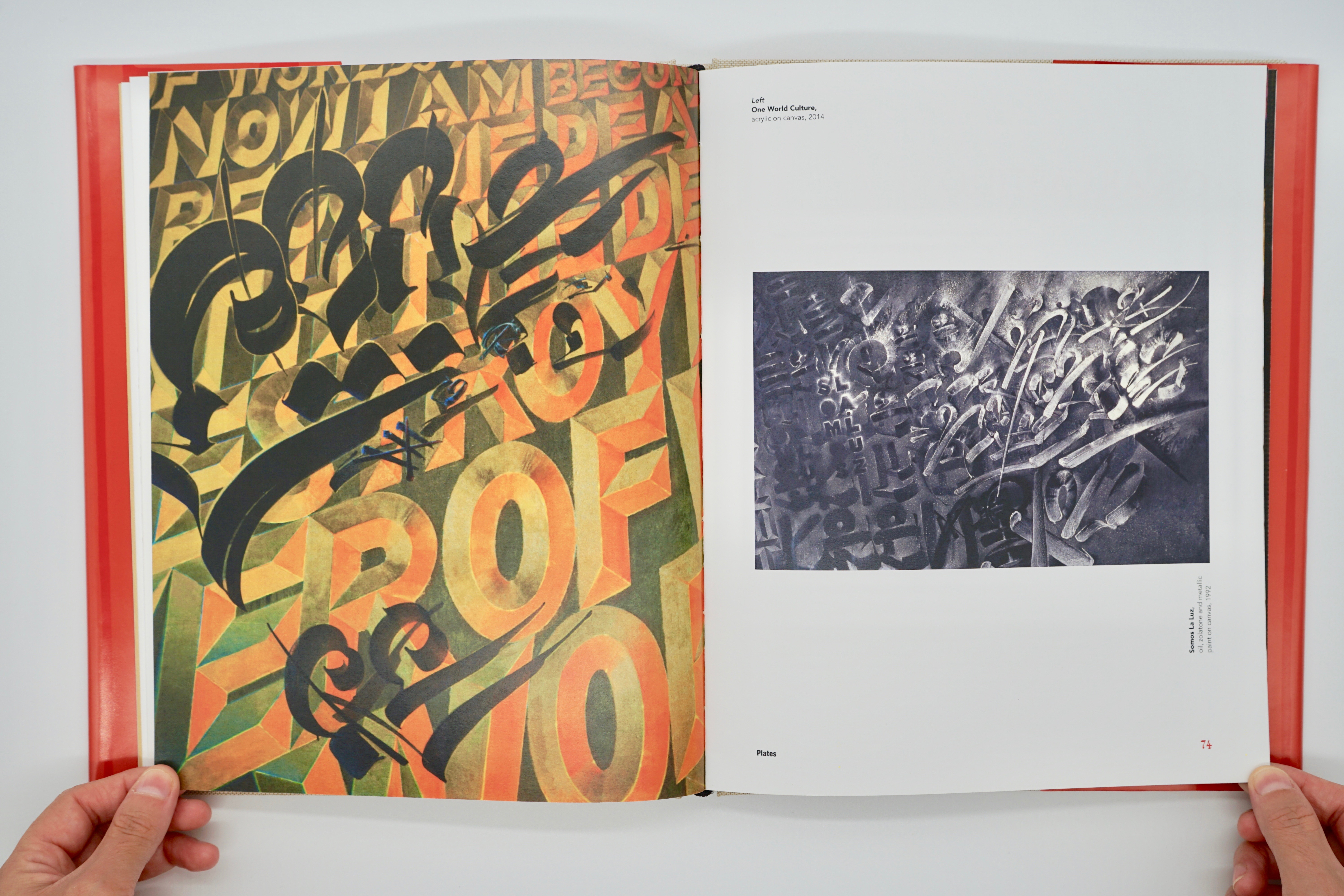
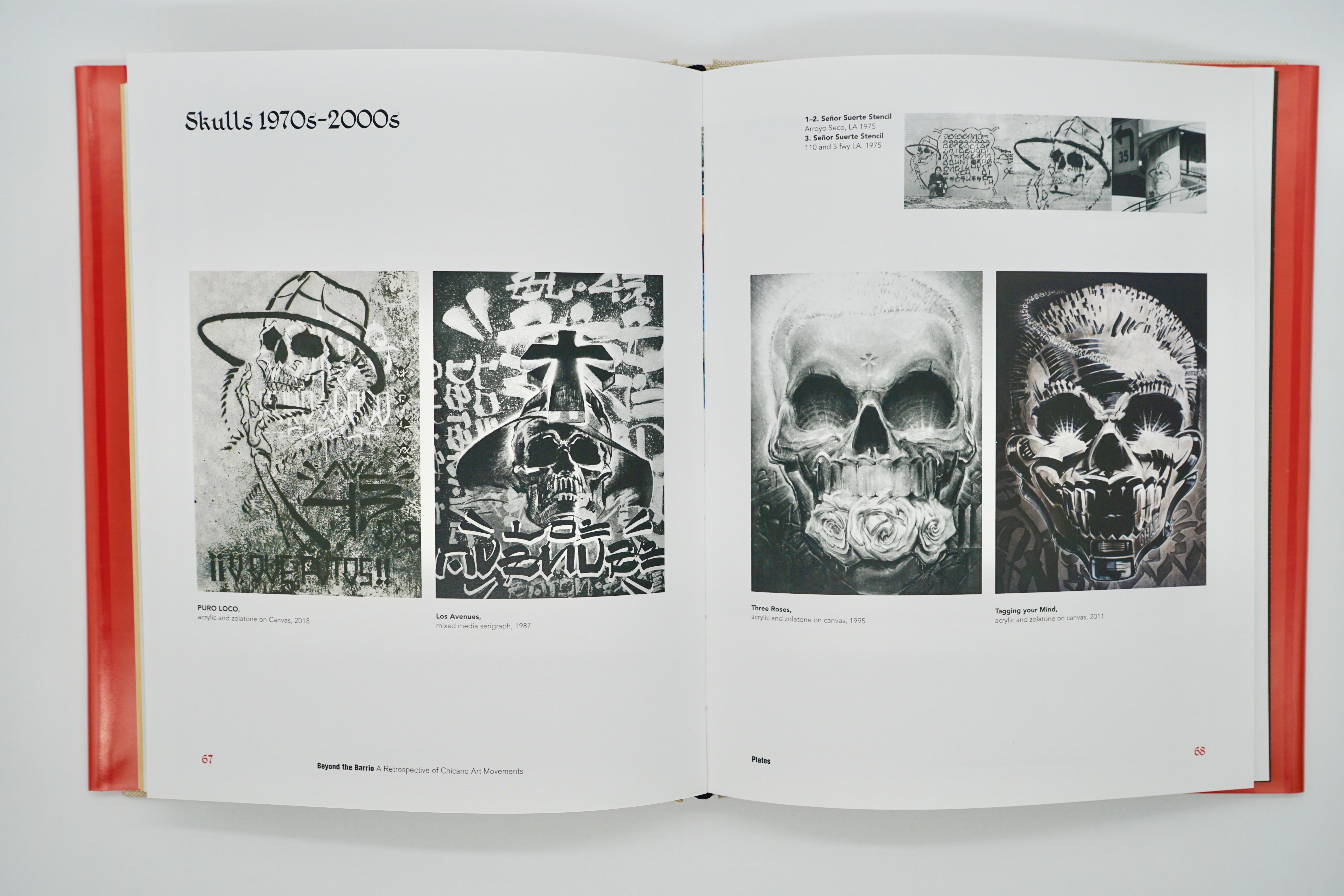
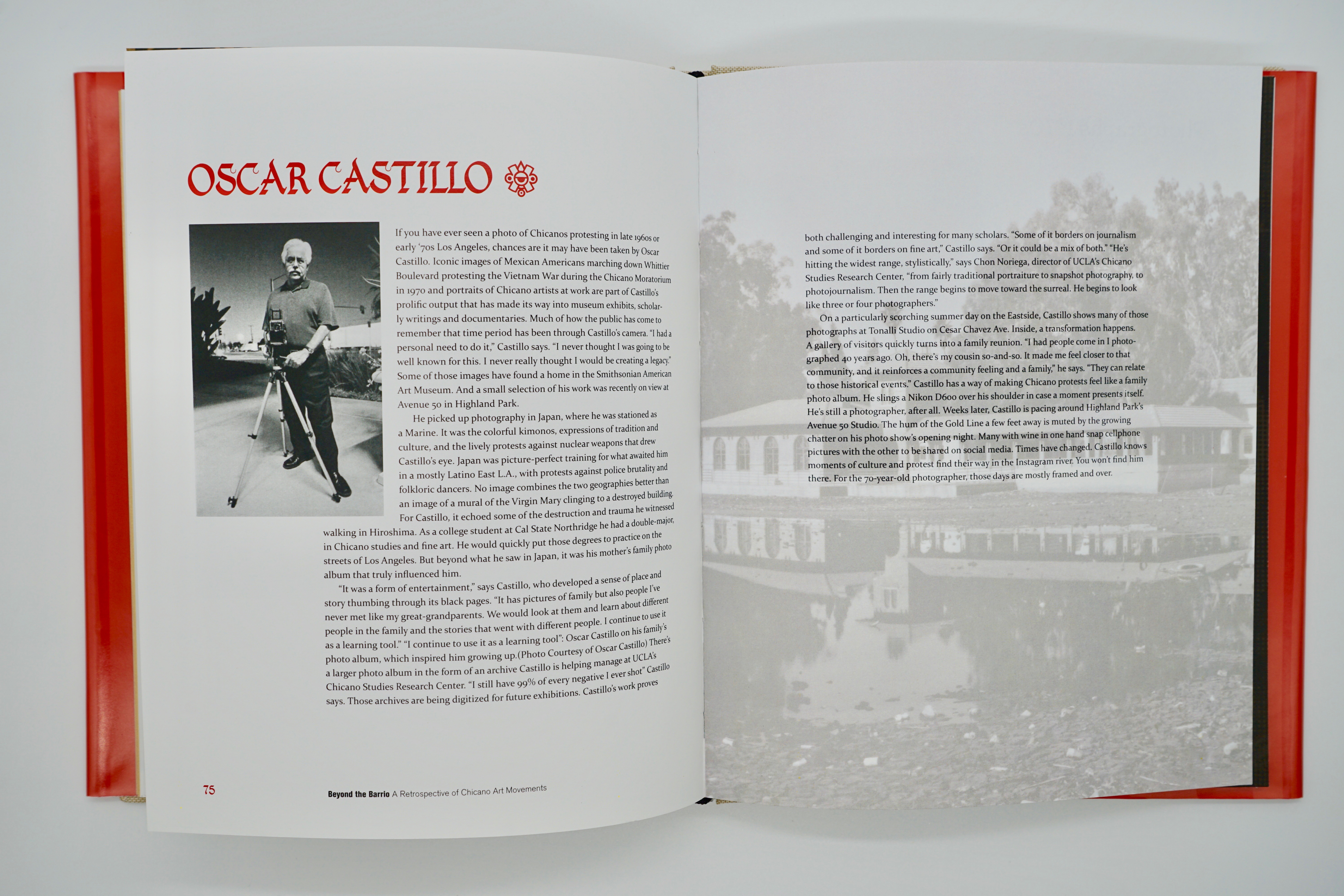
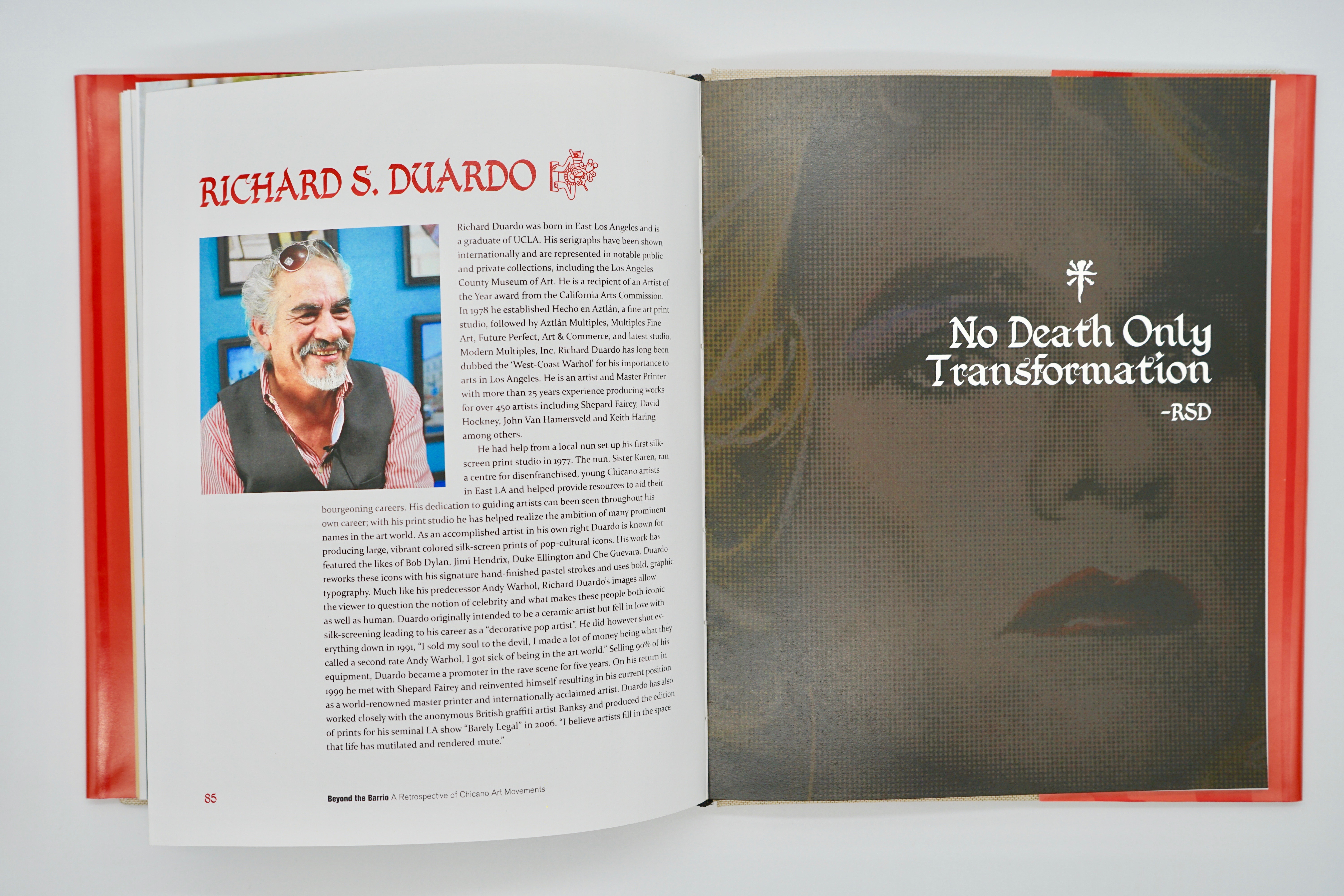
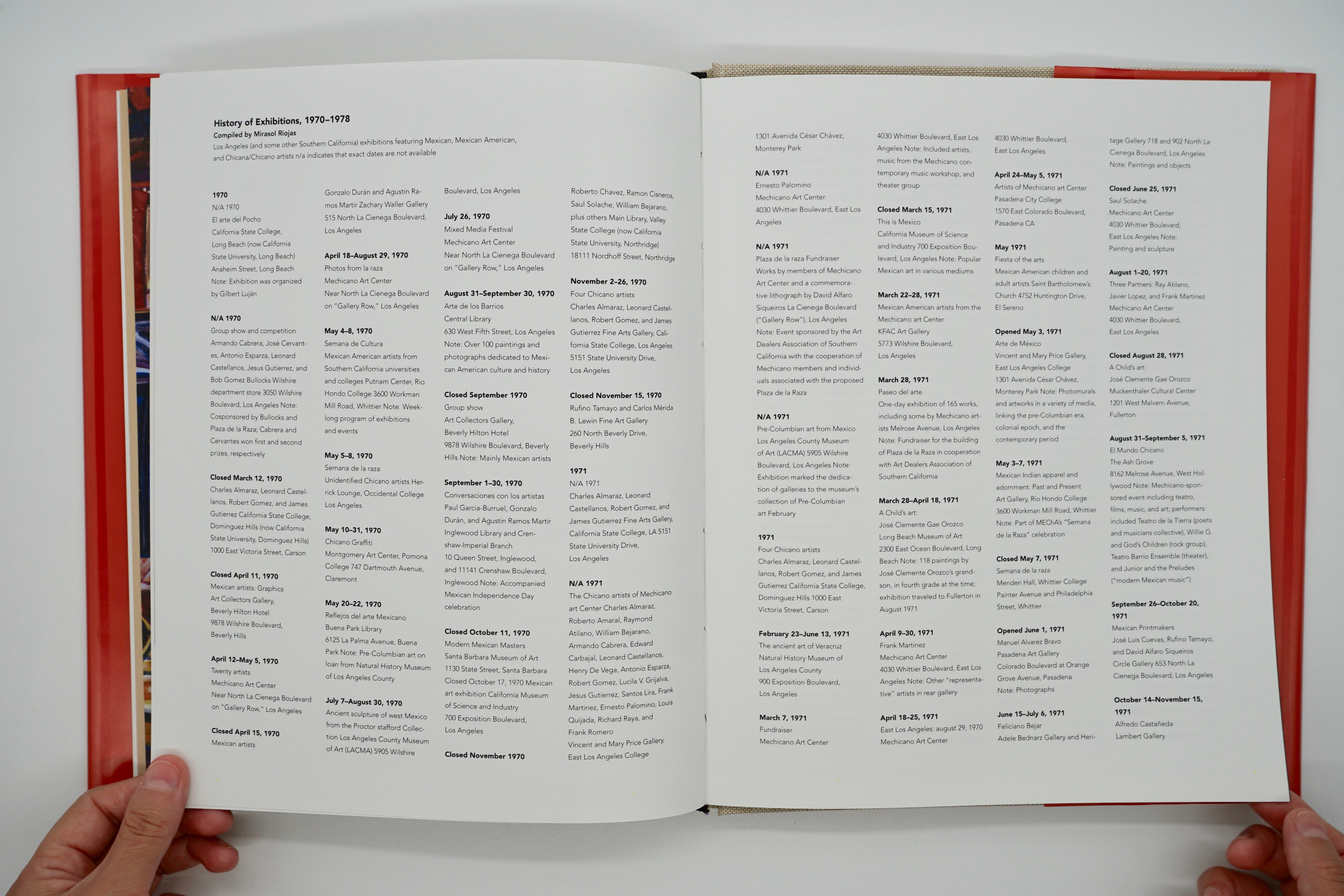
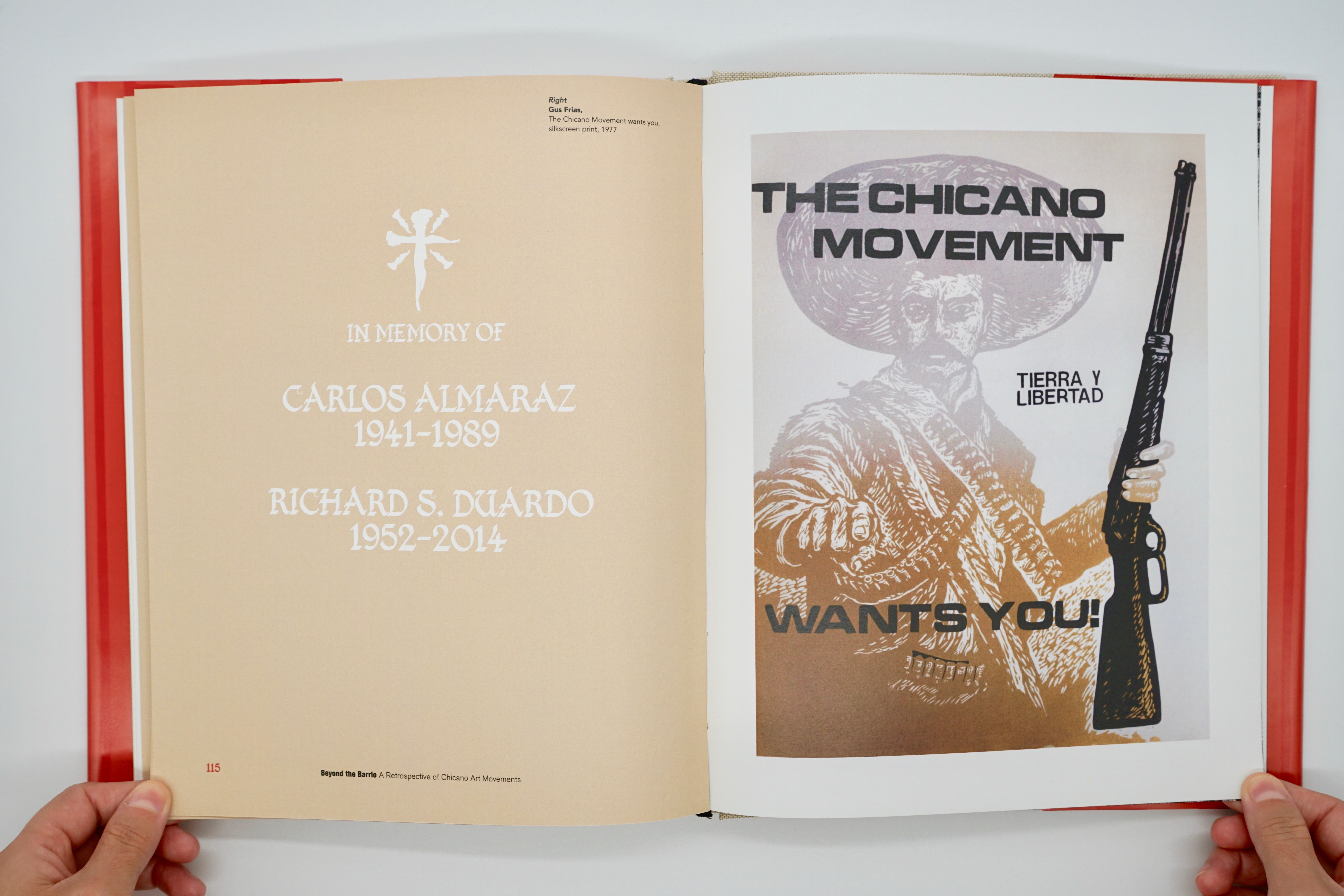
Beyond the Barrio is a Chicano Art exhibition and book cataloging the curation of six artists who contributed to the Chicano Art Movement during the 1960s–80s and beyond. This book explores in detail specific movements that shaped the Chicano Art scene in and around the greater Los Angeles area. From freeway underpasses to murals that adorned businesses and street walls, were all utilized as canvases. Some of the most iconic and influential artists range from Carlos Almaraz to Chaz Bojorquez who both made enormous contributions to Chicano culture. Their unique styles are still relevant today.
Credits:
*Hypothetical project for educational purposes only!
*Not for sale or Reproduction!
My Role: Book Design + Typography + Curation
Photography: Erron Estrada + Jasmin Jimenez
(Book Design/Typography/Print)
Beyond the Barrio is a Chicano Art exhibition and book cataloging the curation of six artists who contributed to the Chicano Art Movement during the 1960s–80s and beyond. This book explores in detail specific movements that shaped the Chicano Art scene in and around the greater Los Angeles area. From freeway underpasses to murals that adorned businesses and street walls, were all utilized as canvases. Some of the most iconic and influential artists range from Carlos Almaraz to Chaz Bojorquez who both made enormous contributions to Chicano culture. Their unique styles are still relevant today.
Credits:
*Hypothetical project for educational purposes only!
*Not for sale or Reproduction!
My Role: Book Design + Typography + Curation
Photography: Erron Estrada + Jasmin Jimenez
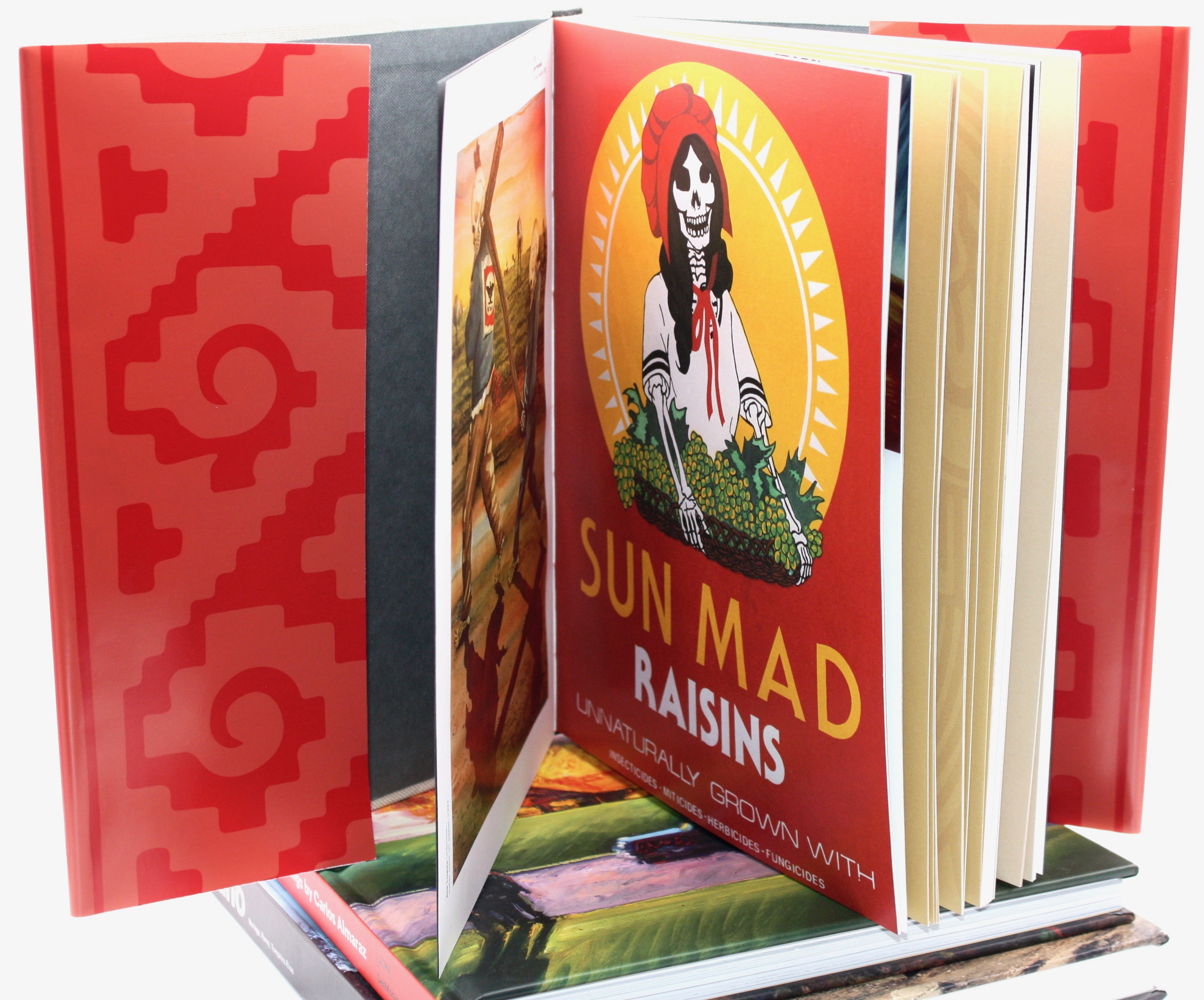
Entrance into the book
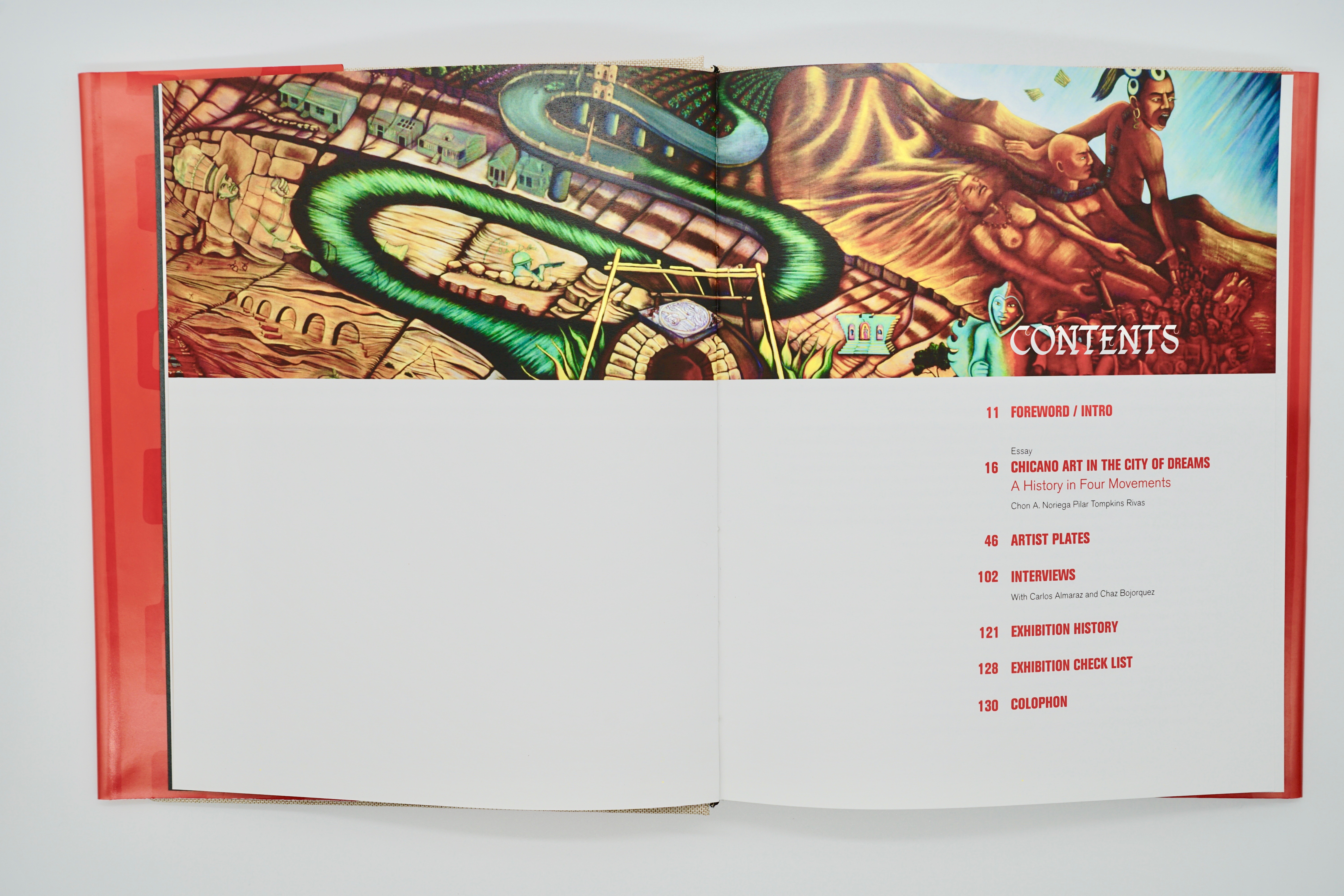
Intro + Essay
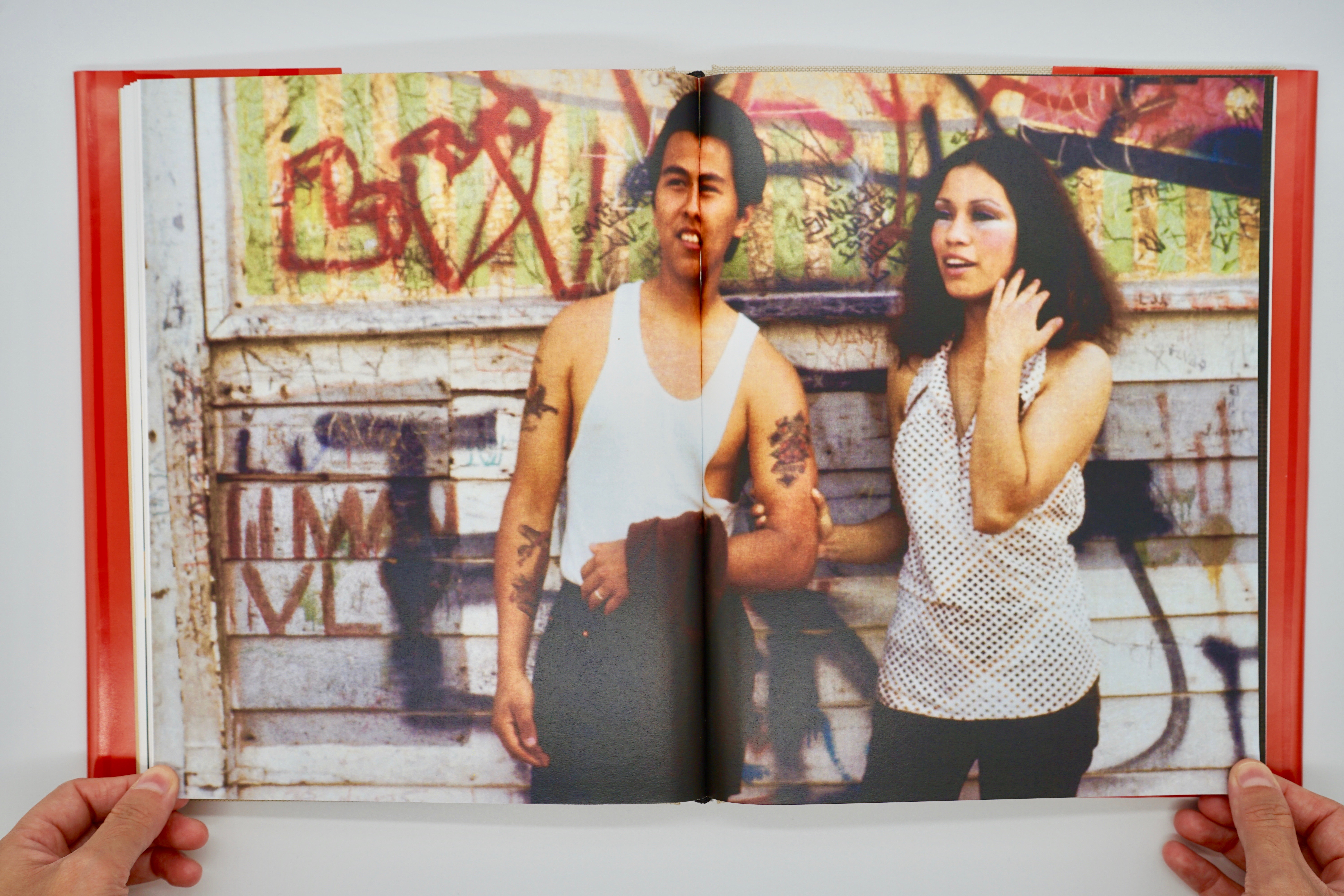
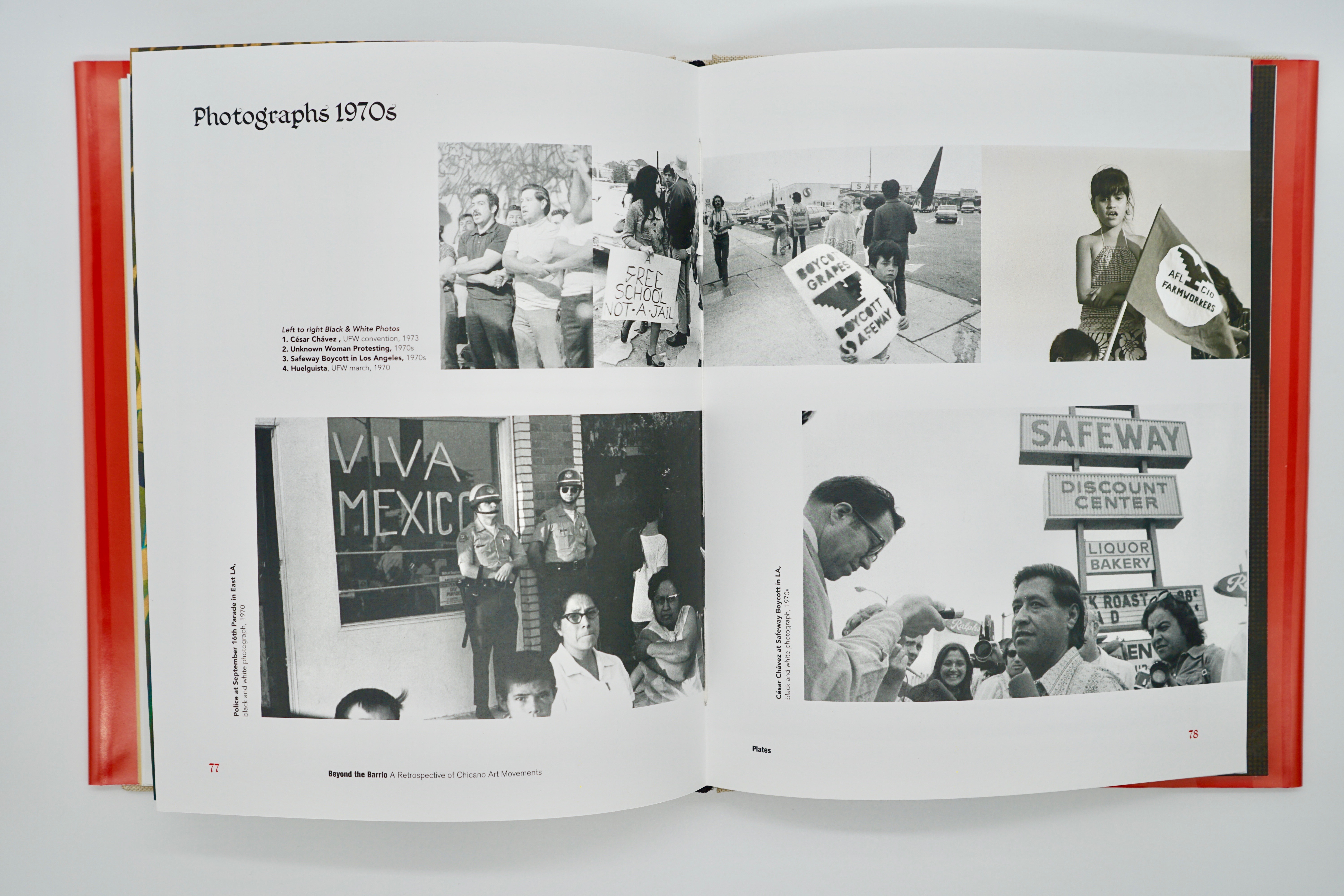
Artists Plates + Bios

Exhibition History + Checklist + Colophon

Promotinal Posters + Exhibition
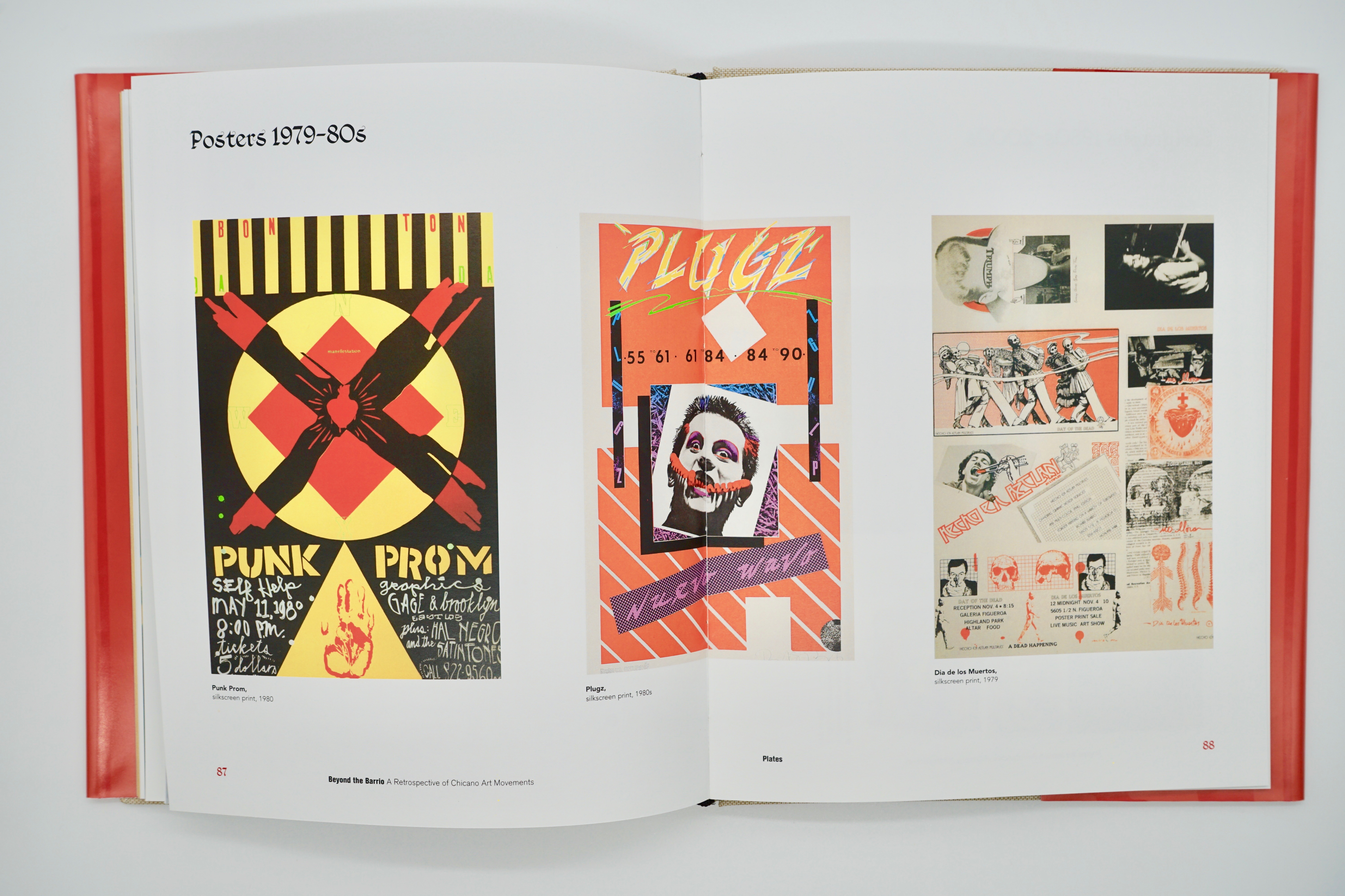
I took it a step further designing a set of posters that highlighted the artist’s work capturing the essence of the Chicano Movement. Furthermore, the posters take you from the streets, to the museum, and beyond. Quetzalcoatl or the feathered serpent is a reoccurring Aztec motif used throughout the book, posters, and gallery entrance symbolizing the merger of opposite forces, movement, and duality.
I took it a step further designing a set of posters that highlighted the artist’s work capturing the essence of the Chicano Movement. Furthermore, the posters take you from the streets, to the museum, and beyond. Quetzalcoatl or the feathered serpent is a reoccurring Aztec motif used throughout the book, posters, and gallery entrance symbolizing the merger of opposite forces, movement, and duality.
Gallery Entrance
Designated Artist Rooms
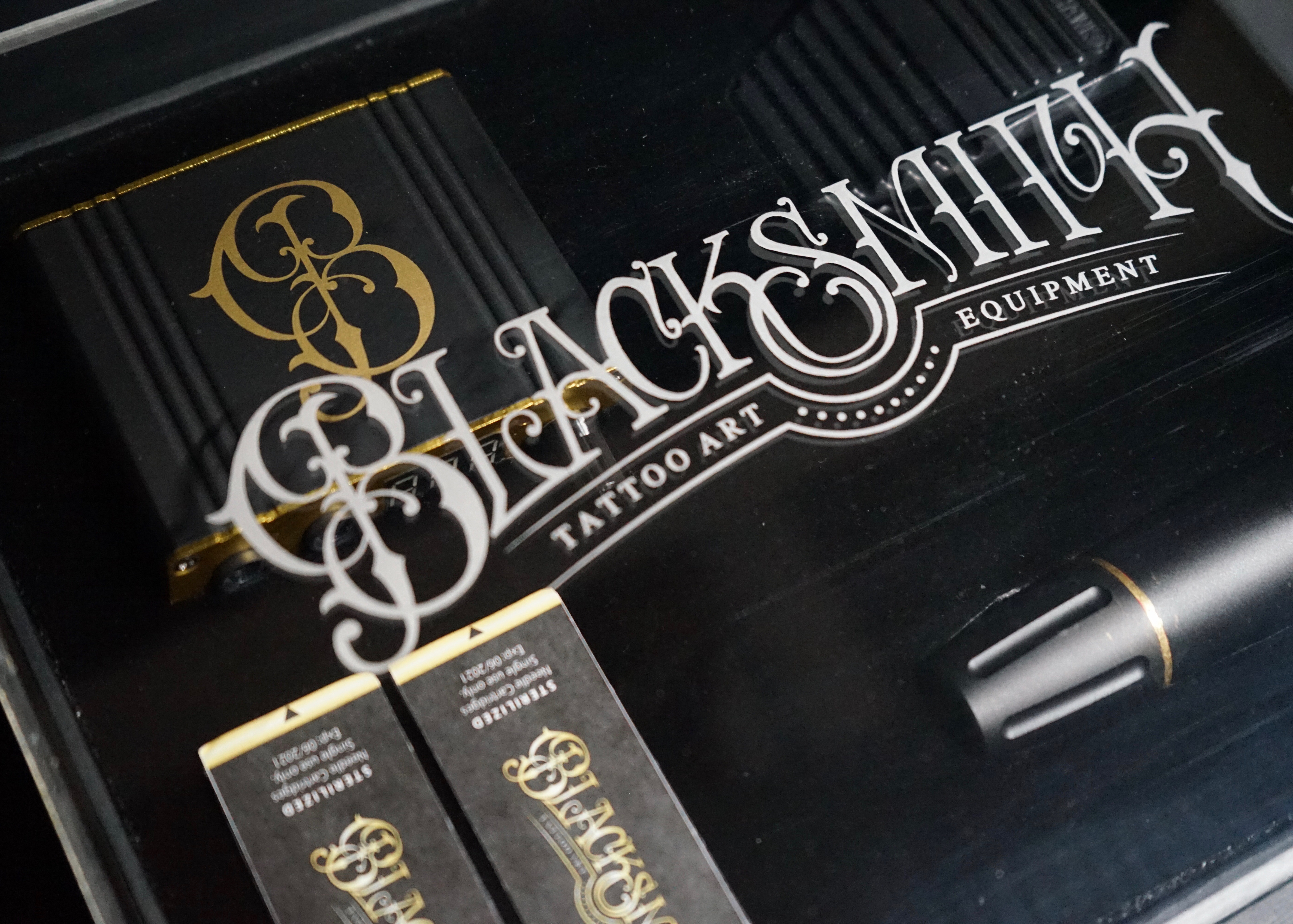
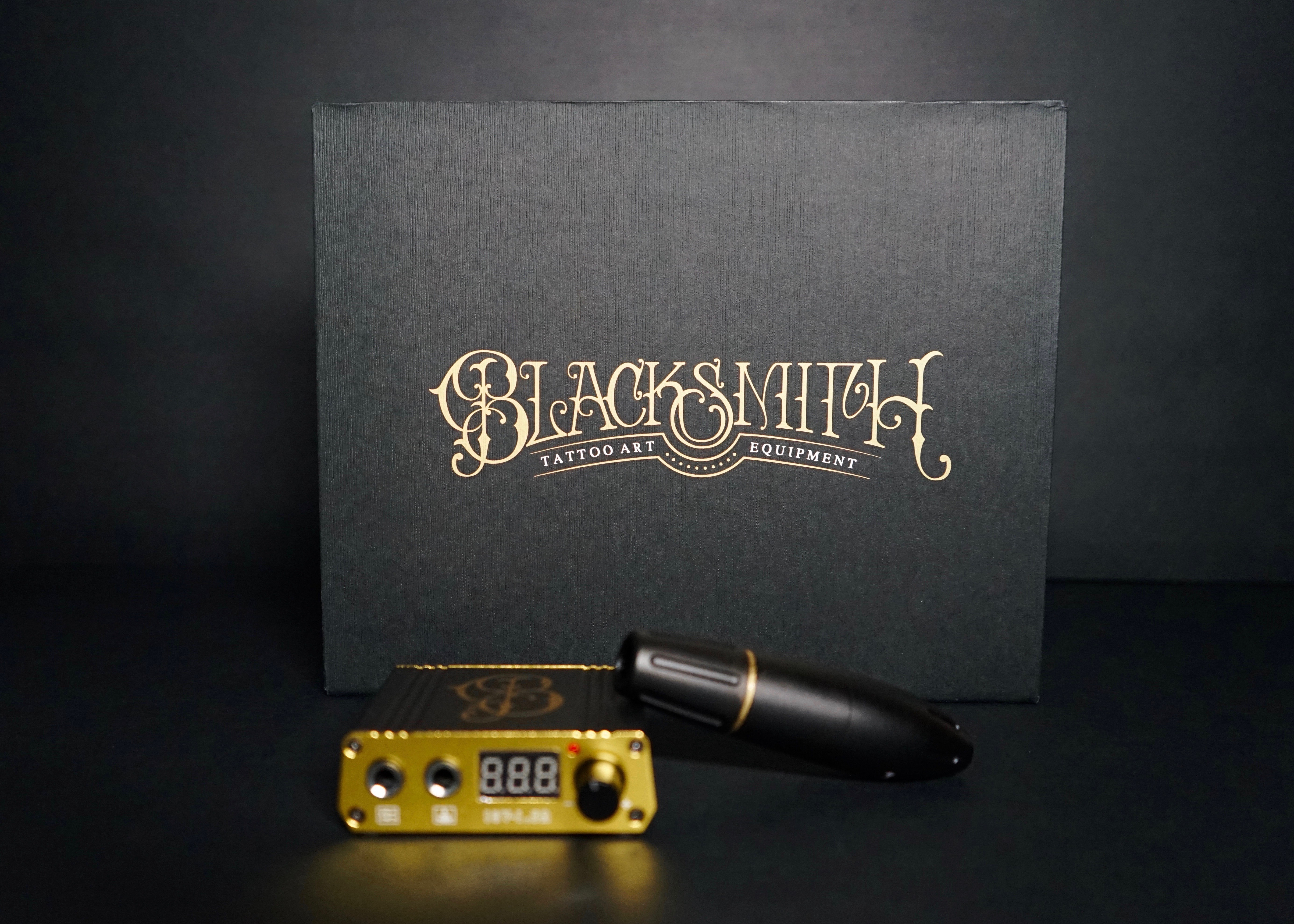
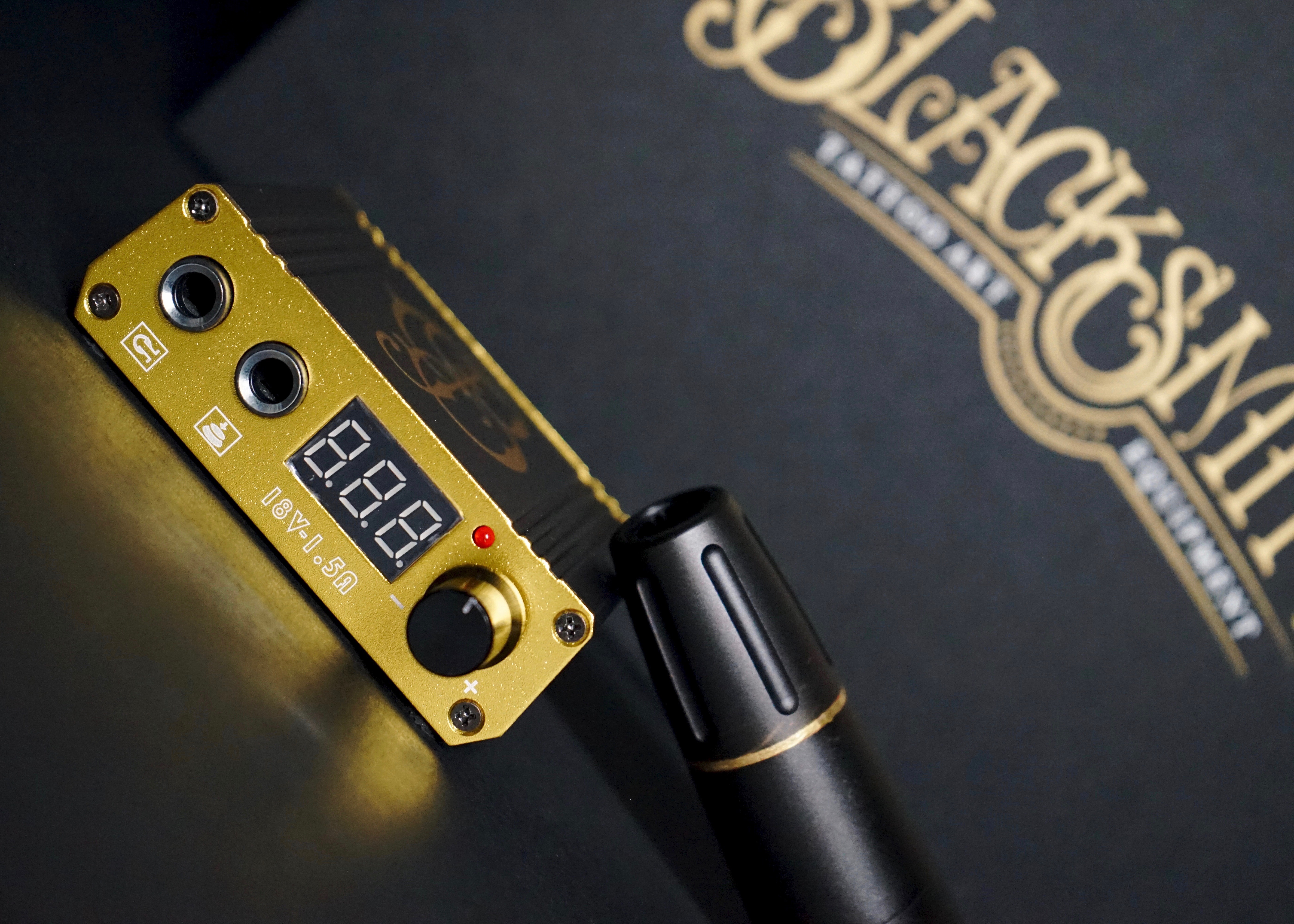
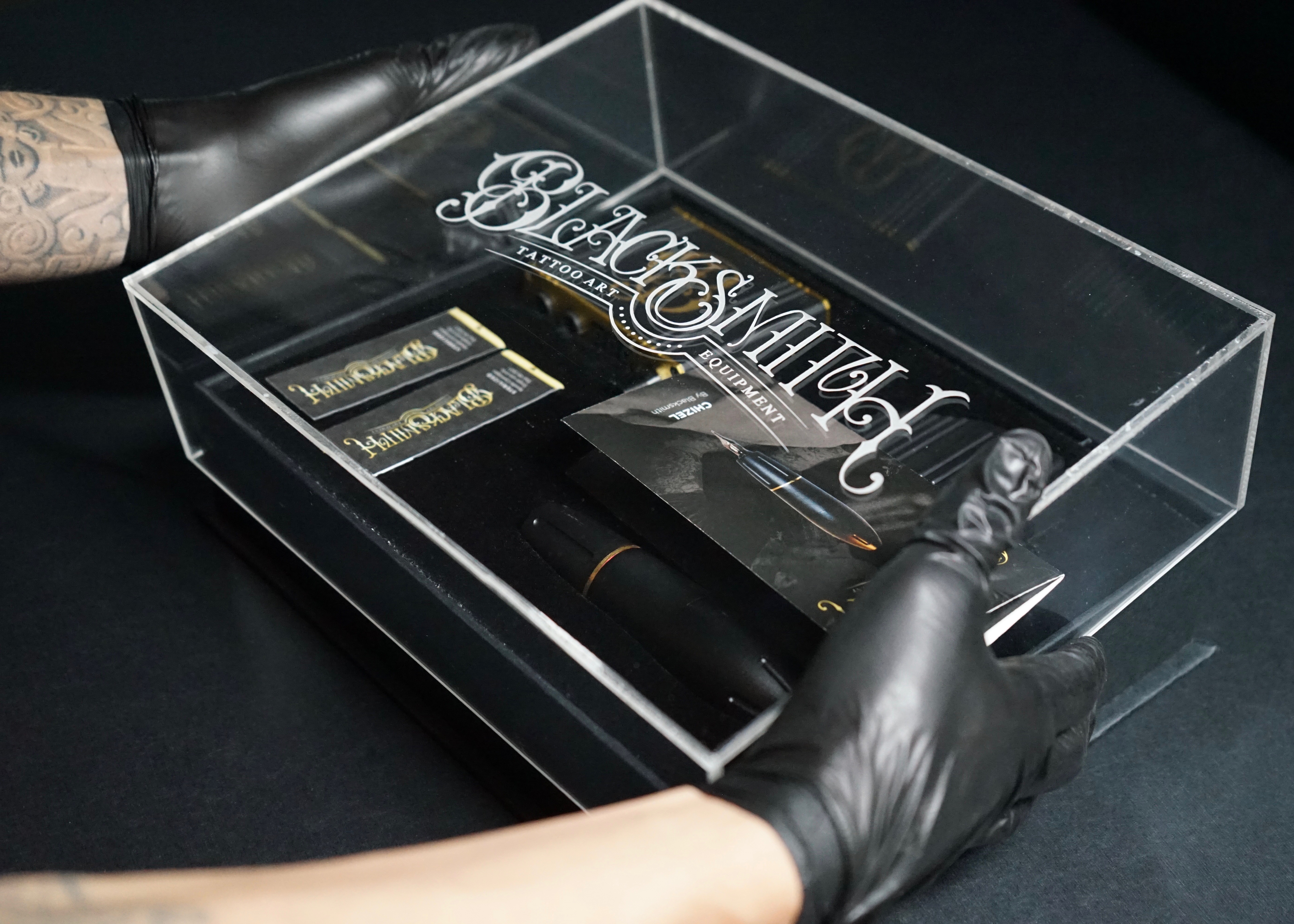
03 Blacksmith Tattoo Kit
Packaging + Lettering
(Package design/Branding/Form Making)
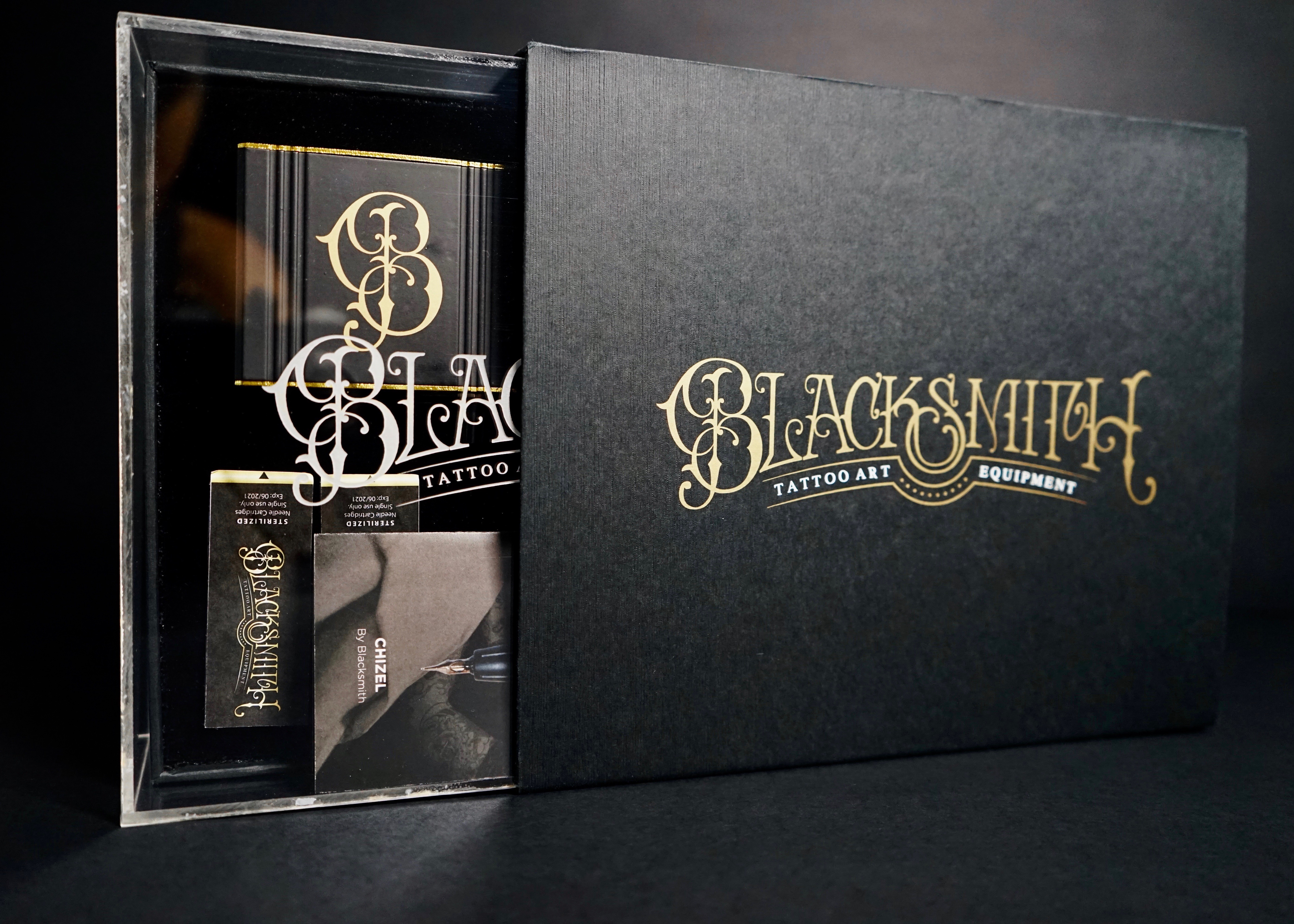
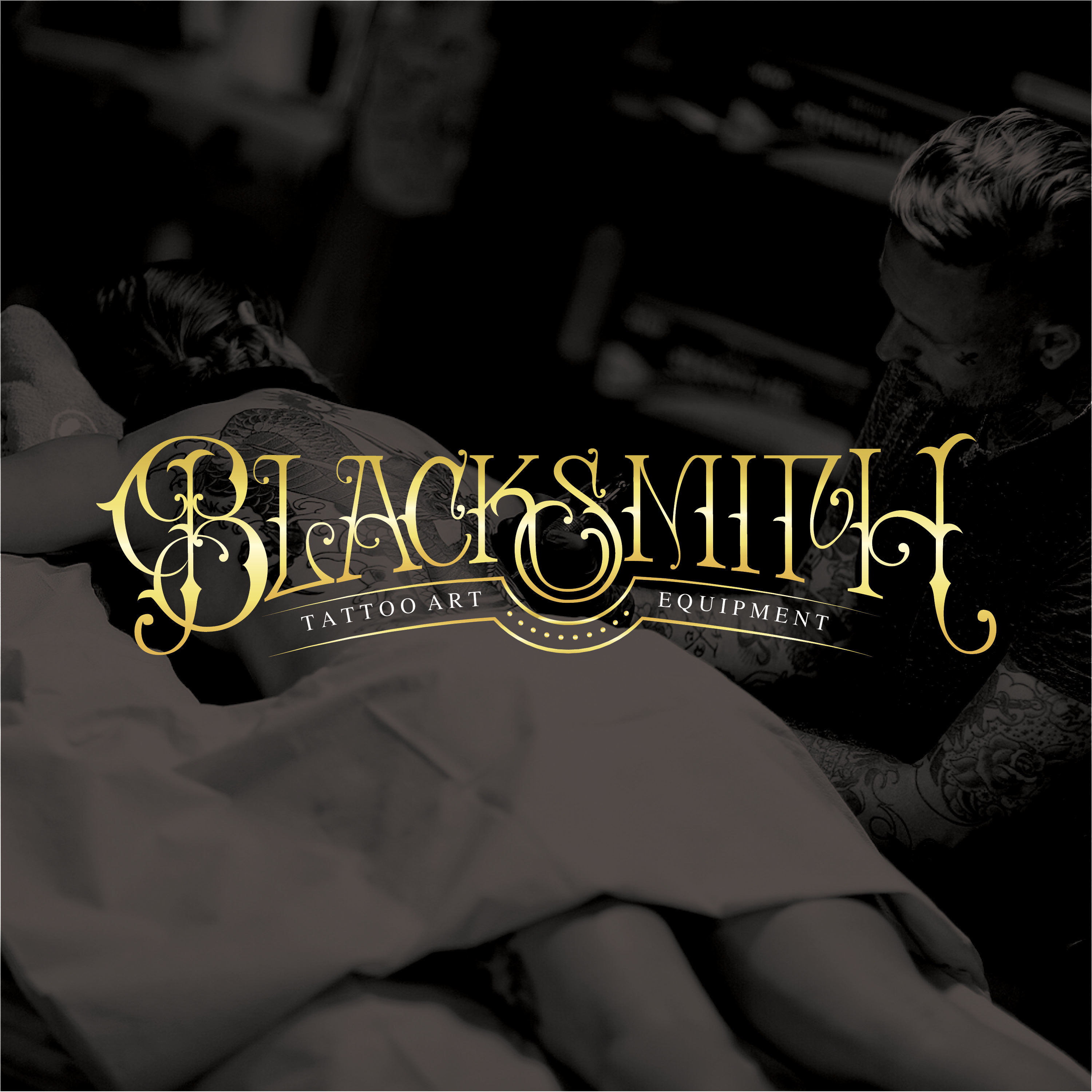
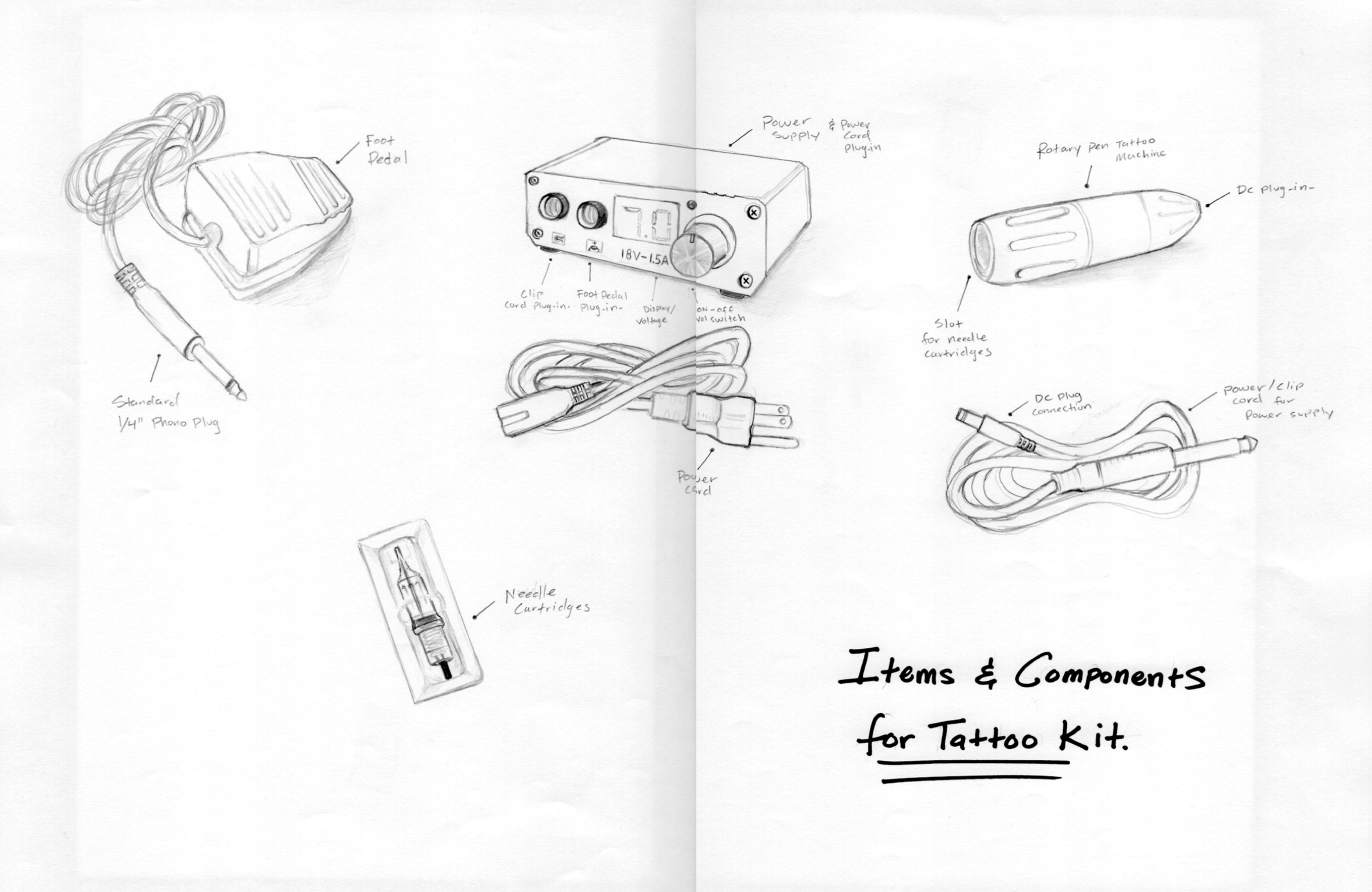
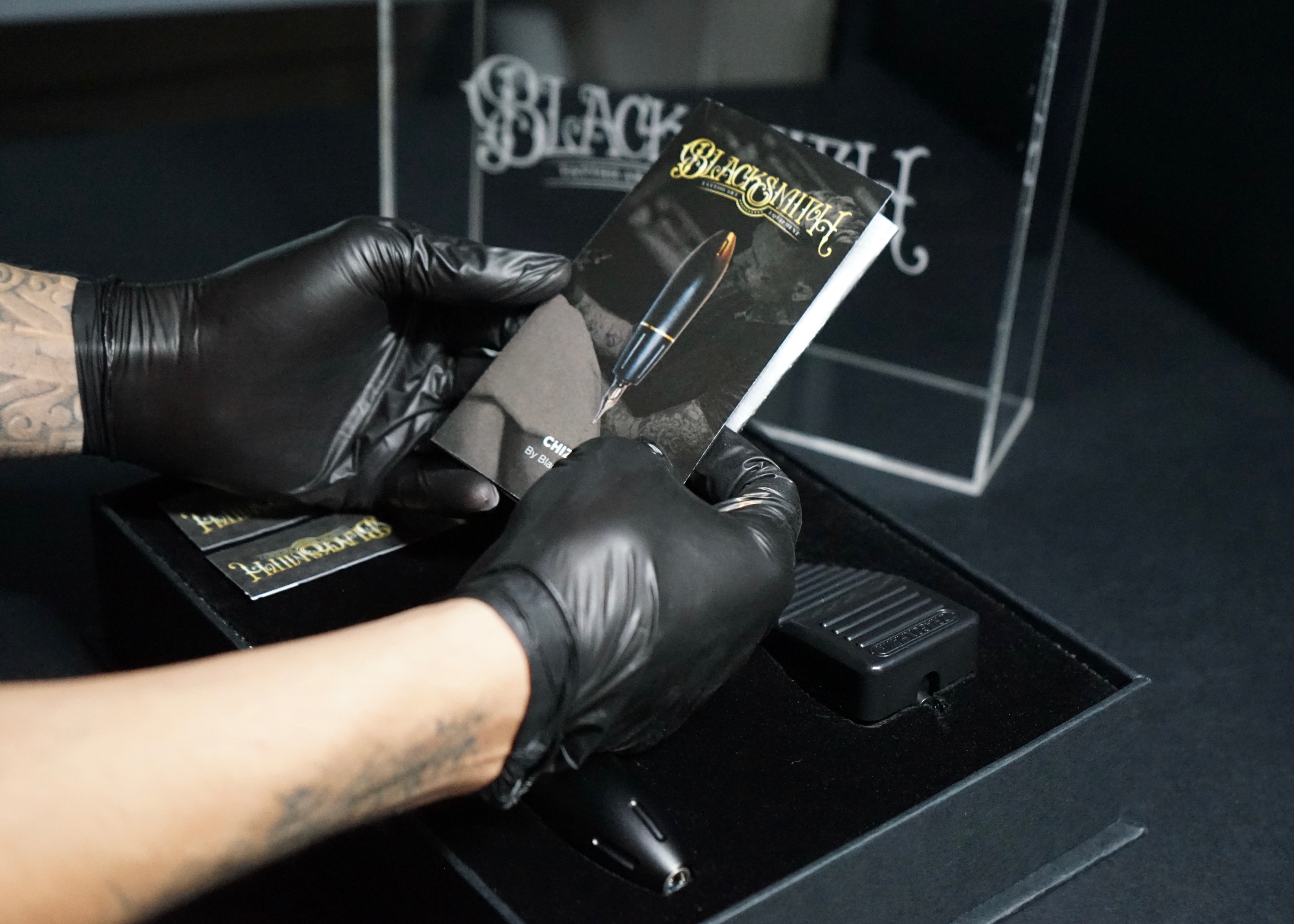
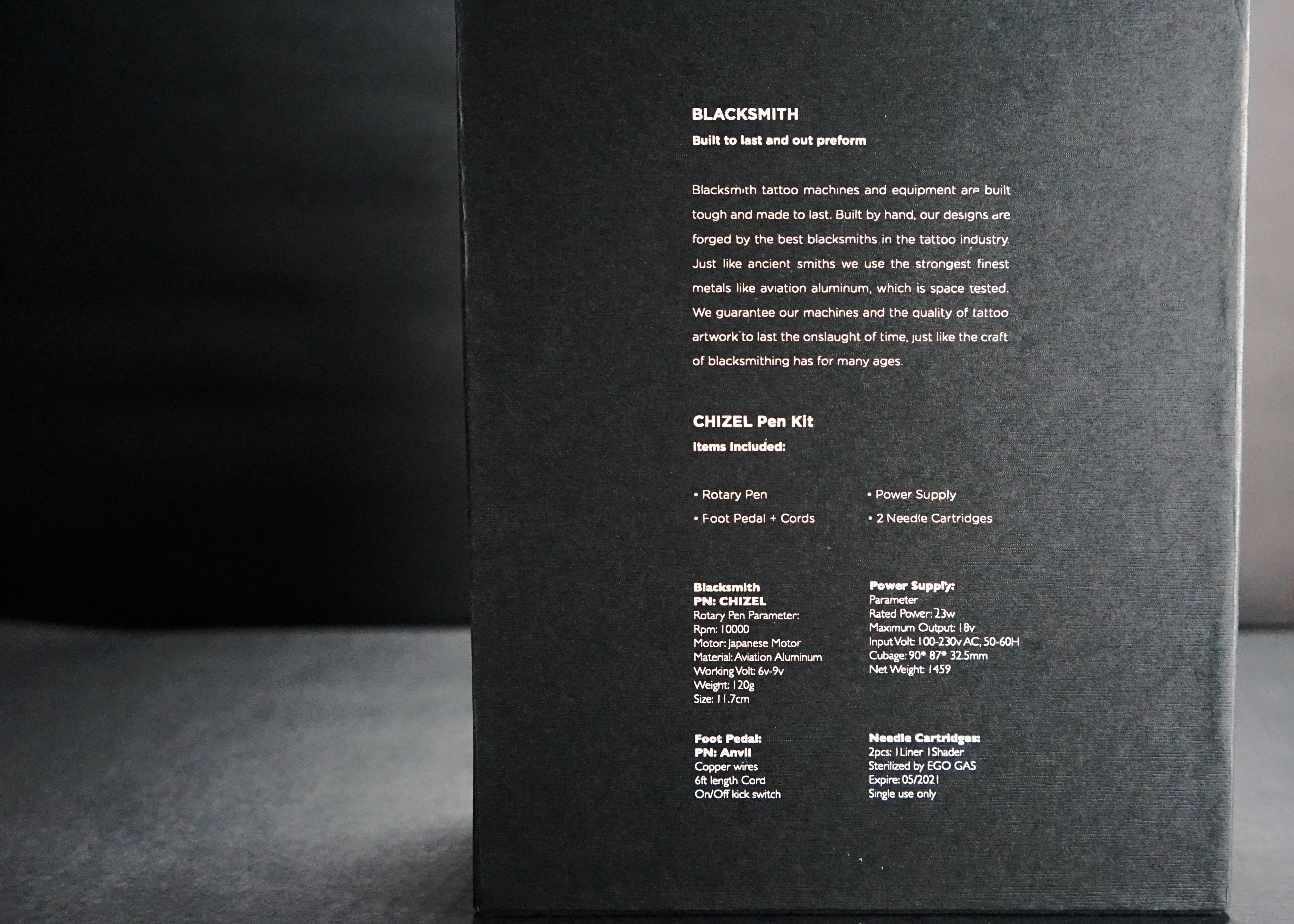
The goal was to design a brand identity mark and packaging system catered to tattoo artists. The packaging is equipped to house four components. This tattoo kit includes a rotary pen machine, power supply + cords, 1 foot petal, and 2 needle cartridges. With this specific kit, artist of more traditional equipment and style could transition more easily. The stress it would relieve on the hand due to lower vibration intensity would help the accuracy and quality of tattoos causing less fatigue and damage to the skin.
Credits:
*Hypothetical project for educational purposes only!
*Not for sale or Reproduction!
My Role: Package Design + Lettering
Photography: Erron Estrada
(Package design/Branding/Form Making)
The goal was to design a brand identity mark and packaging system catered to tattoo artists. The packaging is equipped to house four components. This tattoo kit includes a rotary pen machine, power supply + cords, 1 foot petal, and 2 needle cartridges. With this specific kit, artist of more traditional equipment and style could transition more easily. The stress it would relieve on the hand due to lower vibration intensity would help the accuracy and quality of tattoos causing less fatigue and damage to the skin.
Credits:
*Hypothetical project for educational purposes only!
*Not for sale or Reproduction!
My Role: Package Design + Lettering
Photography: Erron Estrada
Sketches + Form Making
My passion for lettering always begins with sketches. I drew out 17 iterations that best suited the logotype for a tattoo supply company. I then tried a few conceptual options for a packaging case that would house the multiple components. The final case was constructed from materials such as book board, foam padding, velvet lining, wood grain 80lb cover stock, and an acrylic casing, which were all form fitted to existing tattoo equipment.
My passion for lettering always begins with sketches. I drew out 17 iterations that best suited the logotype for a tattoo supply company. I then tried a few conceptual options for a packaging case that would house the multiple components. The final case was constructed from materials such as book board, foam padding, velvet lining, wood grain 80lb cover stock, and an acrylic casing, which were all form fitted to existing tattoo equipment.
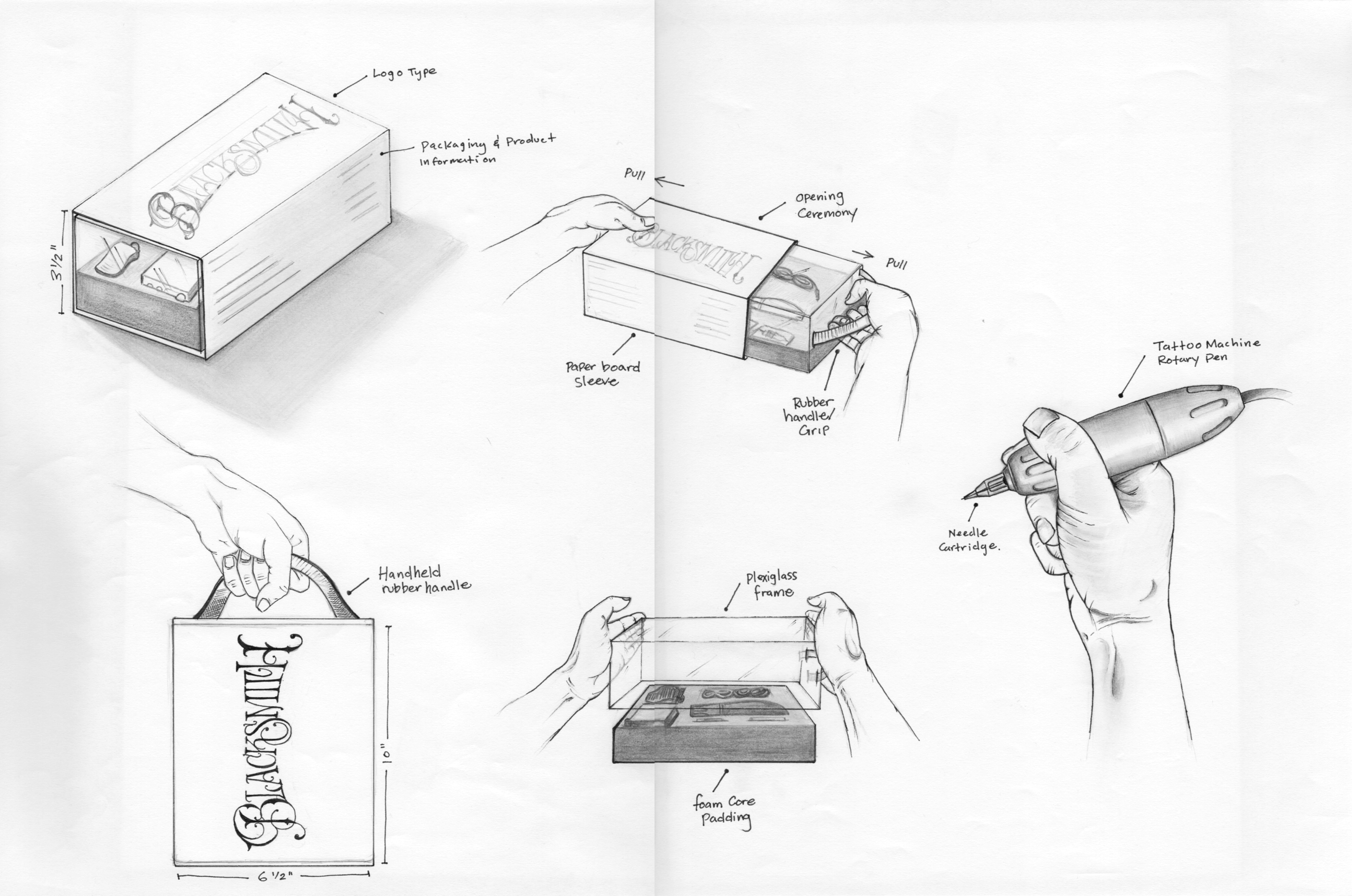
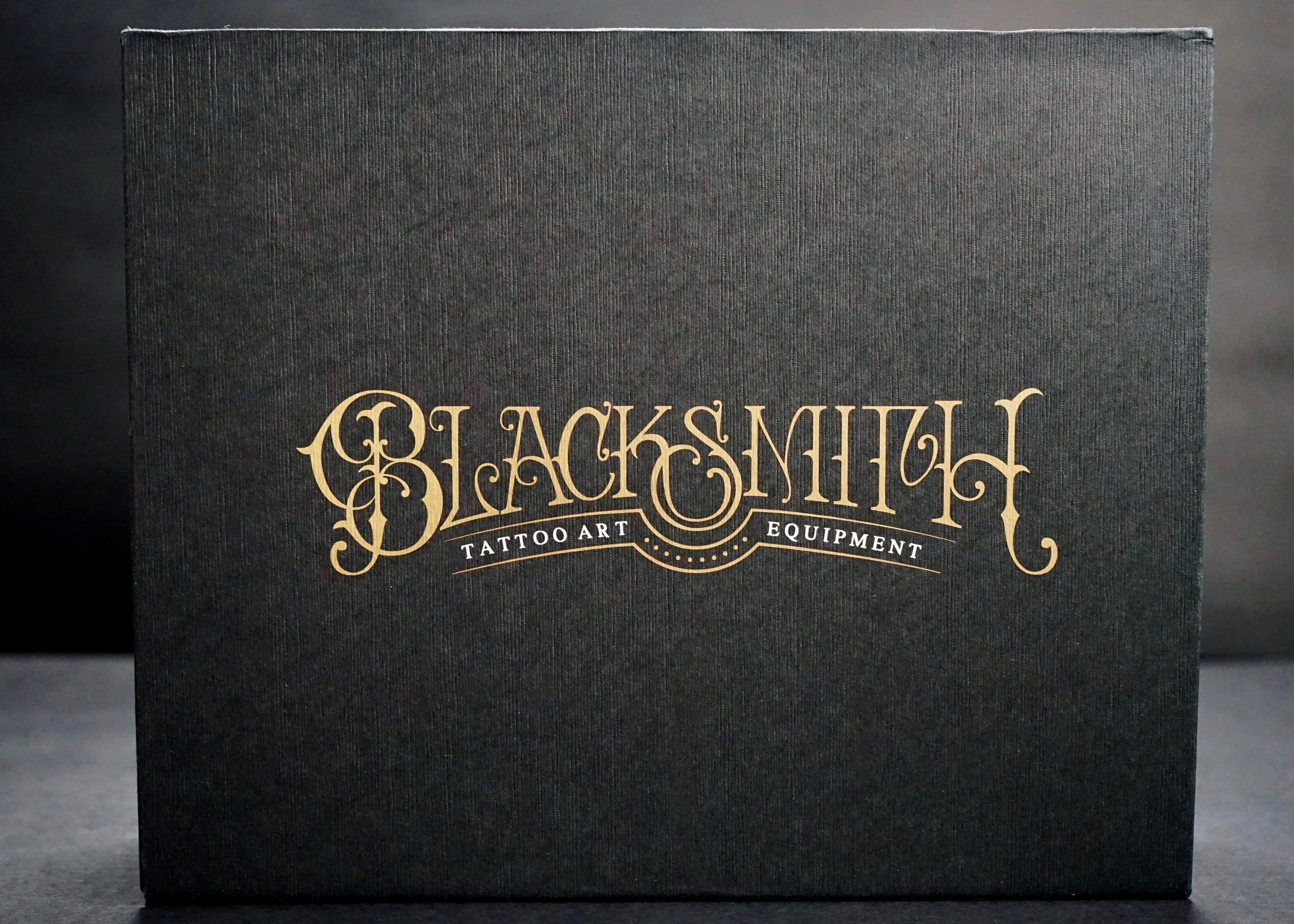
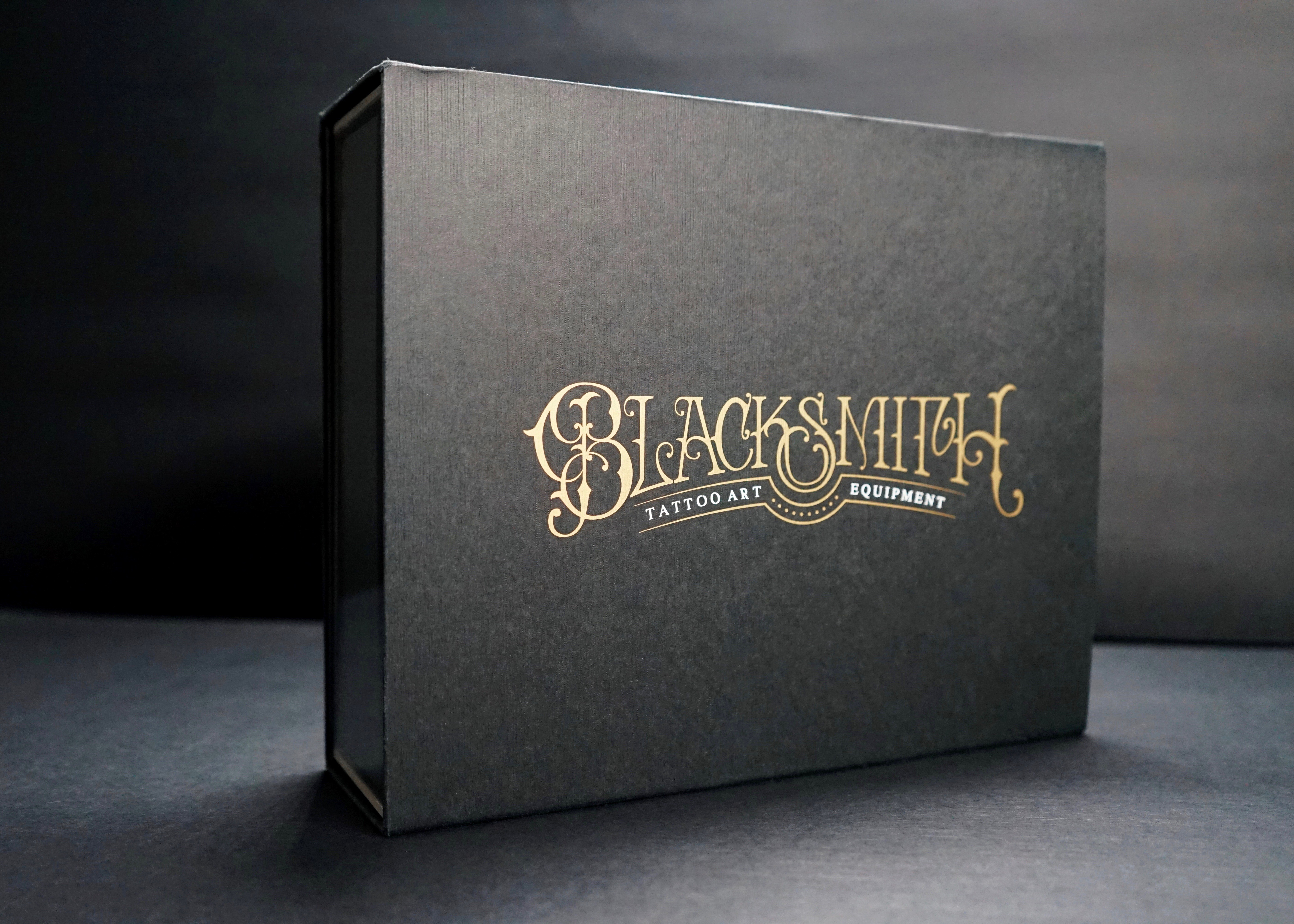
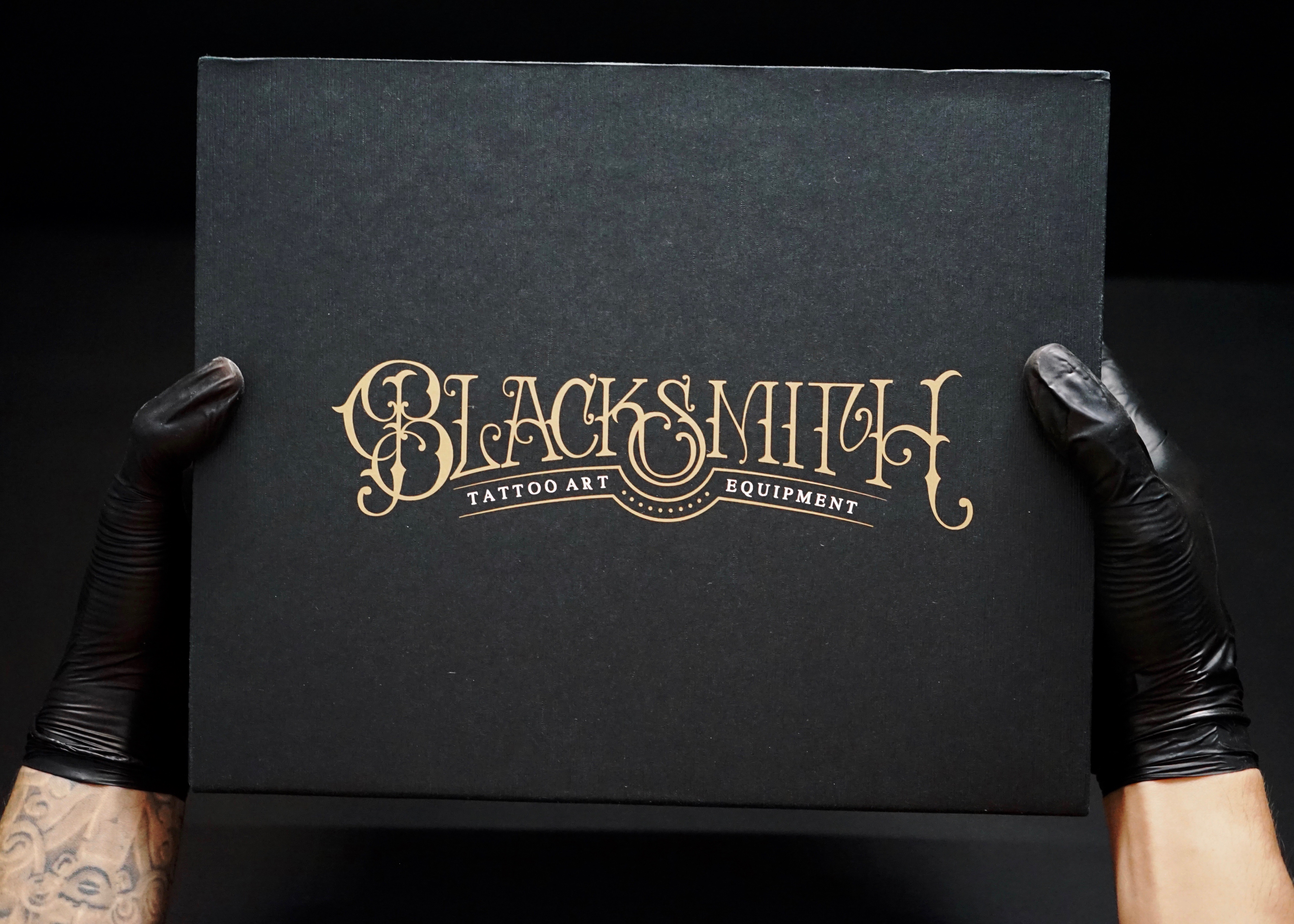
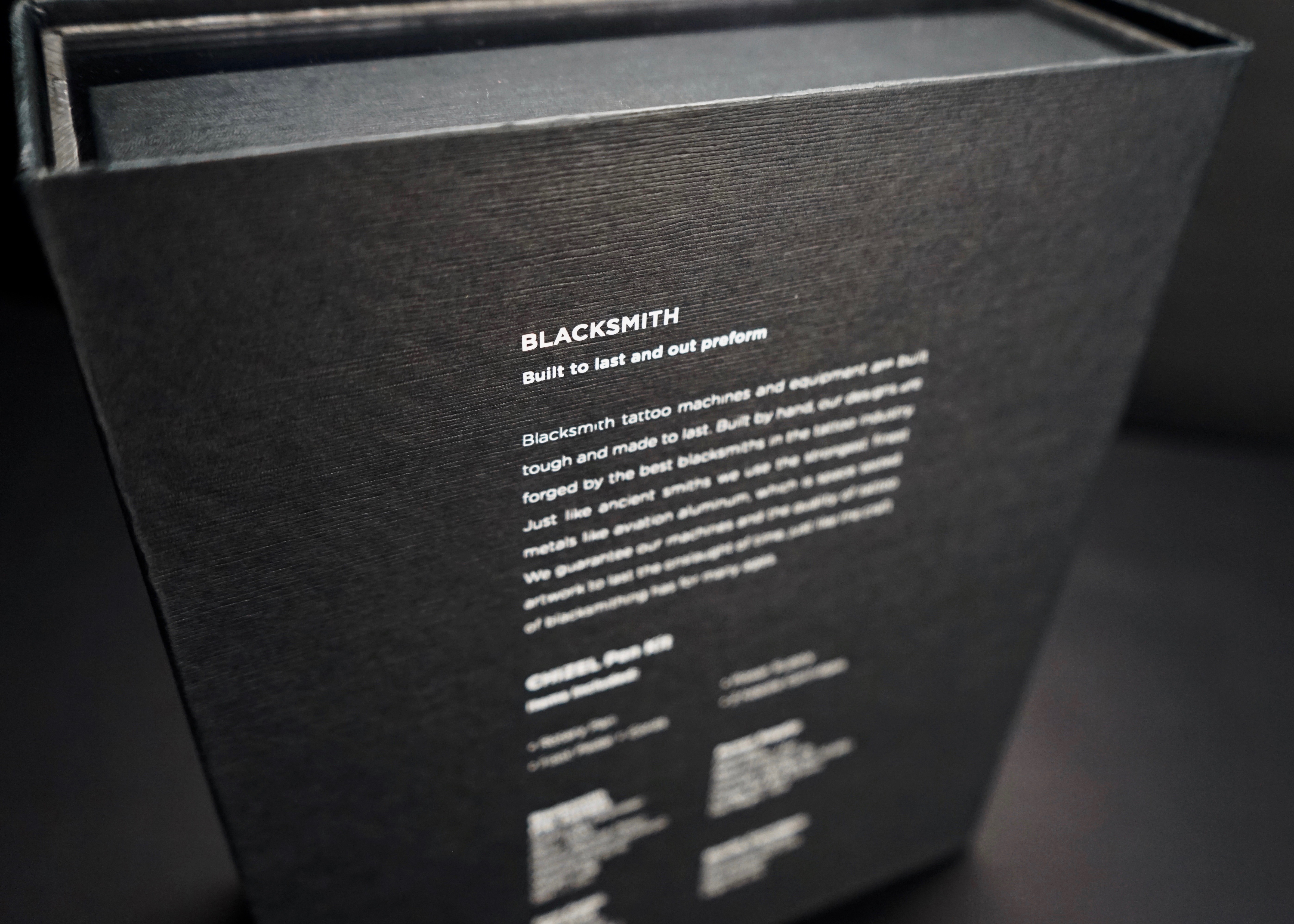
Front Outer Casing + Backside Description
Exterior Signage + Interior Shop

Opening Ceremony
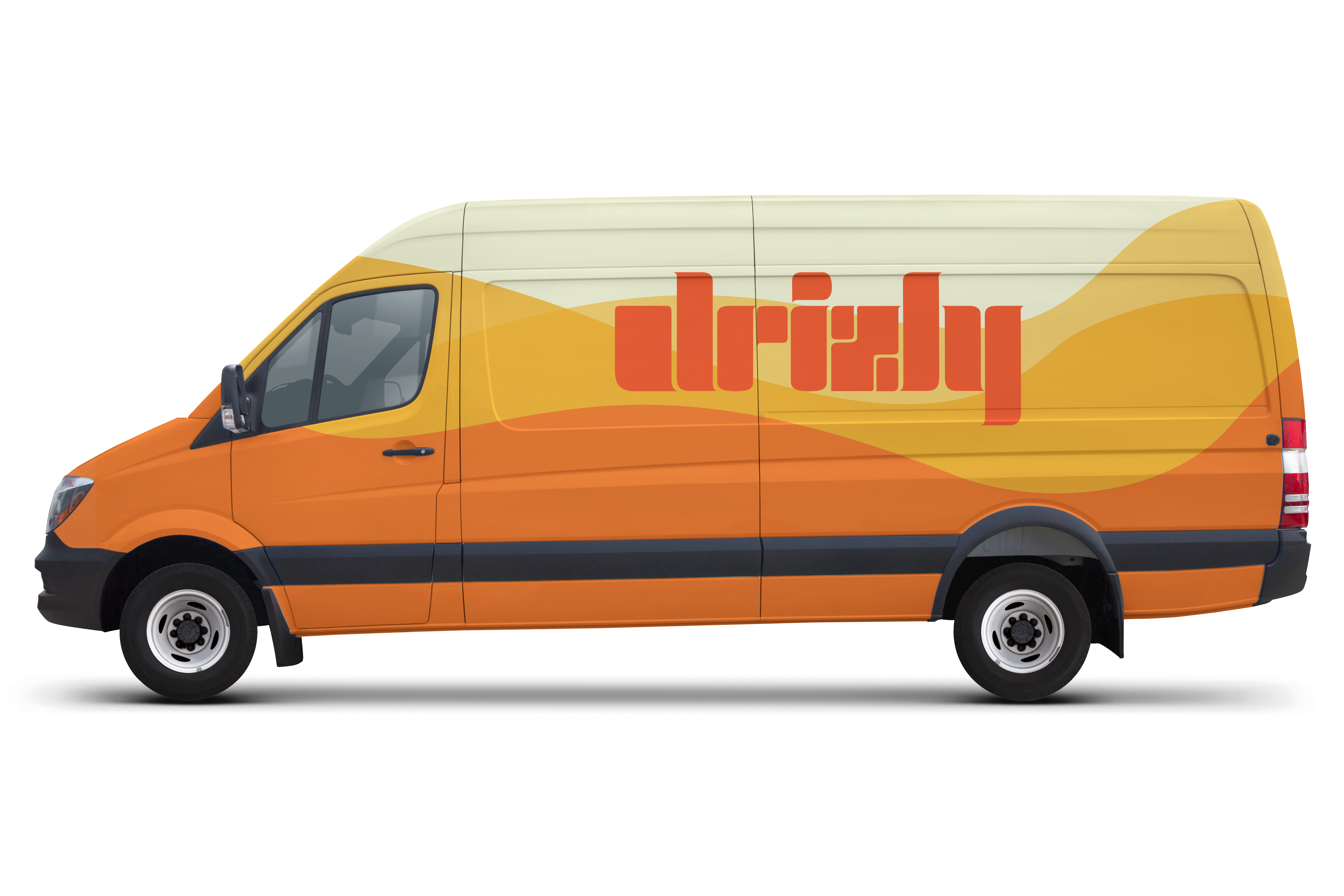
04 Drizly App
Rebrand + Visual Identity
(Digital/UI/UX/Print)
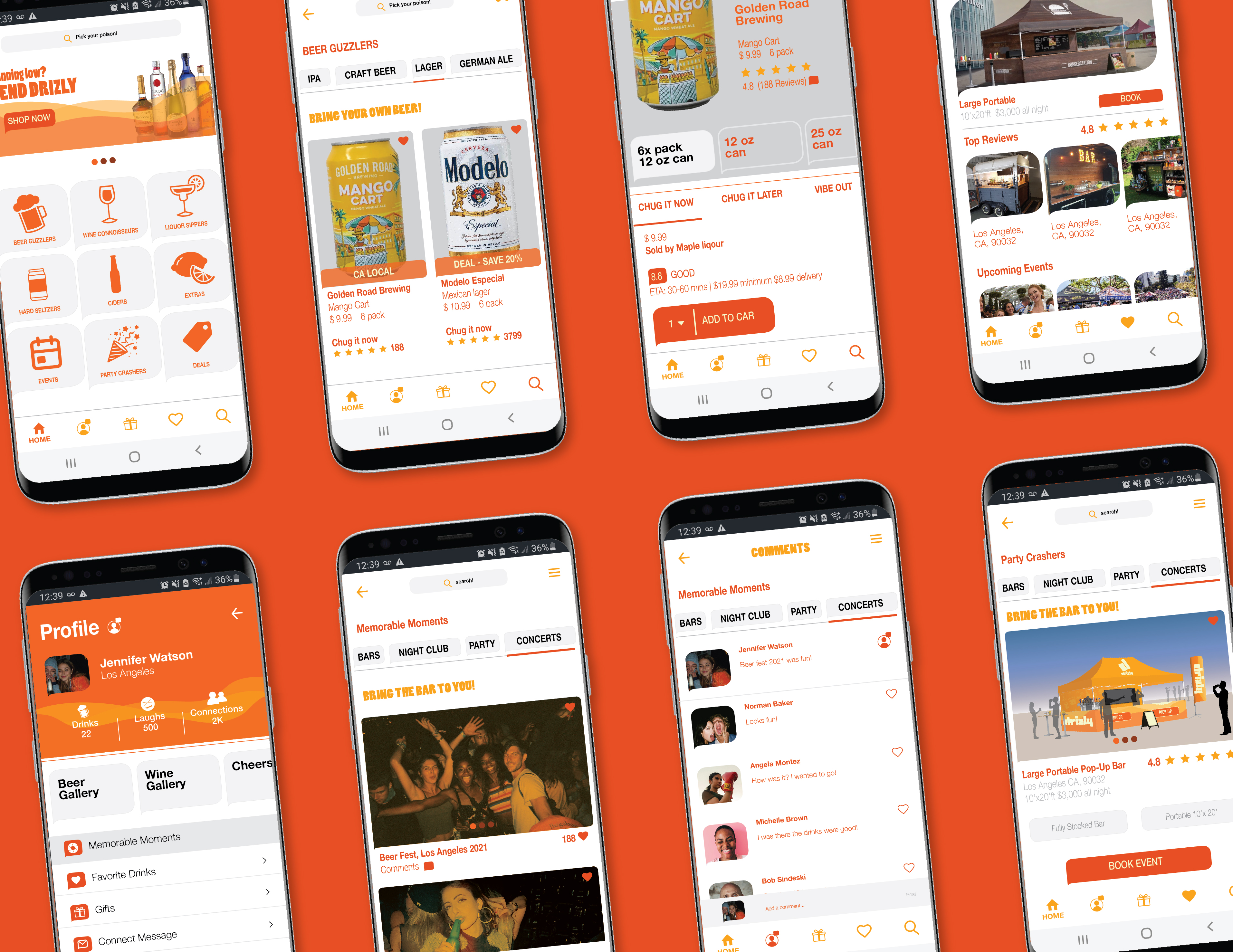
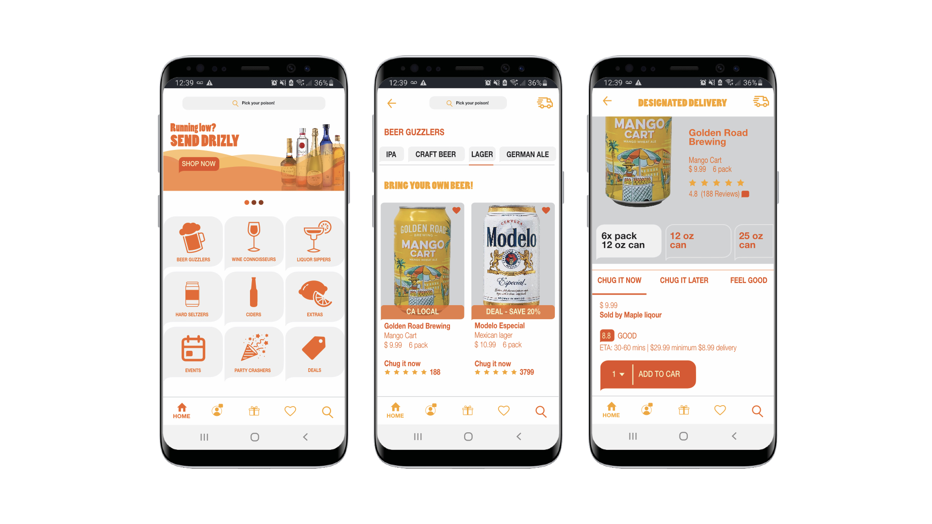
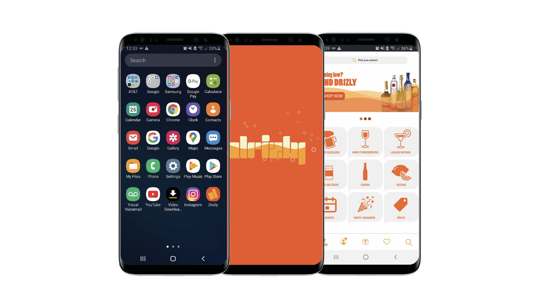
The goal was to rebrand an existing mobile app. I chose the largest on demand alcohol delivery service and marketplace app “Drizly”.
(Digital/UI/UX/Print)
The goal was to rebrand an existing mobile app. I chose the largest on demand alcohol delivery service and marketplace app “Drizly”.
Credits:
*Hypothetical project for educational purposes only!
*Not for sale or Reproduction!
My Role: Rebrand Identity + UI UX + Motion
Motion Design: Erron Estrada + Jovan Estrada
Client: Hypothetically Drizly
*Hypothetical project for educational purposes only!
*Not for sale or Reproduction!
My Role: Rebrand Identity + UI UX + Motion
Motion Design: Erron Estrada + Jovan Estrada
Client: Hypothetically Drizly

Sketches + Icon System
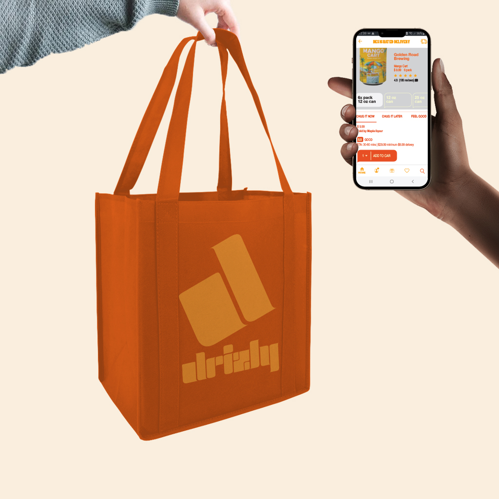
Developing multiple iterations of the letter “D” as a logo mark was the start of my sketching process. The logo mark resembles a speech or thought bubble, which represents communication between customers. I created an icon system consisting of beverage symbols that were utilized as pattern and buttons for the mobile app.
Developing multiple iterations of the letter “D” as a logo mark was the start of my sketching process. The logo mark resembles a speech or thought bubble, which represents communication between customers. I created an icon system consisting of beverage symbols that were utilized as pattern and buttons for the mobile app.
Logo Type + Lock-up + Icons + Buttons
![]()

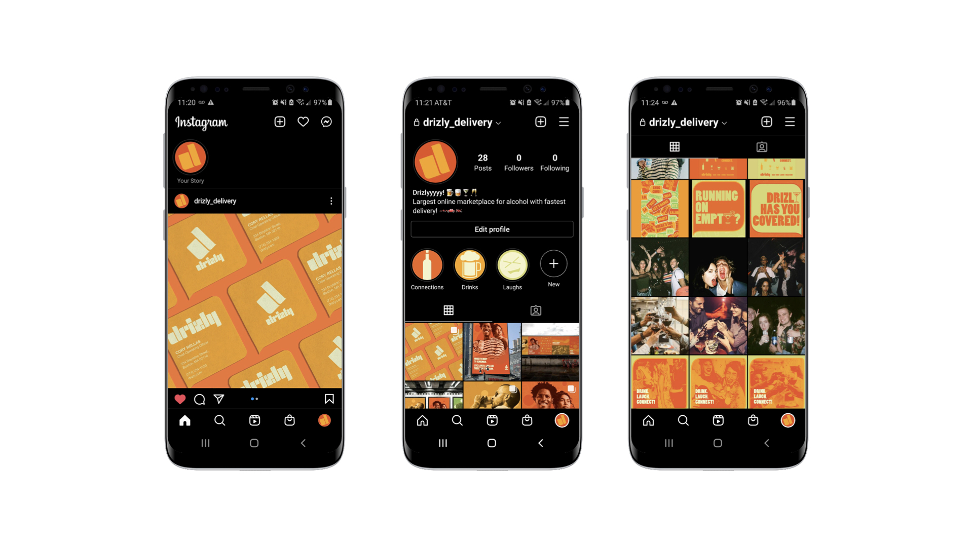
Mobile App + Instagram
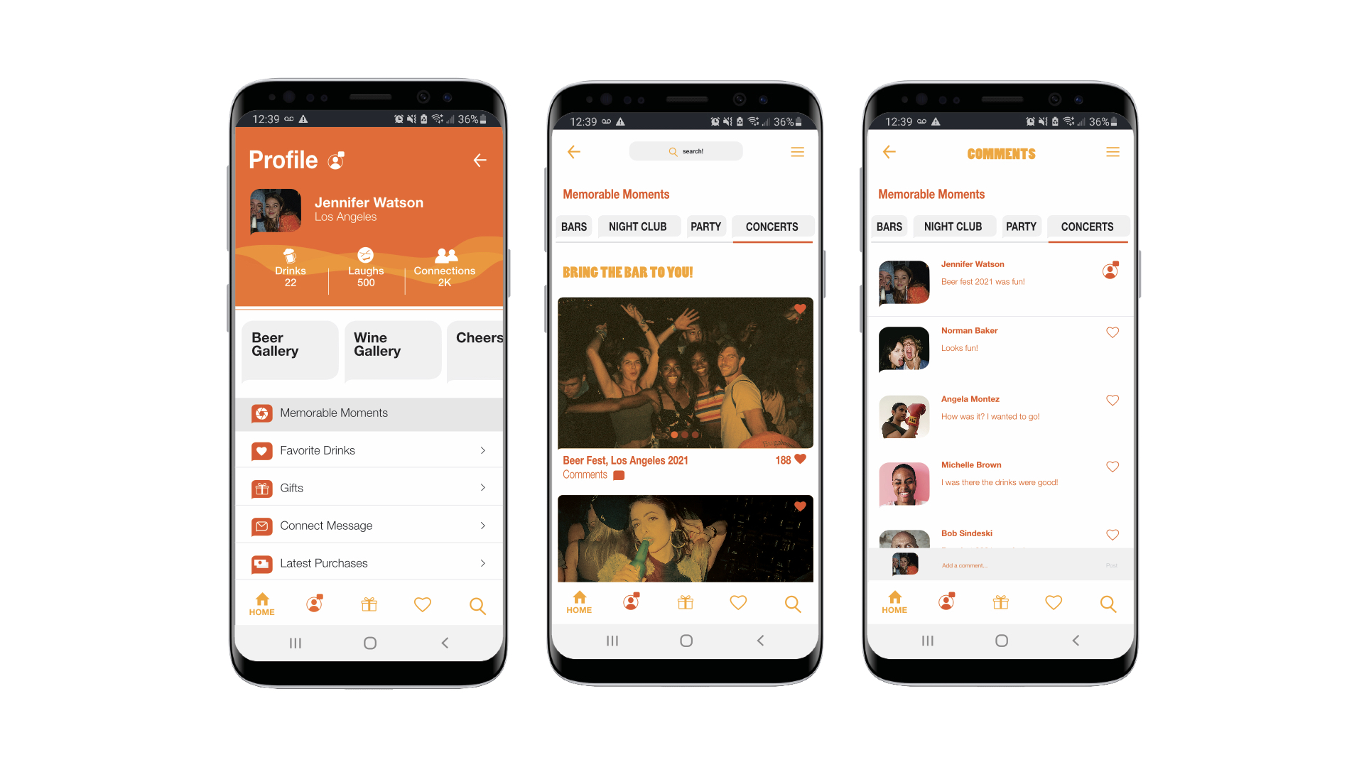
Developing a hypothetical functioning app was a challenge but was overcome by UI/UX integration. The app allows you to order alcohol or a pop-up bar and have it delivered, while simultaneously sharing memorable moments via your profile page.
Developing a hypothetical functioning app was a challenge but was overcome by UI/UX integration. The app allows you to order alcohol or a pop-up bar and have it delivered, while simultaneously sharing memorable moments via your profile page.
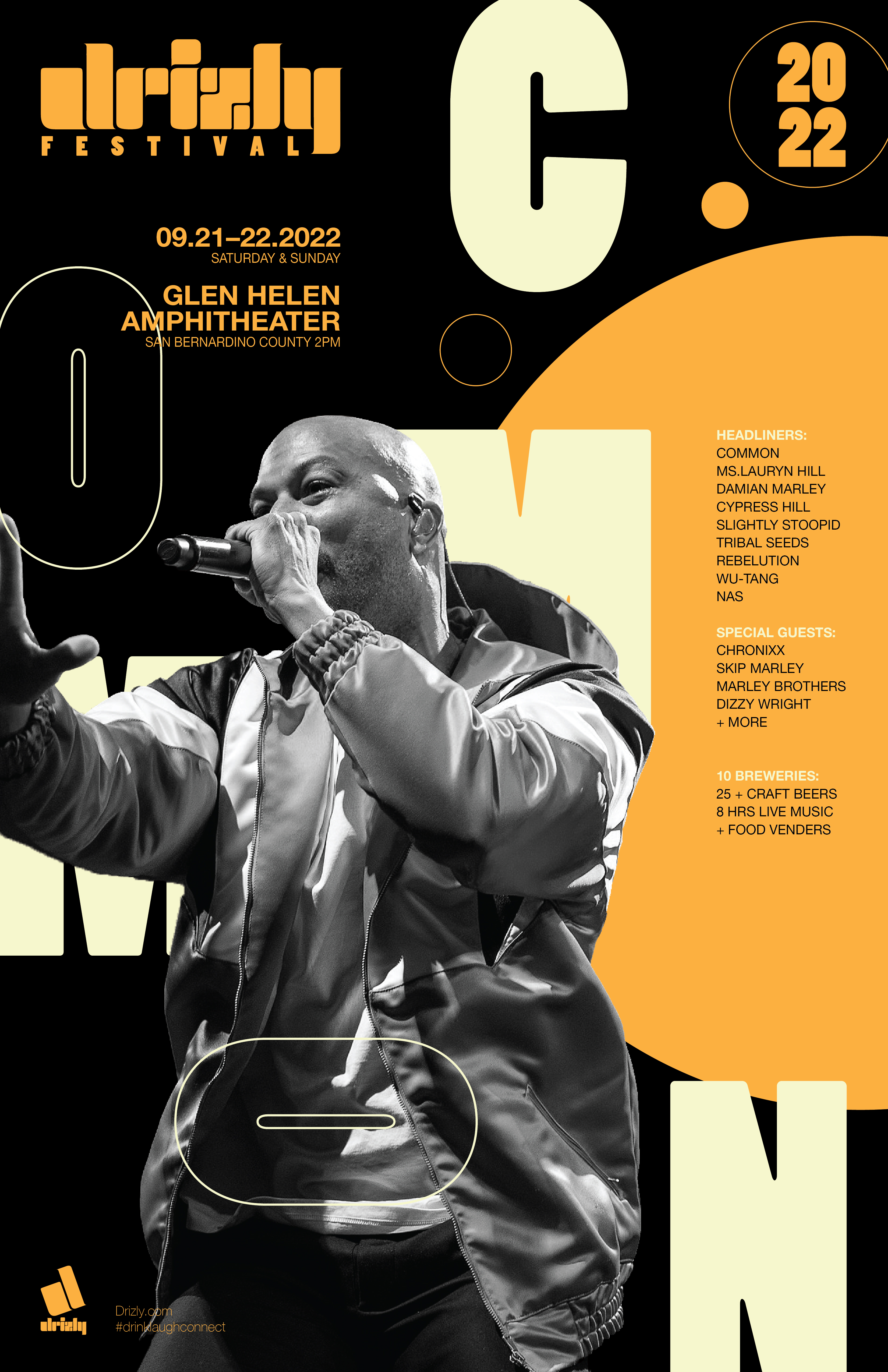
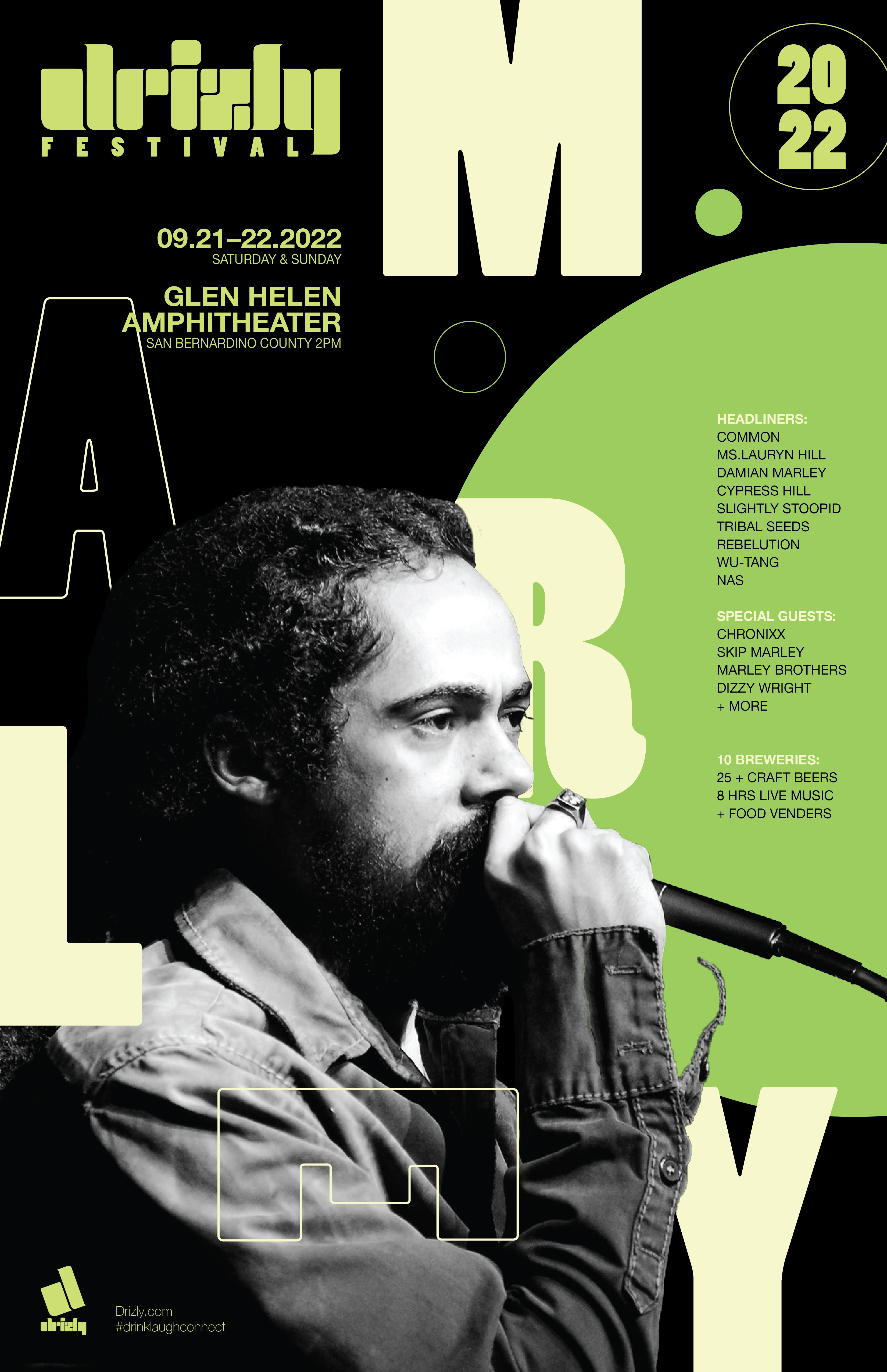
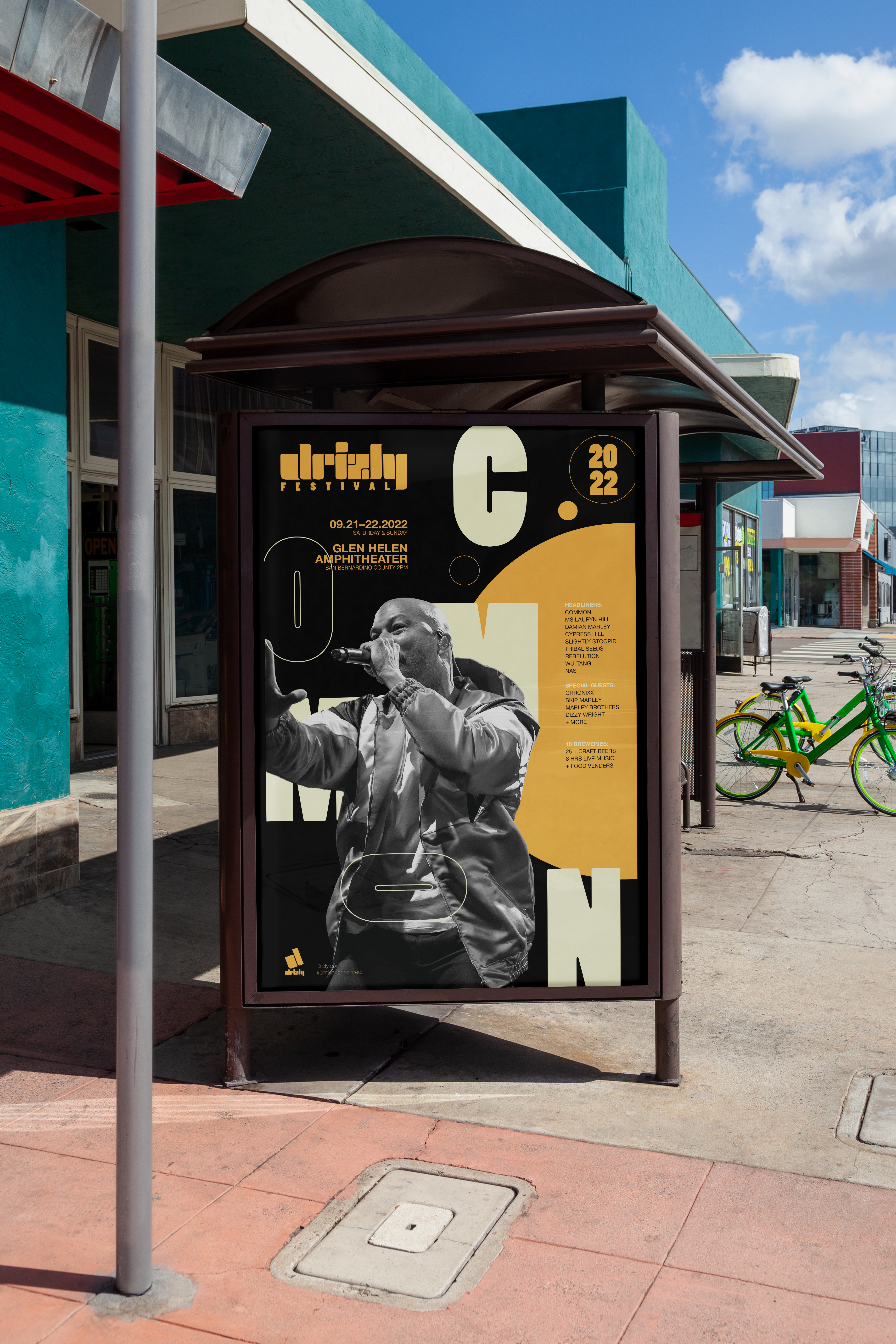
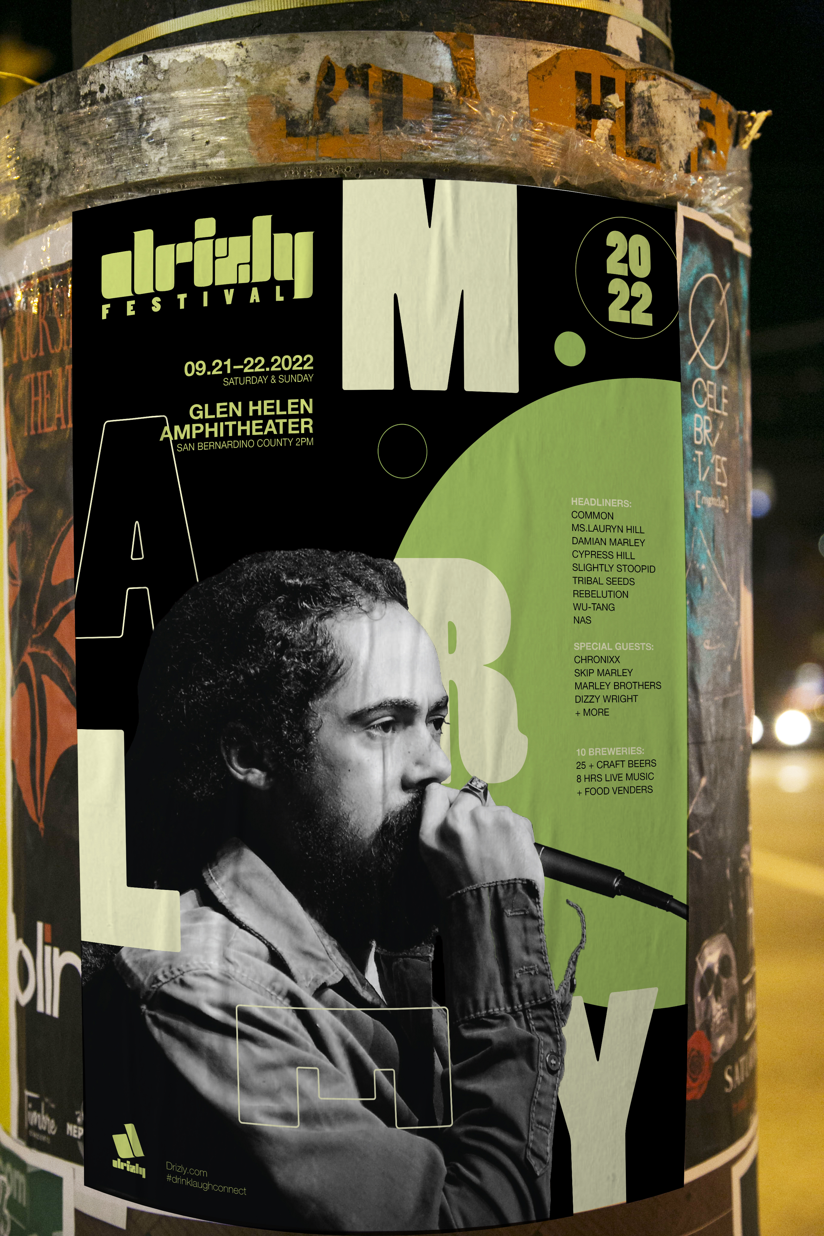
Promotional Campaign
This poster series highlights the essence of communication and interaction between people. The interaction indicates the act of social drinking and the good memories that come with it.
This poster series highlights the essence of communication and interaction between people. The interaction indicates the act of social drinking and the good memories that come with it.

Drizly Catering Service
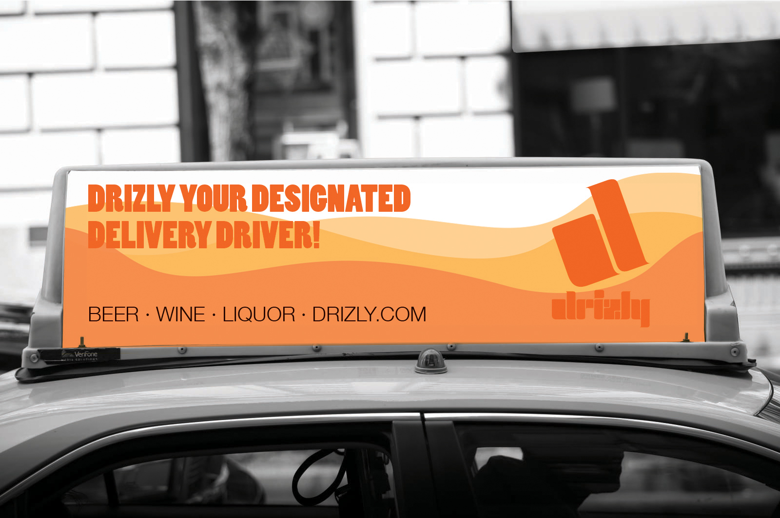
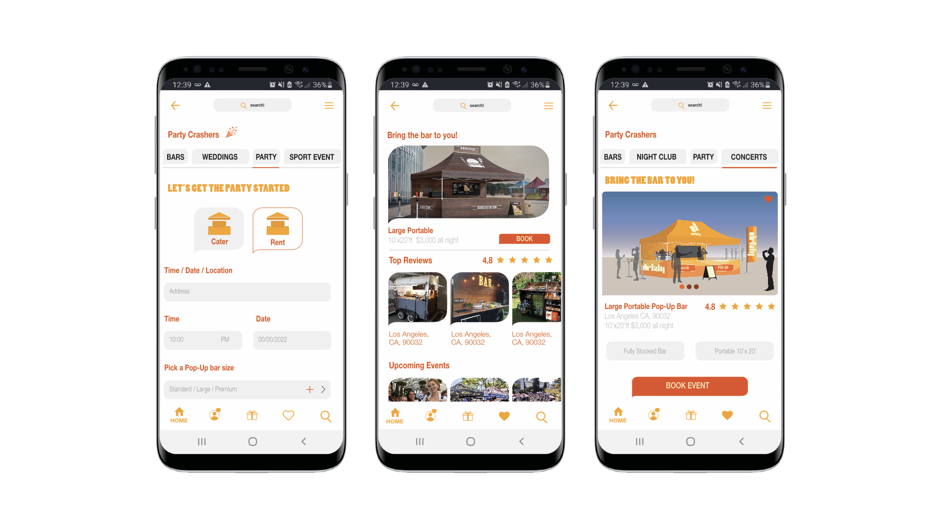
I hypothesized, what if Drizly could bring the bar to you? This exclusive service would allow app subscribers to rent mini to large scale pop-up bars delivered and set up by Drizly’s catering services.
I hypothesized, what if Drizly could bring the bar to you? This exclusive service would allow app subscribers to rent mini to large scale pop-up bars delivered and set up by Drizly’s catering services.
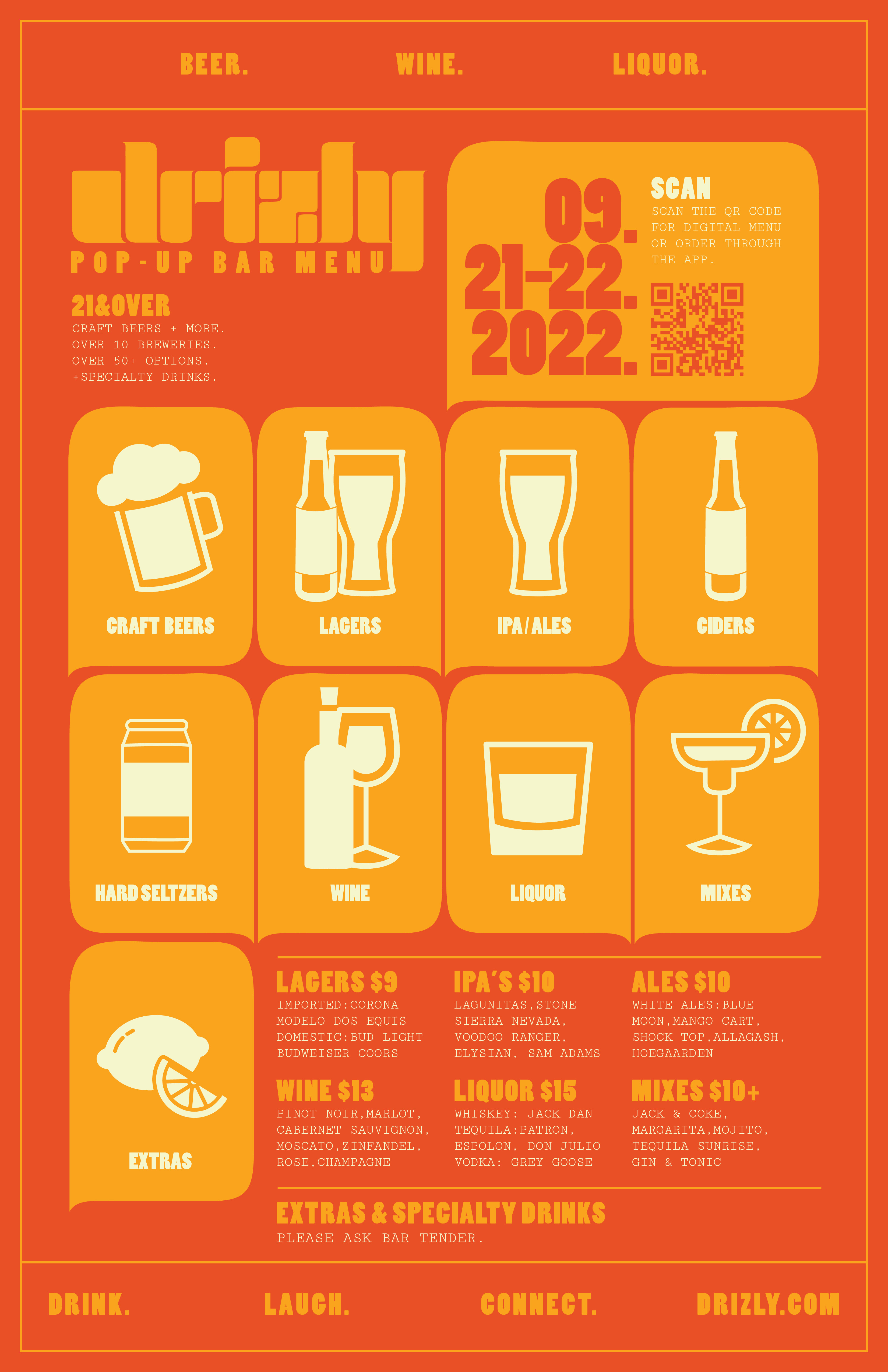
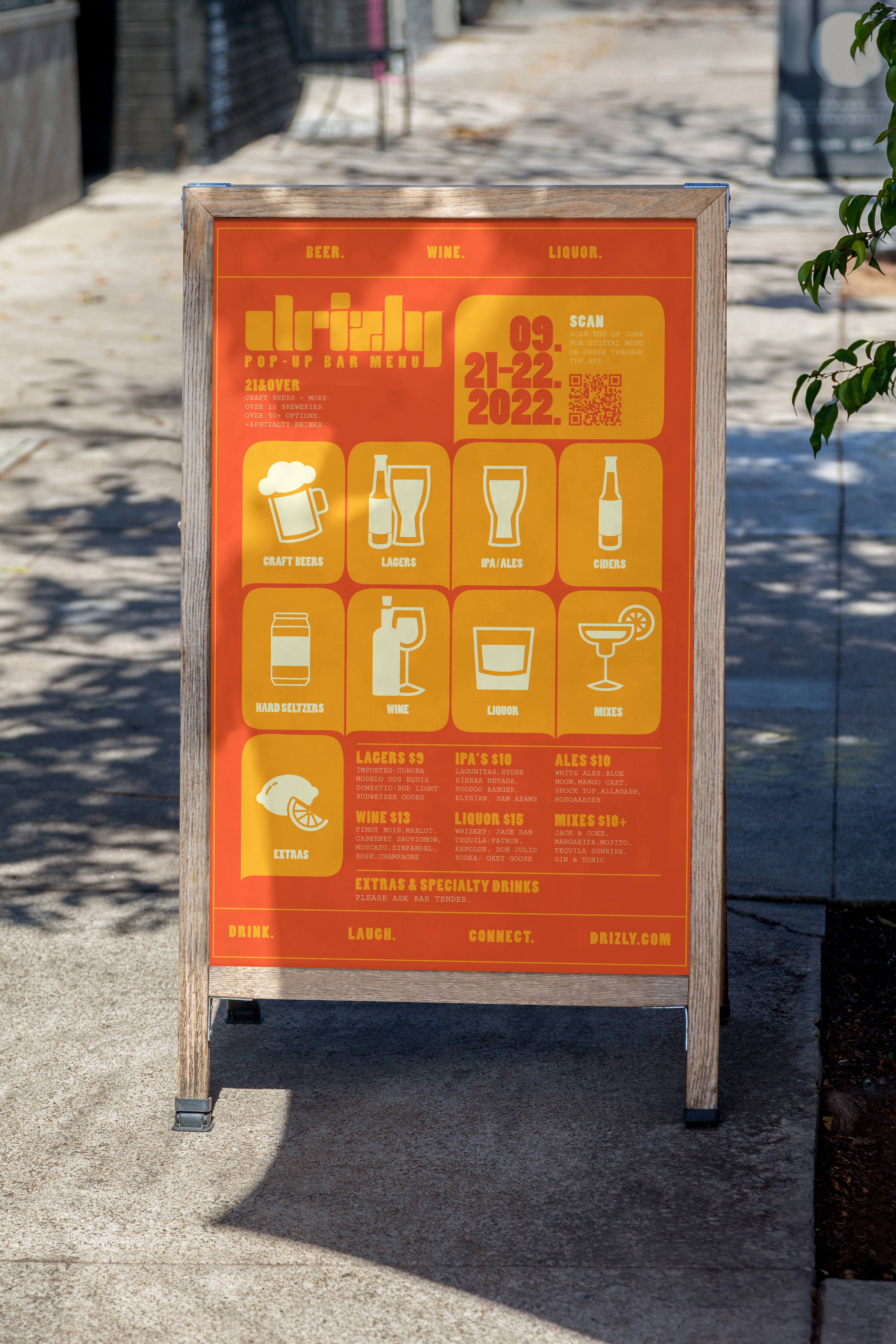
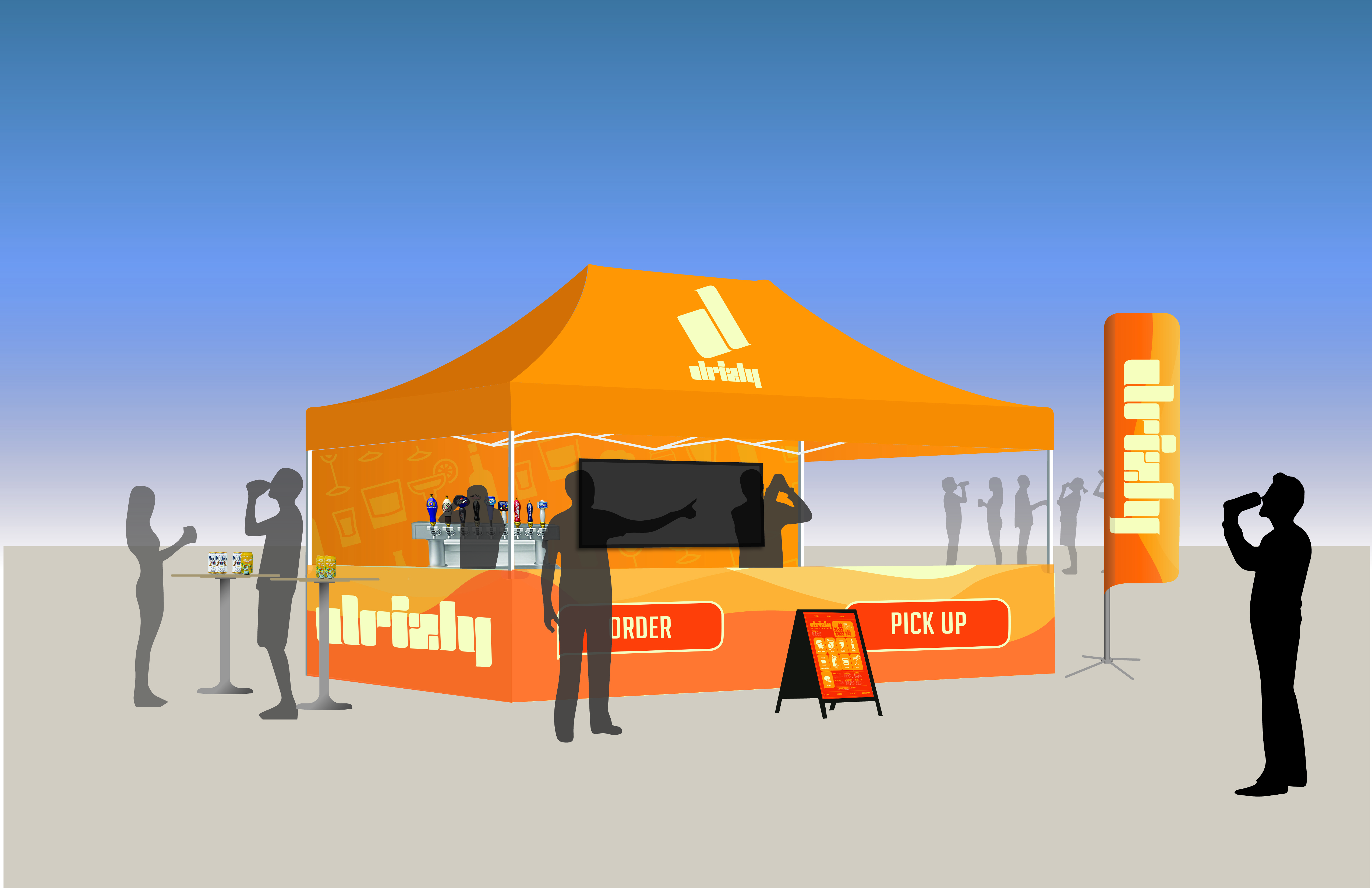
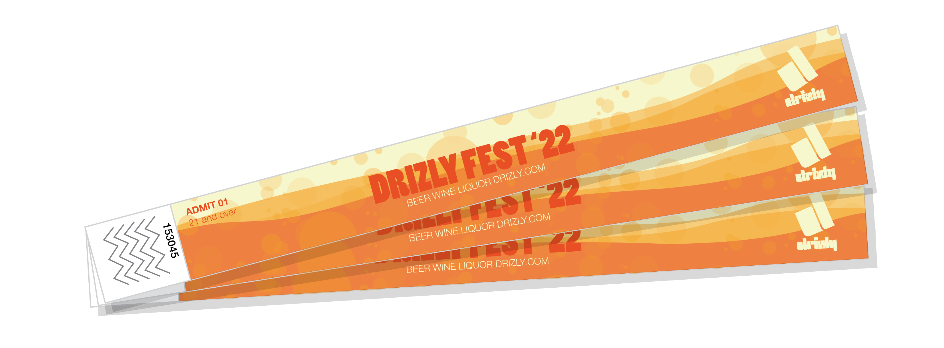
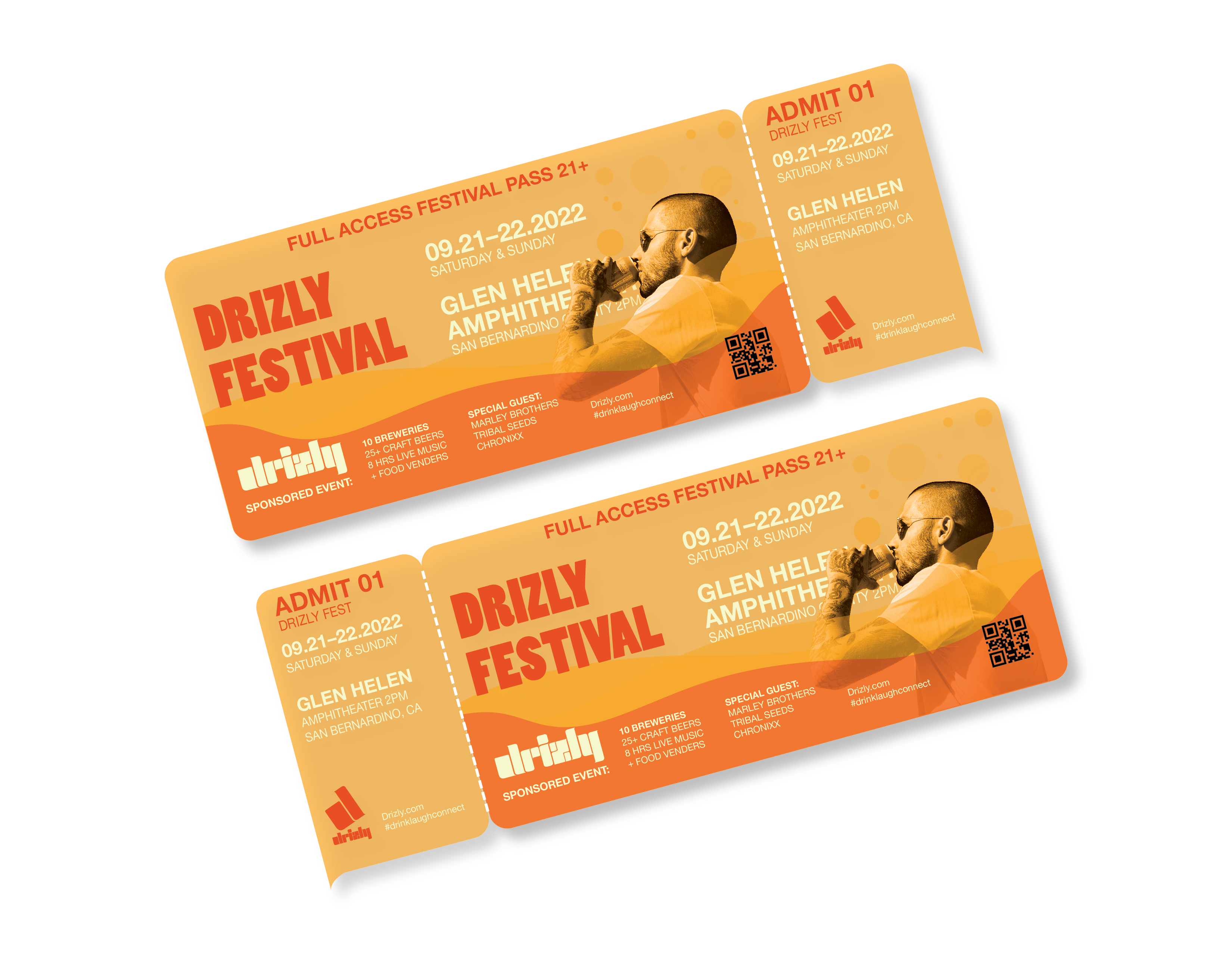
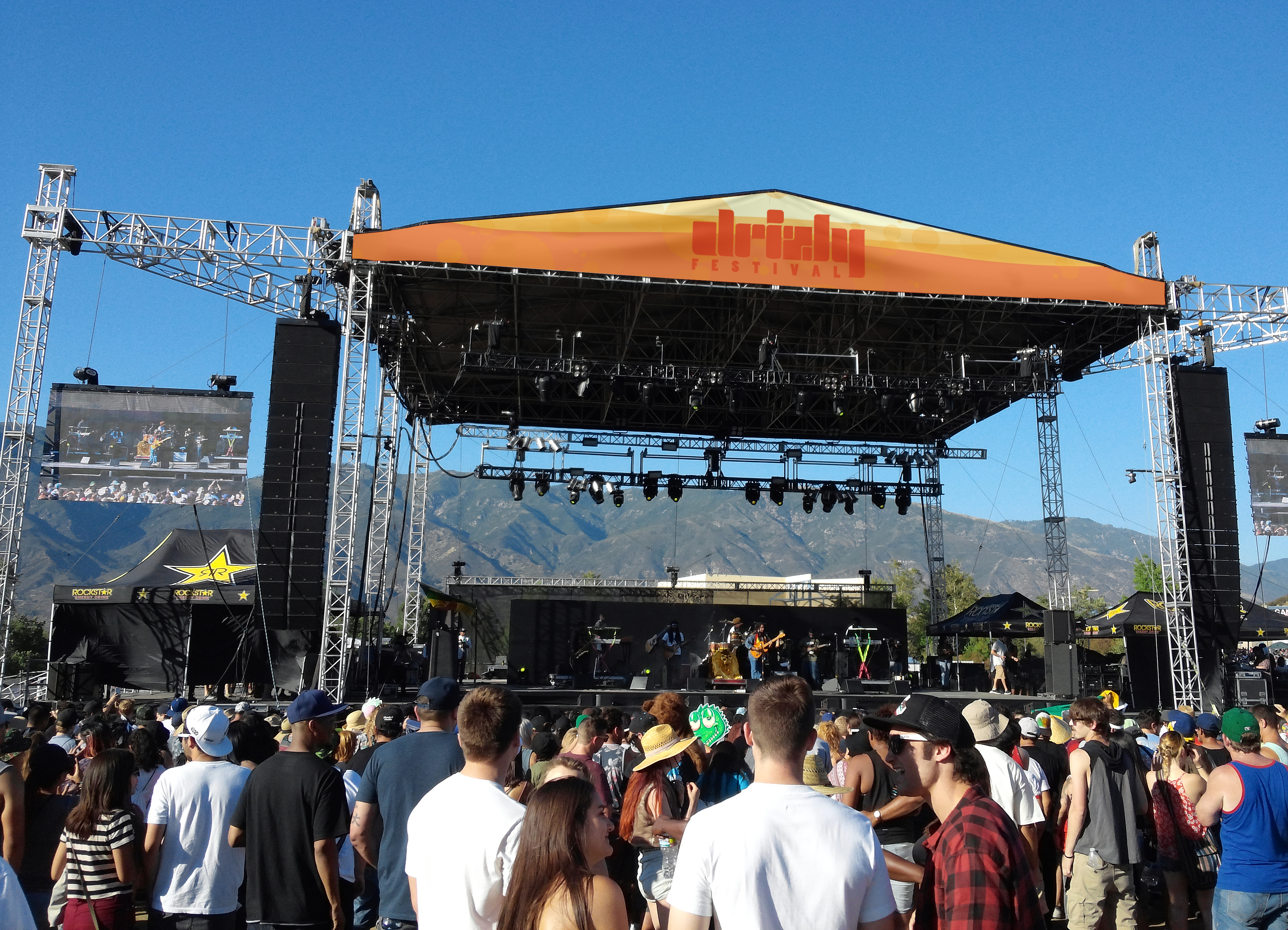
Drizly
Sponsored Events
I
also imagined Drizly as a sponsor of exclusive events like concerts, ballpark
stadium games, and a host of other various events. For example, I developed the
concept of Drizly Fest a sponsored music and craft beer festival.

05 Near Death Experience Skateboards
Branding + Cultural Identity + Editorial
(Print/Surface Design/Illustration/Apparel)
NDE is an indigenous owned and design inspired but not limited skateboarding brand. The goal was to design a cultural brand identity and product deliverables catered to skateboarding culture.
Credits:
*Hypothetical project for educational purposes only!
*Not for sale or Reproduction!
My Role: Brand Identity + Creative Direction + Editorial
Models: Brian Gonzalez + Erron Estrada
Photography: Daniel De La Rosa + Erron Estrada
Collaborator: Igloo Products Corp.
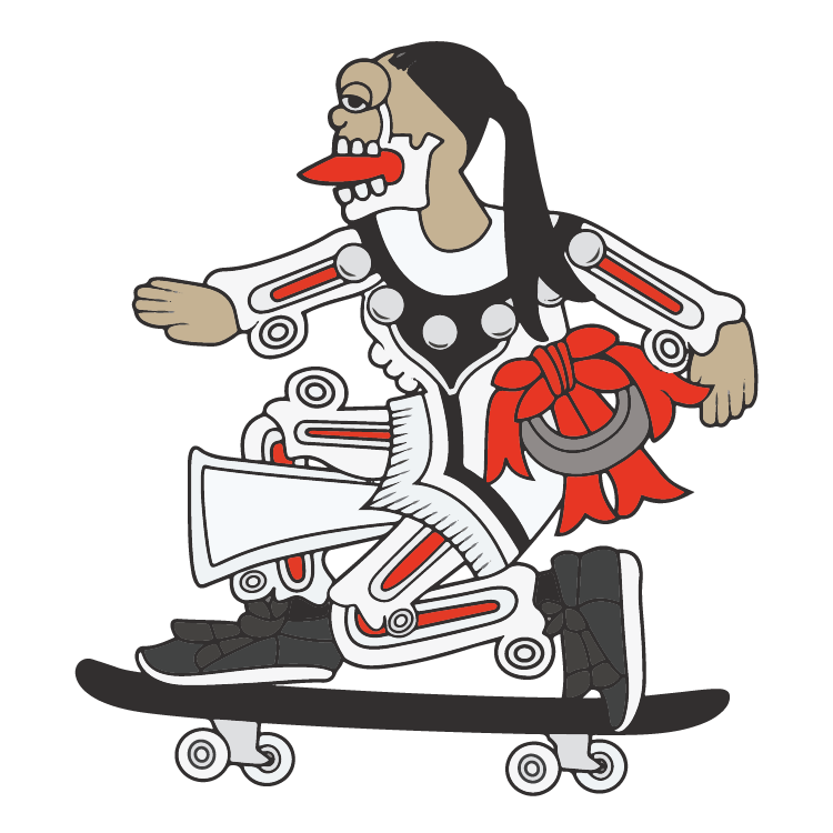
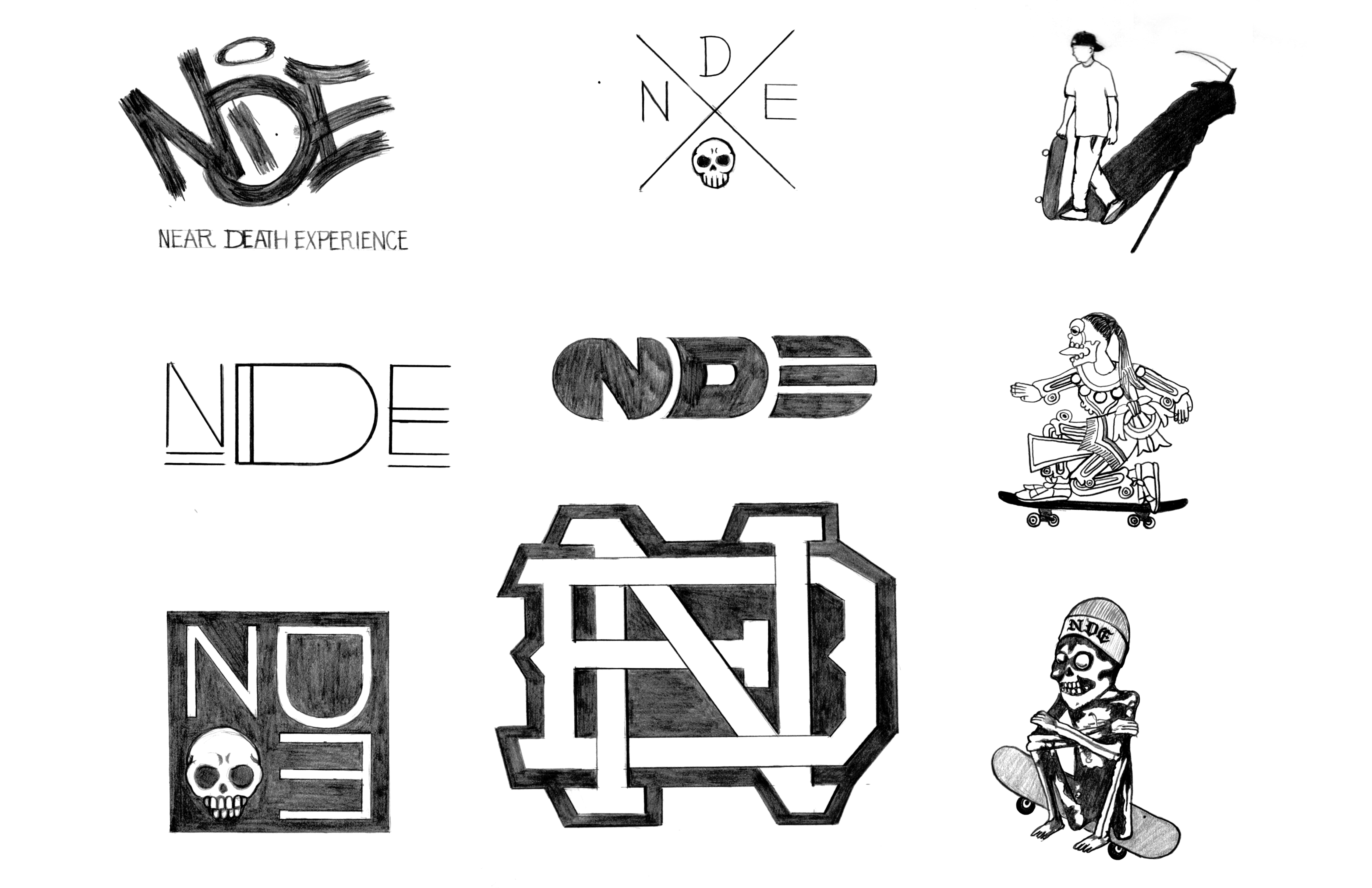
Mictlantecuhtli: Aztec god of the dead
Logo
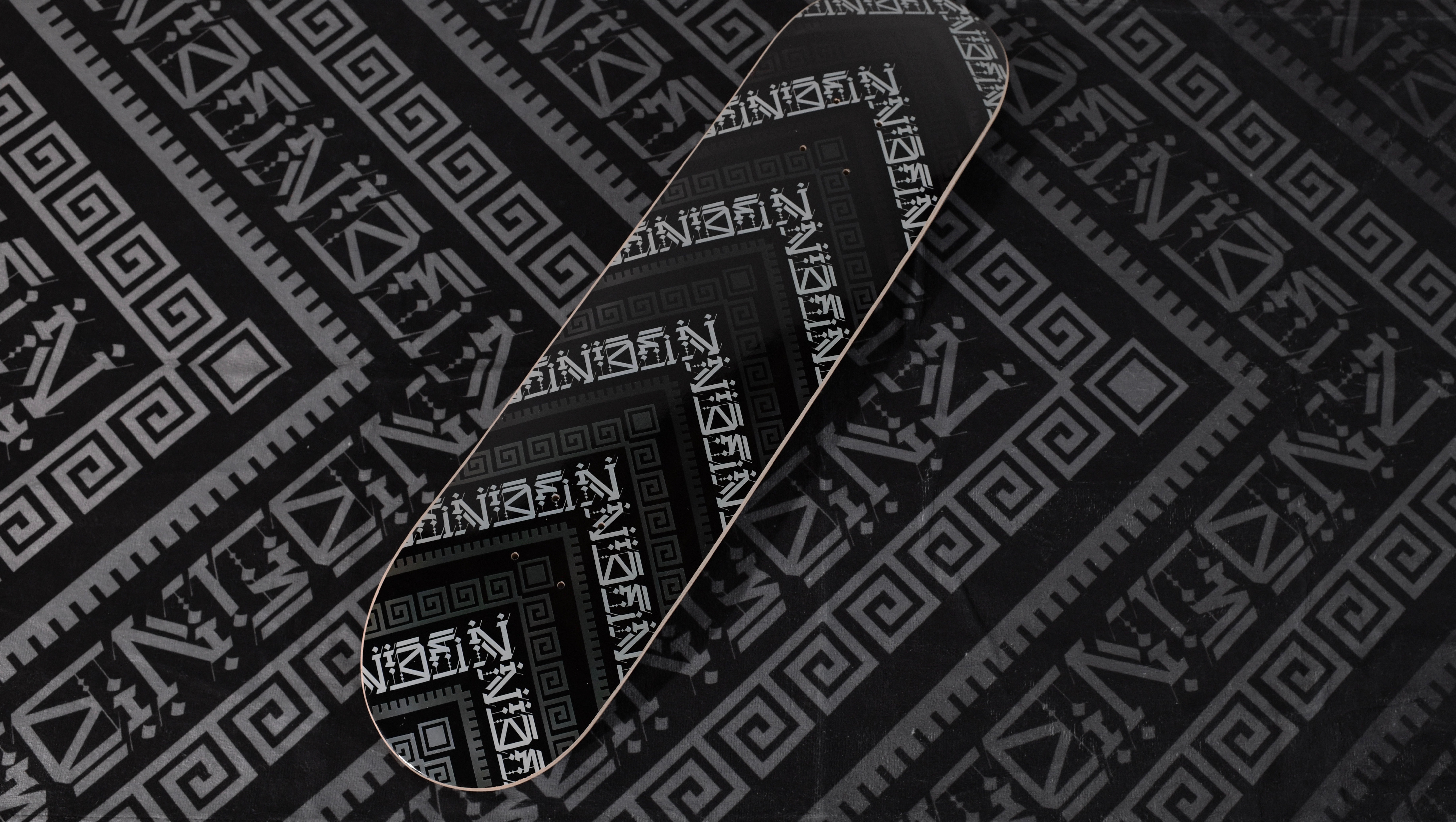
Sketches + Board Designs
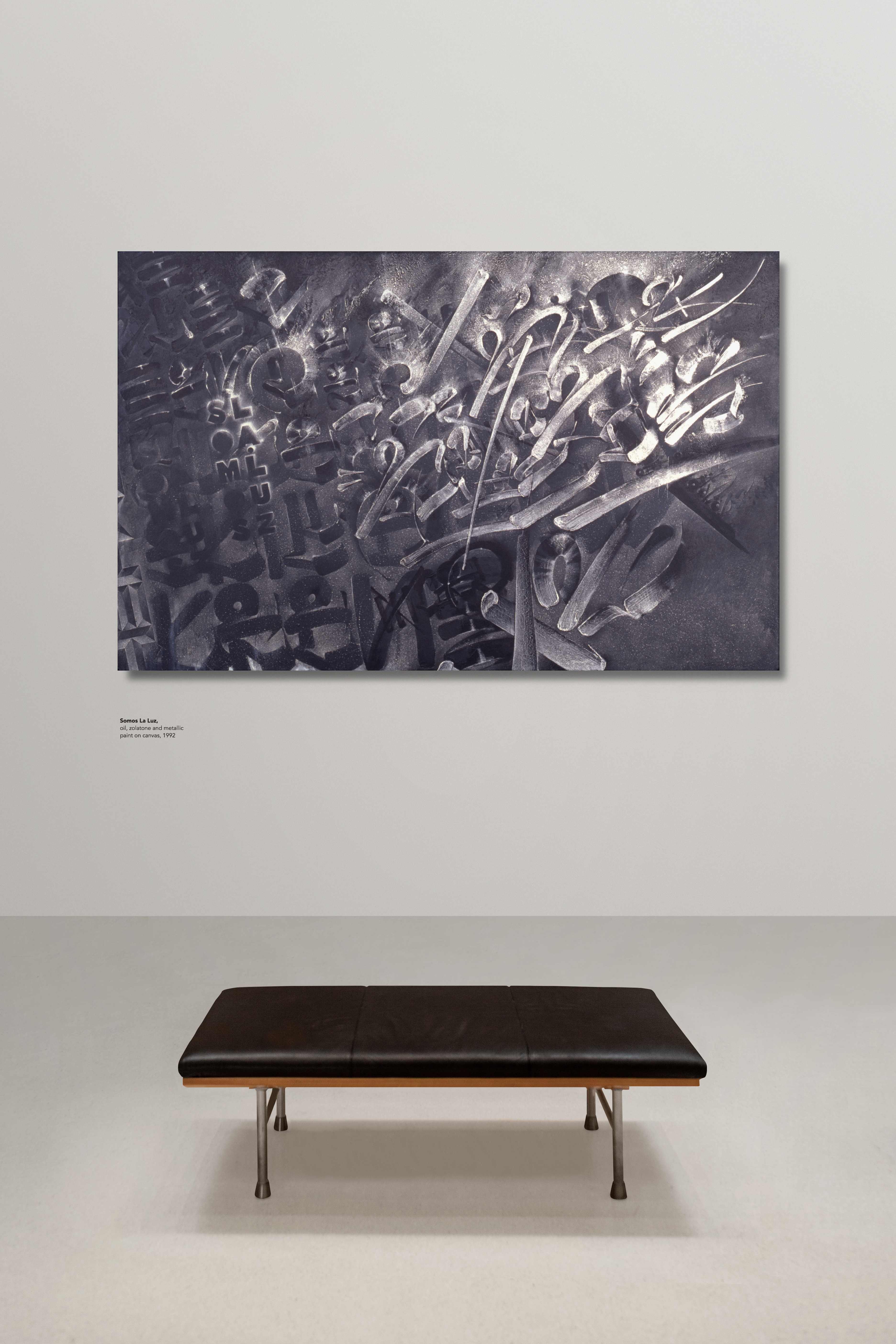
My first iterations focused around the concept of near death experiences, a personal path I’ve endured over the years, plus my love for lettering. The logo evolved from one of the calligraphic tribal inspired board designs, which is made to represent a labyrinth with dead end roads and misleading pathways emblematic of my personal life struggles.
My first iterations focused around the concept of near death experiences, a personal path I’ve endured over the years, plus my love for lettering. The logo evolved from one of the calligraphic tribal inspired board designs, which is made to represent a labyrinth with dead end roads and misleading pathways emblematic of my personal life struggles.
NDE Catalog Zine
This catalog describes the brands mission statement, which is dedicated to supporting indigenous communities through skateboarding. It showcases both an artist series with custom apparel, and a deck section cataloging multiple designs.
This catalog describes the brands mission statement, which is dedicated to supporting indigenous communities through skateboarding. It showcases both an artist series with custom apparel, and a deck section cataloging multiple designs.
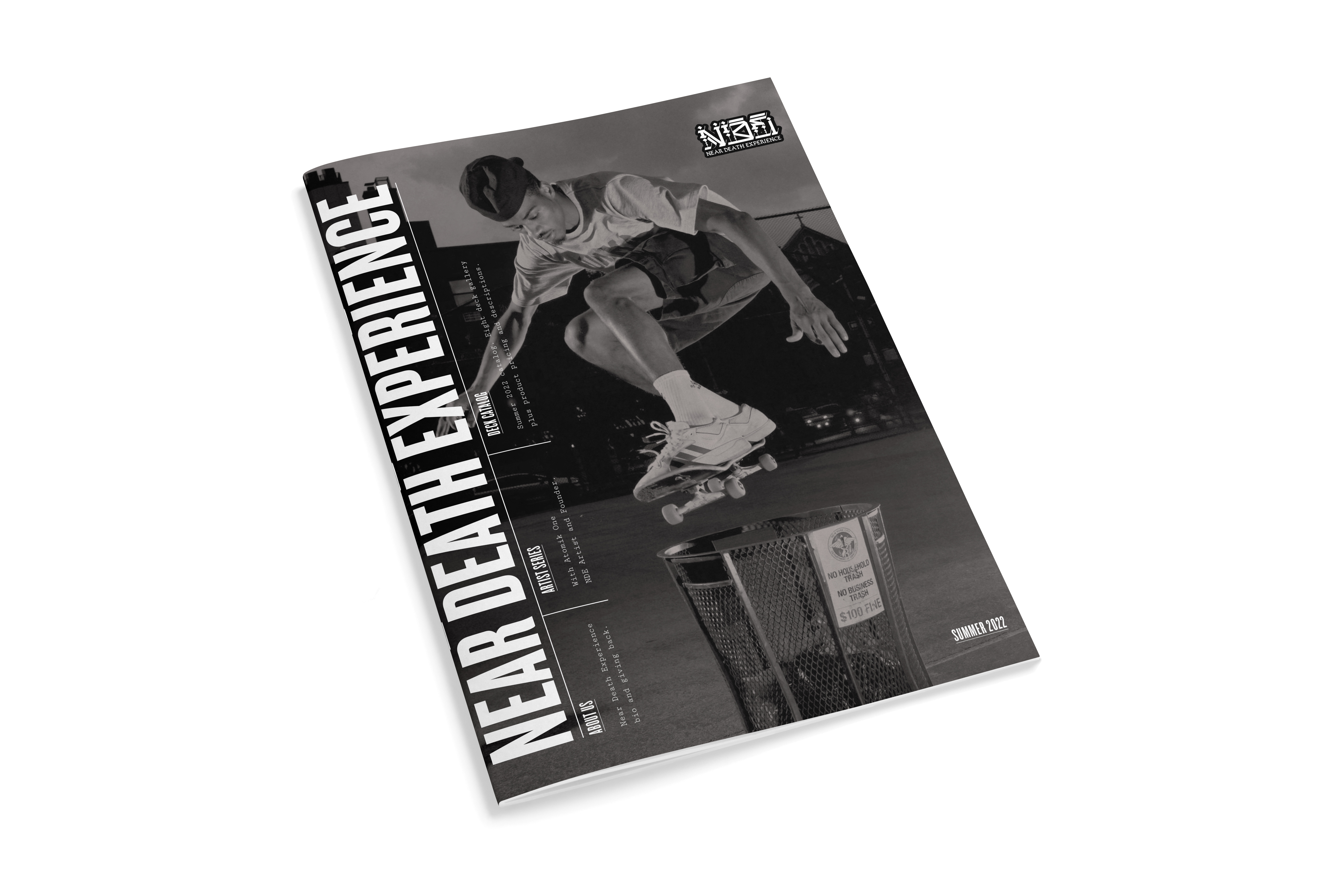
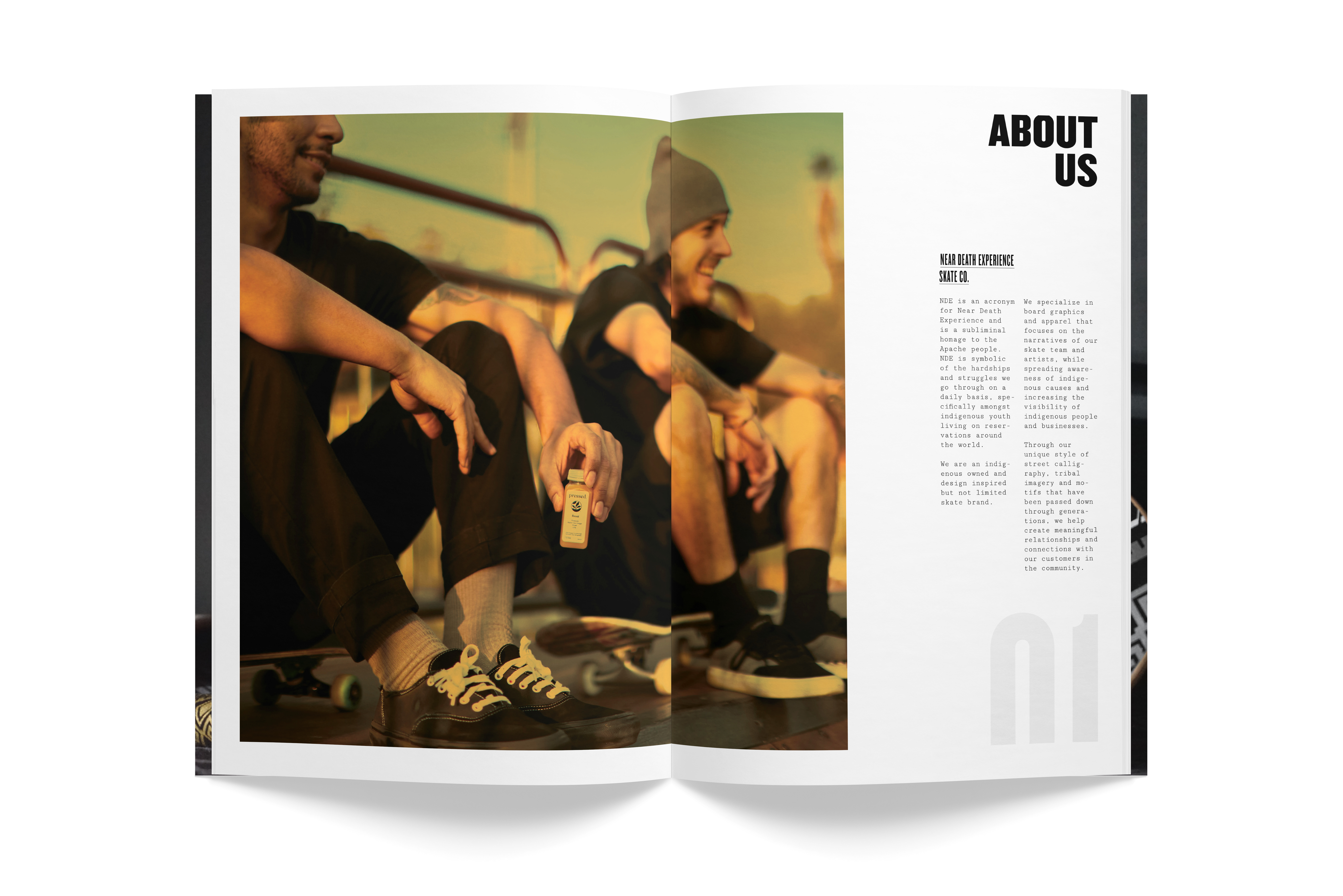
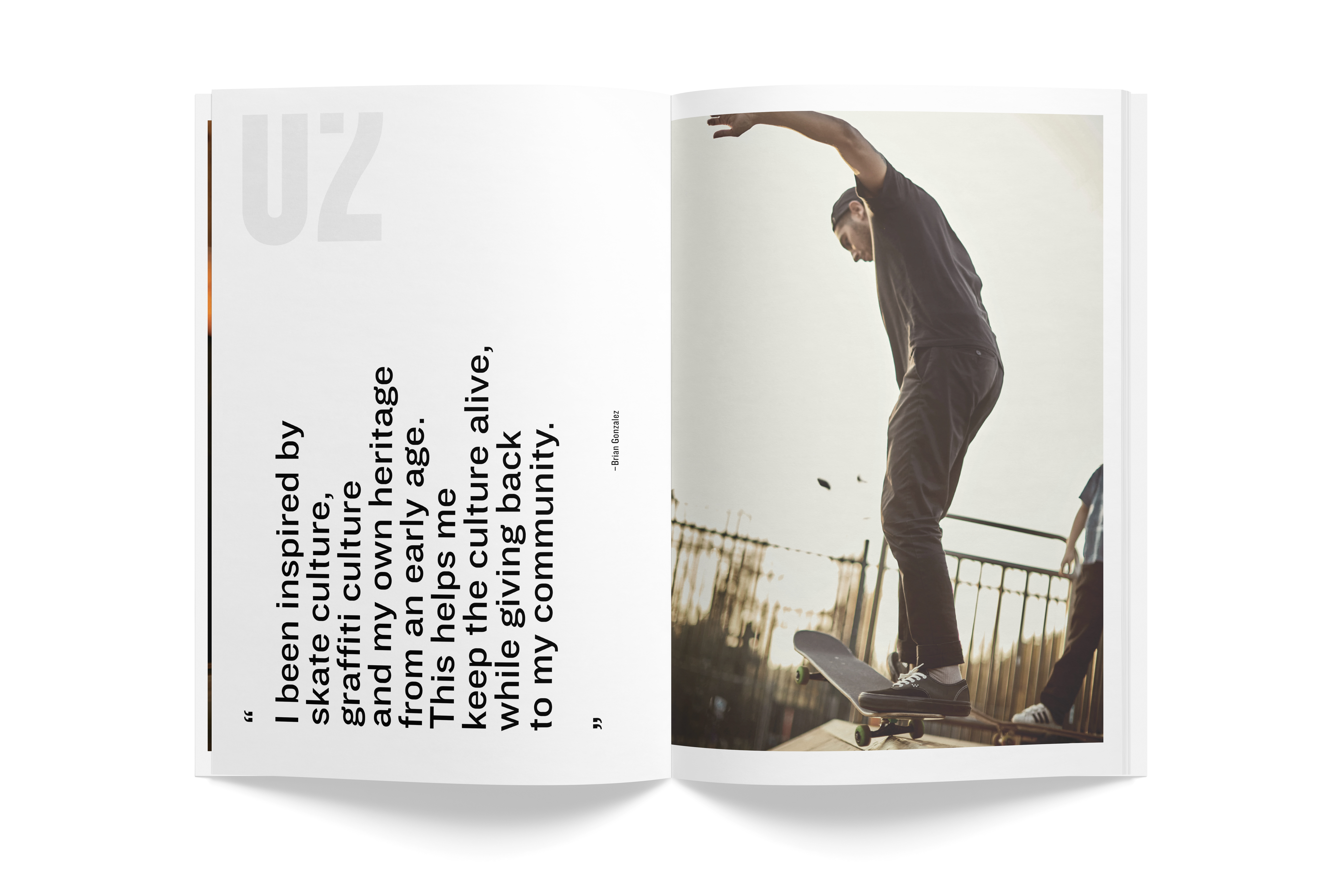
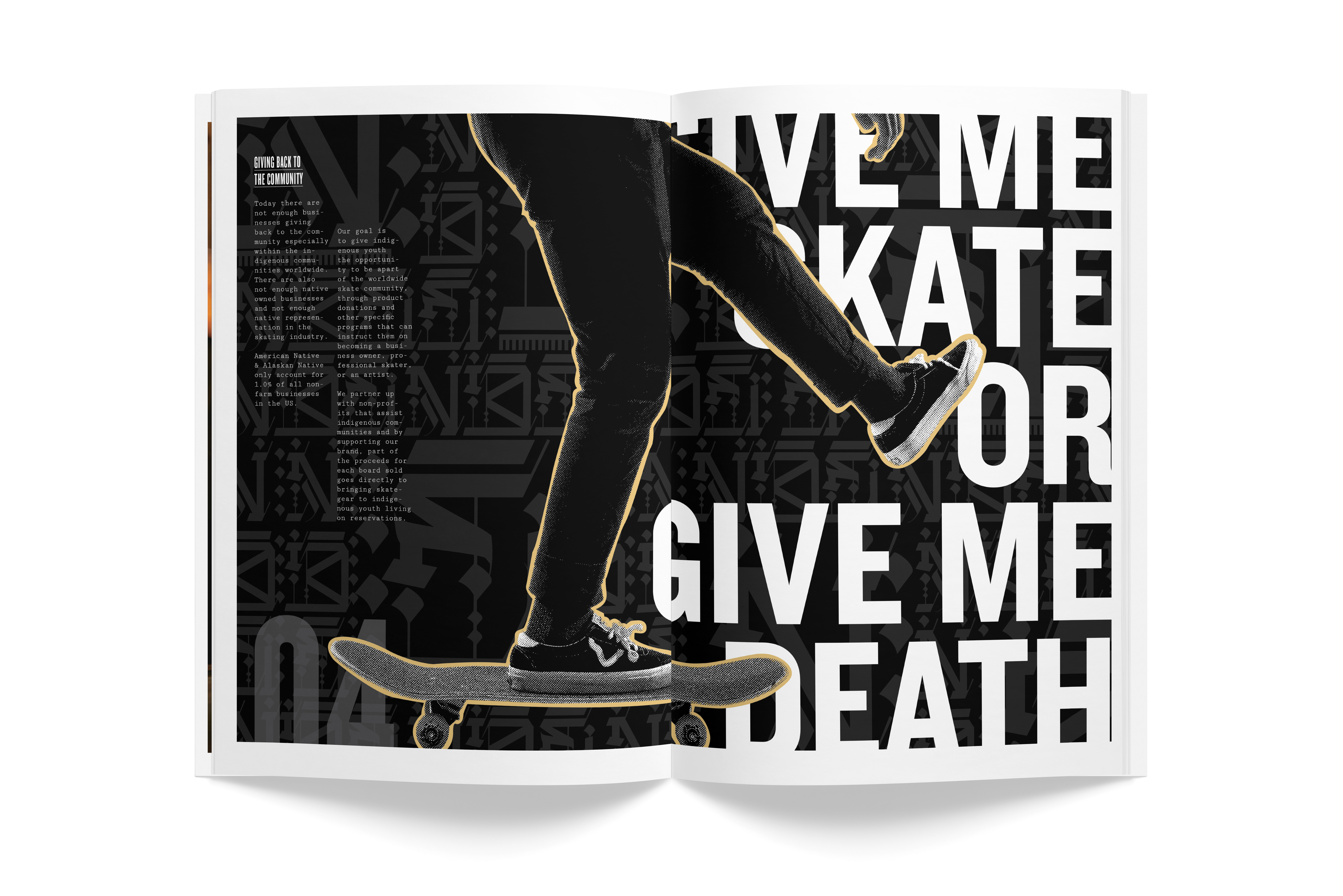
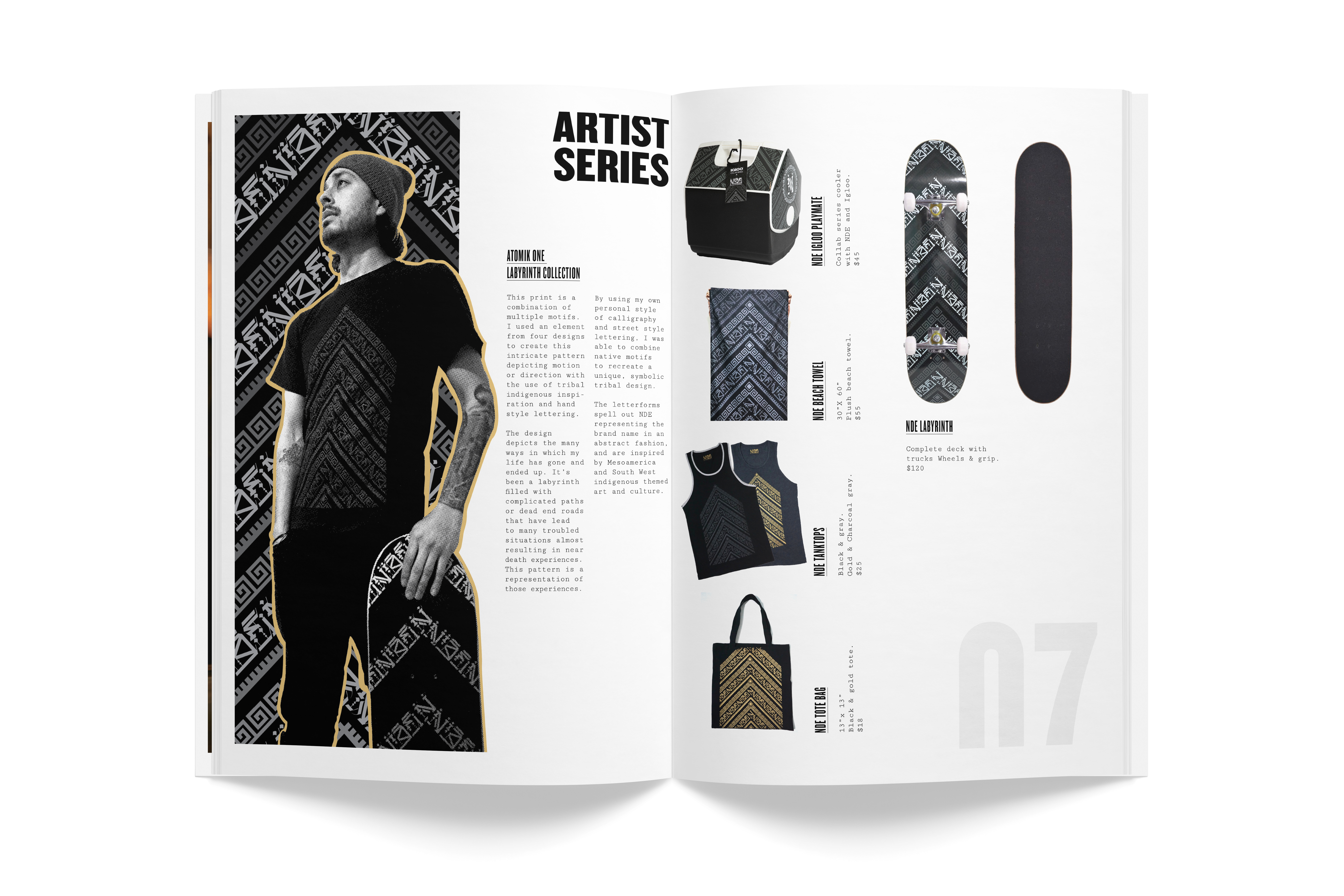
Photo Gallery
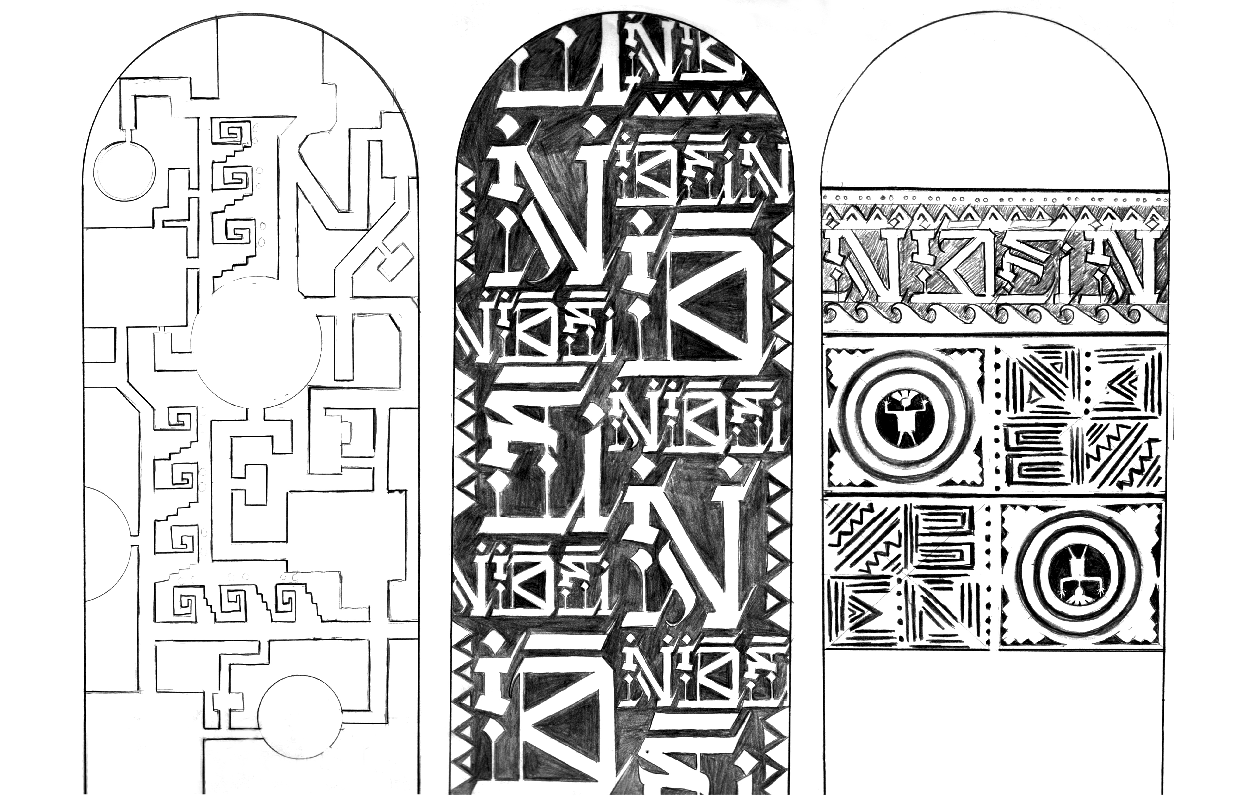
Labyrinth + Apache Scout Decks
Labyrinth Collection
Collab Series with Igloo + Additional Set
Hang Tags